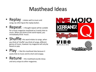
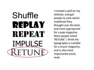
Masthead Ideas
• Replay – relates well to music and
    songs, by referring to the replay button.

• Repeat – I thought repeat will be suitable
    for a music magazine masthead as it easily links to
    music. When you think of the word repeat, you
    immediately think ‘music’.

• Shuffle- this word relates to songs, when
    you think of ‘shuffle’ you think of songs, different
    genres of music, however my magazine will only be
    based on pop.

• Play – I like this masthead idea because it
    easily links to music and its short and snappy.

• Retune – this masthead sounds classy
    and very unique to other magazines.
I created a poll on my
website, and got
people to vote which
masthead they
thought was the best,
and most appropriate
for a pop magazine.
Most people voted
‘RETUNE’. I think the
typography is suitable
for a music magazine,
and is also most
importantly easily
read.
Font Faces
With my chosen title name I
have found suitable font faces. I
have decided on one of these as
the previous set of fonts were
very stylish and too much was
going on. These font faces are
more simple and clear. They
seem more original and meet
the expectations of a classy
and professional looking
magazine. I am choosing to use
the second font Nouvelle Vague
as it is the most original and
classy looking one on there.

Masthead ideas eda

  • 1.
    Masthead Ideas • Replay– relates well to music and songs, by referring to the replay button. • Repeat – I thought repeat will be suitable for a music magazine masthead as it easily links to music. When you think of the word repeat, you immediately think ‘music’. • Shuffle- this word relates to songs, when you think of ‘shuffle’ you think of songs, different genres of music, however my magazine will only be based on pop. • Play – I like this masthead idea because it easily links to music and its short and snappy. • Retune – this masthead sounds classy and very unique to other magazines.
  • 2.
    I created apoll on my website, and got people to vote which masthead they thought was the best, and most appropriate for a pop magazine. Most people voted ‘RETUNE’. I think the typography is suitable for a music magazine, and is also most importantly easily read.
  • 3.
    Font Faces With mychosen title name I have found suitable font faces. I have decided on one of these as the previous set of fonts were very stylish and too much was going on. These font faces are more simple and clear. They seem more original and meet the expectations of a classy and professional looking magazine. I am choosing to use the second font Nouvelle Vague as it is the most original and classy looking one on there.