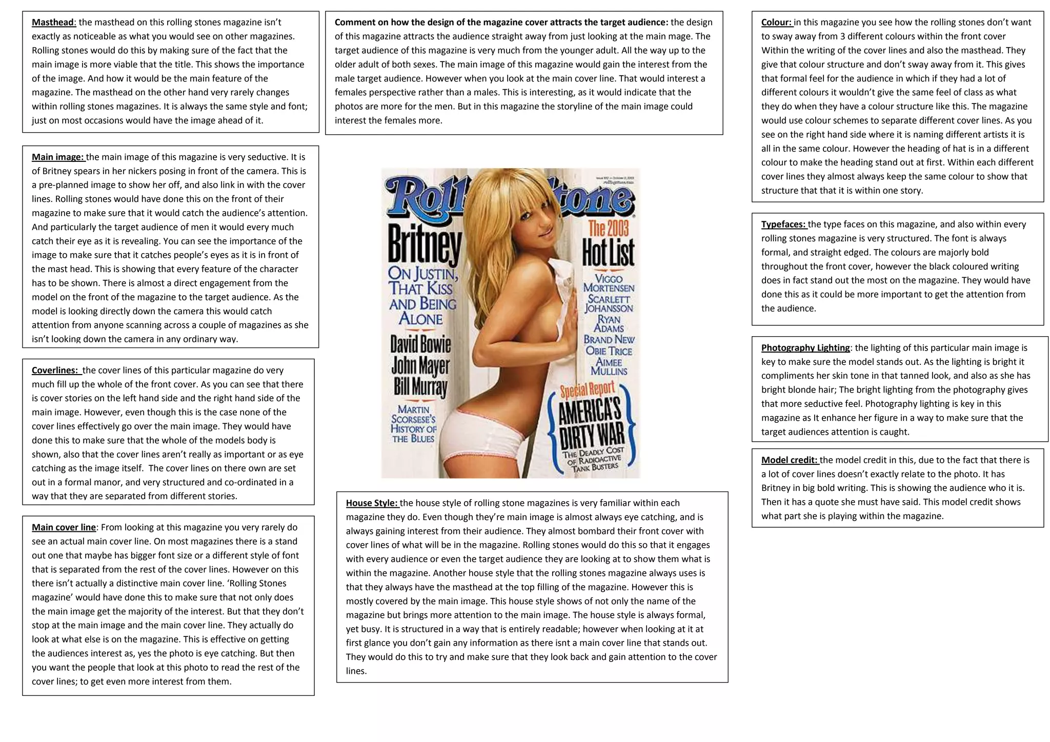
1. Masthead: the masthead on this rolling stones magazine isn’t Comment on how the design of the magazine cover attracts the target audience: the design Colour: in this magazine you see how the rolling stones don’t want
exactly as noticeable as what you would see on other magazines. of this magazine attracts the audience straight away from just looking at the main mage. The to sway away from 3 different colours within the front cover
Rolling stones would do this by making sure of the fact that the target audience of this magazine is very much from the younger adult. All the way up to the Within the writing of the cover lines and also the masthead. They
main image is more viable that the title. This shows the importance older adult of both sexes. The main image of this magazine would gain the interest from the give that colour structure and don’t sway away from it. This gives
of the image. And how it would be the main feature of the male target audience. However when you look at the main cover line. That would interest a that formal feel for the audience in which if they had a lot of
magazine. The masthead on the other hand very rarely changes females perspective rather than a males. This is interesting, as it would indicate that the different colours it wouldn’t give the same feel of class as what
within rolling stones magazines. It is always the same style and font; photos are more for the men. But in this magazine the storyline of the main image could they do when they have a colour structure like this. The magazine
just on most occasions would have the image ahead of it. interest the females more. would use colour schemes to separate different cover lines. As you
see on the right hand side where it is naming different artists it is
all in the same colour. However the heading of hat is in a different
Main image: the main image of this magazine is very seductive. It is
colour to make the heading stand out at first. Within each different
of Britney spears in her nickers posing in front of the camera. This is
cover lines they almost always keep the same colour to show that
a pre-planned image to show her off, and also link in with the cover
structure that that it is within one story.
lines. Rolling stones would have done this on the front of their
magazine to make sure that it would catch the audience’s attention.
And particularly the target audience of men it would every much Typefaces: the type faces on this magazine, and also within every
catch their eye as it is revealing. You can see the importance of the rolling stones magazine is very structured. The font is always
image to make sure that it catches people’s eyes as it is in front of formal, and straight edged. The colours are majorly bold
the mast head. This is showing that every feature of the character throughout the front cover, however the black coloured writing
has to be shown. There is almost a direct engagement from the does in fact stand out the most on the magazine. They would have
model on the front of the magazine to the target audience. As the done this as it could be more important to get the attention from
model is looking directly down the camera this would catch the audience.
attention from anyone scanning across a couple of magazines as she
isn’t looking down the camera in any ordinary way.
Photography Lighting: the lighting of this particular main image is
key to make sure the model stands out. As the lighting is bright it
Coverlines: the cover lines of this particular magazine do very
compliments her skin tone in that tanned look, and also as she has
much fill up the whole of the front cover. As you can see that there
bright blonde hair; The bright lighting from the photography gives
is cover stories on the left hand side and the right hand side of the
that more seductive feel. Photography lighting is key in this
main image. However, even though this is the case none of the
magazine as It enhance her figure in a way to make sure that the
cover lines effectively go over the main image. They would have
target audiences attention is caught.
done this to make sure that the whole of the models body is
shown, also that the cover lines aren’t really as important or as eye
Model credit: the model credit in this, due to the fact that there is
catching as the image itself. The cover lines on there own are set
a lot of cover lines doesn’t exactly relate to the photo. It has
out in a formal manor, and very structured and co-ordinated in a
Britney in big bold writing. This is showing the audience who it is.
way that they are separated from different stories.
House Style: the house style of rolling stone magazines is very familiar within each Then it has a quote she must have said. This model credit shows
magazine they do. Even though they’re main image is almost always eye catching, and is what part she is playing within the magazine.
Main cover line: From looking at this magazine you very rarely do always gaining interest from their audience. They almost bombard their front cover with
see an actual main cover line. On most magazines there is a stand cover lines of what will be in the magazine. Rolling stones would do this so that it engages
out one that maybe has bigger font size or a different style of font with every audience or even the target audience they are looking at to show them what is
that is separated from the rest of the cover lines. However on this within the magazine. Another house style that the rolling stones magazine always uses is
there isn’t actually a distinctive main cover line. ‘Rolling Stones that they always have the masthead at the top filling of the magazine. However this is
magazine’ would have done this to make sure that not only does mostly covered by the main image. This house style shows of not only the name of the
the main image get the majority of the interest. But that they don’t magazine but brings more attention to the main image. The house style is always formal,
stop at the main image and the main cover line. They actually do yet busy. It is structured in a way that is entirely readable; however when looking at it at
look at what else is on the magazine. This is effective on getting first glance you don’t gain any information as there isnt a main cover line that stands out.
the audiences interest as, yes the photo is eye catching. But then They would do this to try and make sure that they look back and gain attention to the cover
you want the people that look at this photo to read the rest of the lines.
cover lines; to get even more interest from them.