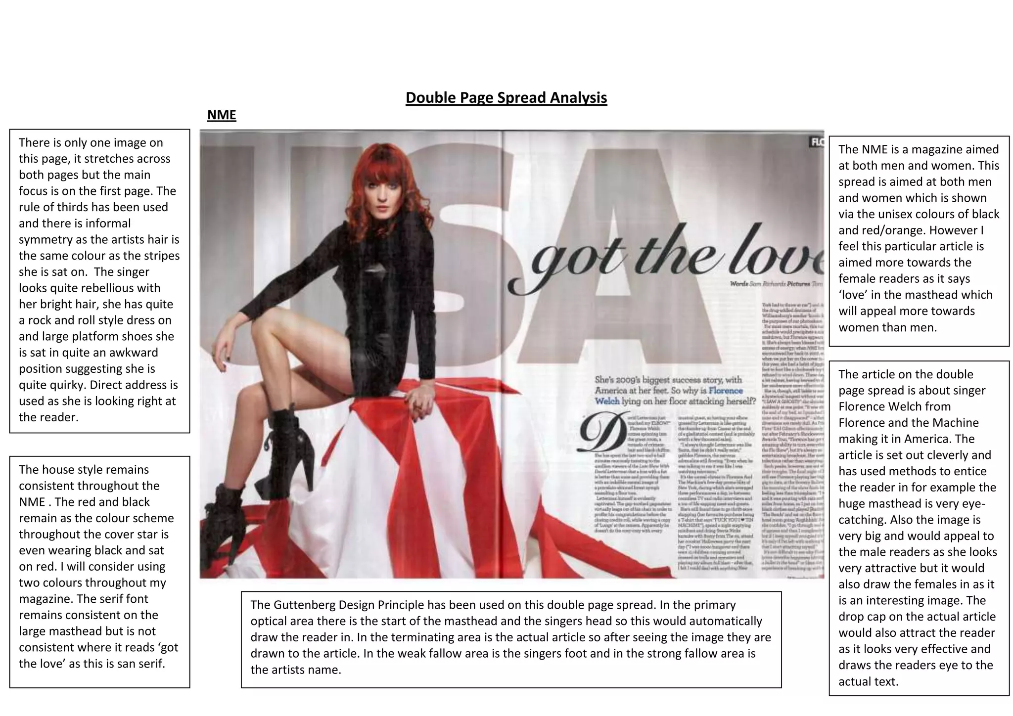
This double page spread from NME magazine features an image of singer Florence Welch stretching across both pages. The layout follows the rule of thirds and uses informal symmetry. It aims to attract both male and female readers with unisex colours and an eye-catching masthead asking "Got the love?". The article is about Welch's success in America.
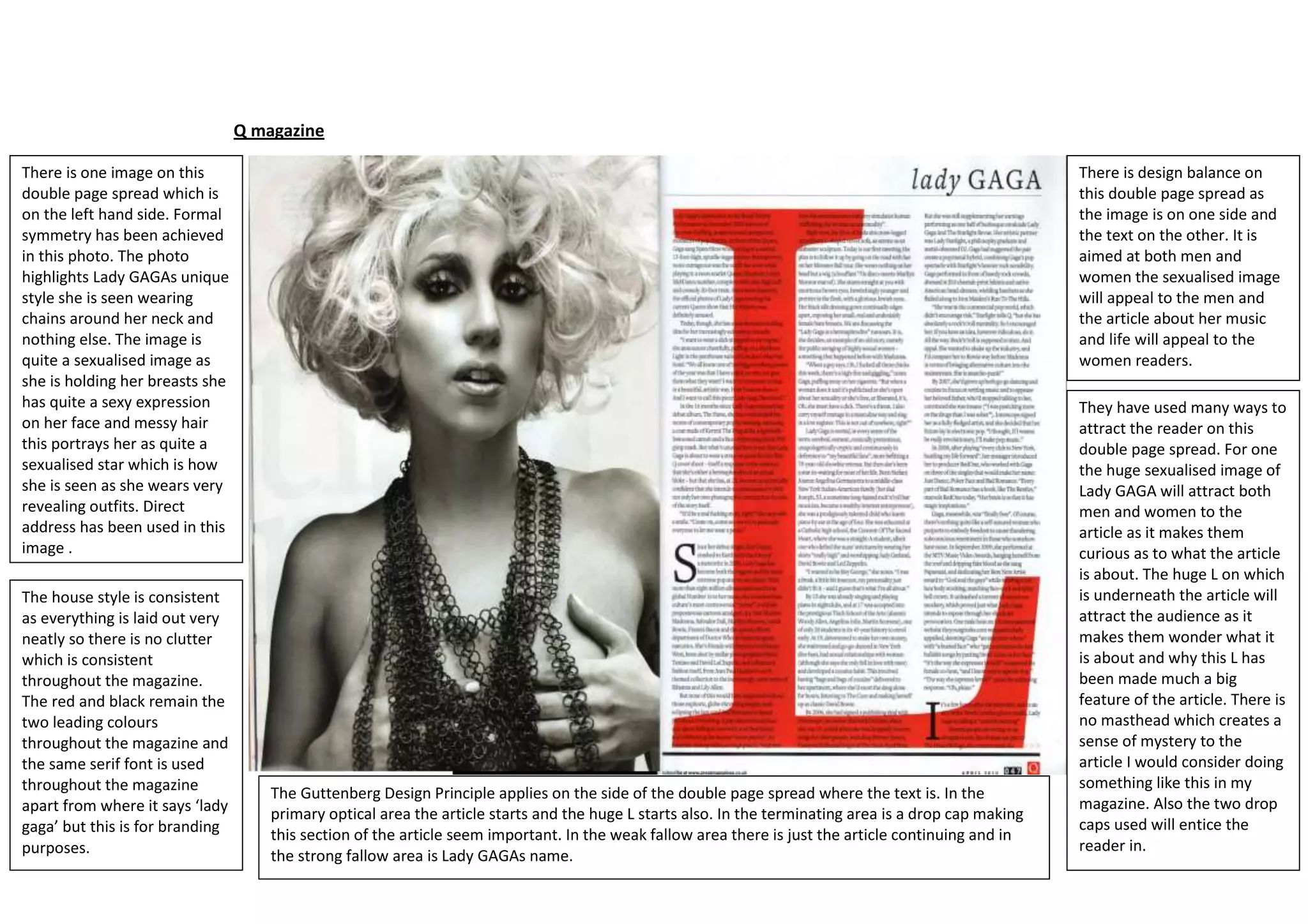
This double page spread from Q magazine features a sexually provocative image of Lady Gaga holding her breasts on one side. The layout achieves formal symmetry and aims to attract both genders - males to the sexualized image and females to the accompanying article about her music and life. It uses large eye-catching designs like the image and initial "