
Recommended
More Related Content
What's hot
What's hot (20)
Similar to Top of the pops
Similar to Top of the pops (20)
Recently uploaded
Recently uploaded (20)
Top of the pops
- 1. Top of the Pops
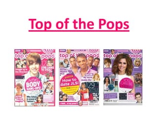
- 2. The MASTHEAD is written in sans-serif THE MAIN IMAGE shows a current font which connotes with the young, ‘hip’ pop boy band who are showing image of a pop magazine, clearly aimed at The BANNER on this example direct mode of address as they are modern, young girls . The sans-serif font shows a feature inside the all looking directly at the camera. creates a more personal message for the magazine, this is not commonly This technique creates a personal readers. The colour is bright pink which seen on a banner as it is usually sense between the reader and instantly suggests who the target used as a sell line to convince the magazine. Each member of the audience is and this would draw this reader into buying it. So this is an band is smiling which is an particular type of reader in. odd way of advertising. ideology of pop magazine covers in particular. The magazine is similar to others in the way that the main image is centred and takes up most The BOOST on this cover is similar to those on of the cover space. other pop magazines. They have WOB to emphasise this more than everything else on the cover. They have also used pink on white and As there is an image of one direction(a popular made the font bigger than the other writing teenage band) and Tulisa(n-dubz) this would making the main feature stand out. create a great amount of sales for this magazine because these people are incredibly Using the words popular with the target audience. such as, ‘exclusive’ The MENU BAR is quite makes the reader large on this magazine This cover has a style section feel as if they are compared to others and it which would highly appeal to getting the best is located slightly below the target audience as young gossip around the main image. There are girls love knowing the latest about their images and lots of fashion and what their favourite stars. information about what favourite celebrities are else is expected inside the currently wearing. Like all magazines sold in magazine. shops, Top of the Pops has a The BBC logo in the top left small BARCODE at the corner is the producer and This magazine uses lots of images on their bottom of the cover. This distributor of this magazine. covers as do other pop mags, this makes it means it is not taking up too more appealing to the audience as they can much room or drawing read about their favourite artists, therefore The COLOURSCHEME is pink, white and baby blue – all attention away from the they are more likely to buy the magazine. typical colours we associate with girls. features inside the mag.
- 3. Using the words ‘INSIDE THE MAG…’ This contents is filled with exciting makes the contents page seem much features yet I think it is important that more interesting. This part of the page attention is paid to make sure that the stands out as it is on a pink background page is not over filled. whereas the rest is on white. As the descriptions of what is on each page are in WOB, the page numbers, coloured in pink stand out much more, This contents page is divided up into making the instructions for which page sections of the magazine, which to go to clear to the reader. makes it a lot easier for the reader to understand. I t also makes the magazine look interesting but not The sub-heading’s are still written in cluttered. sans-serif font, keeping the theme throughout however this is a slightly different type of font which is more formal and mature looking, therefore The same as the cover, the content appealing to young girls. page uses an image of the popular boy band, one direction, this keeps the magazine consistent and more interesting for the readers. The page numbers which are seen as the most important are in a larger font than all the others are. Not many pop magazines feature an image of the actual front cover on the contents page, but I think this is a Small cut outs, showing glimpses good idea as this particular mag is of some certain features in the aimed at young girls and this feature magazine. will take them directly to the main The WOB(white on black) on each of the sub- headings makes these stand out further than most story they were drawn into in the first things apart from the title. place.
- 4. The words ‘Exclusive Interview’ are in WOB The introduction to the article stands out as it is which make it stand out, again the word separated from the rest of the writing. The bands exclusive suggests to the reader that they name is in BOLD CAPITALS which makes the These small are getting the best story. reader certain who the article is about. little illustrations on the callouts make the page more aesthetically The title ‘Back with a appealing. splash’ is in the centre of the page and is what the reader is drawn to immediately when they look at the page. The The black page font used is blue and numbers on blue keeps with the ‘water’ background contrast theme. well, and show the reader which page they are on clearly, with no confusion what so ever. The small speech bubbles have black font on a blue background, they stand out from the rest of the writing which is good Indicates the reader because they are the to tell them to turn most interesting The article features an interview, with question and answer format. The over the page for things that the answers are in a blue font, with the questions in the same colour but more on this celebrities said in bold and the band members name is in black so it stands out and the interview. their interview. reader can easily tell which person is giving the answer.