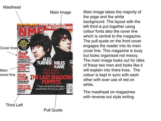
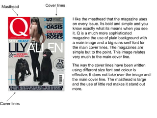
Front Cover Analyse
Masthead Main Image Cover lines Third Left Pull Quote Main cover line Main image takes the majority of the page and the white background. The layout with the left third is put together using colour fonts also the cover line which is central to the magazine. The pull quote on the front cover engages the reader into its main cover line. This magazine is busy but looks organised not messy. The main image looks out for idles of these two men and looks like it will explain into there lives.  The colour is kept in sync with each other with over use of red on white.  The masthead on magazines with reverse out style writing
Masthead I like the masthead that the magazine uses on every issue. Its bold and simple and you know exactly what its means when you see it. Q is a much more sophisticated magazine the use of plain background with a main image and a big sans serif font for the main cover lines. The magazines are simple but to the point. This image relates very much to the main cover line.  The way the cover lines have been written using different size font and colour is effective. It does not take over the image and the main cover line. The masthead is large and the use of little red makes it stand out more.  Cover lines Cover lines
Kerrangs masthead shows that its contents is going to be fresh, brand new and exclusive. The cover lines with added pictures and on a colour strip separates the main cover line from other cover lines. The colours are kept similar and therefore it does not look too explosive. Its sophisticated but there is more going on the front cover to catch the readers attention. The main image of the three and one of them with there hand on there heart gives the band the look of serious and genuine to there fans.  Masthead Cover lines

Front Cover Analyse

  • 1.
  • 2.
    Masthead Main ImageCover lines Third Left Pull Quote Main cover line Main image takes the majority of the page and the white background. The layout with the left third is put together using colour fonts also the cover line which is central to the magazine. The pull quote on the front cover engages the reader into its main cover line. This magazine is busy but looks organised not messy. The main image looks out for idles of these two men and looks like it will explain into there lives. The colour is kept in sync with each other with over use of red on white. The masthead on magazines with reverse out style writing
  • 3.
    Masthead I likethe masthead that the magazine uses on every issue. Its bold and simple and you know exactly what its means when you see it. Q is a much more sophisticated magazine the use of plain background with a main image and a big sans serif font for the main cover lines. The magazines are simple but to the point. This image relates very much to the main cover line. The way the cover lines have been written using different size font and colour is effective. It does not take over the image and the main cover line. The masthead is large and the use of little red makes it stand out more. Cover lines Cover lines
  • 4.
    Kerrangs masthead showsthat its contents is going to be fresh, brand new and exclusive. The cover lines with added pictures and on a colour strip separates the main cover line from other cover lines. The colours are kept similar and therefore it does not look too explosive. Its sophisticated but there is more going on the front cover to catch the readers attention. The main image of the three and one of them with there hand on there heart gives the band the look of serious and genuine to there fans. Masthead Cover lines