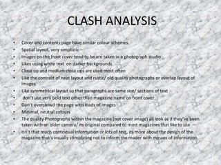
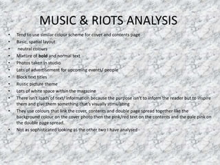
The document provides an analysis of the design elements of several magazine covers and contents pages, including Clash, Loud and Quiet, and Music & Riots magazines. Some key highlights noted across the magazines include:
- Using white text on darker backgrounds to make the text stand out
- Employing close-up or medium close-up photographs
- Balancing neat layouts with more rustic, older-looking photographs
- Favoring symmetrical and minimalist designs with ample white space
- Incorporating similar color schemes and design elements across pages
- Not overly relying on bold text or images to convey information