The document provides an analysis of the house style, design elements, and images used across double page spreads in two music magazines - Vibe and Q Magazine. For Vibe, the colors and layout match the genre of a rap music magazine. The large image takes up half the page to draw attention. For Q Magazine, darker cold colors are used to match the indie music genre. Both magazine spreads lack design balance and symmetry since the large images dominate one page. Neither uses the rule of thirds, instead focusing attention with big images and mastheads.
I have analysed 3 front covers, 3 contents pages and 3 double page spreads. I have said what is good and bad about them, and the things that i like and dislike about them.
1. VIBE MAGAZINEHouse style
The house style of this double page
spread matches together well. All the
colours go together well. As well as this is
that the colours on the double page
match the genre of the music magazine
well. As the drawing on the artist face on
the picture is black and red the actual
writing is red and black too. This looks
good as everything goes together as well
as it being easier to see. As well as this
the masthead is half the page. This
makes it stand out so that it is noticeable
and bright. As well as this the writing is
written in two columns which makes it
look neat and organised.
Design balance
There is no real balance across the
double page spread. One reason for this
is due to the picture taking up one half of
that double page. This makes the writing
not be able to be equal. This is also due
to the fact the masthead is half of the
right page which makes sure the writing
is half of that page. This shows that there
is no real balance across the magazine as
the image is a lot bigger than any other
section of the magazine.
Use of rules of thirds
The rule of thirds is not used on the
double page of this vibe magazine. The
complete design is different to this style.
One explanation for this is that the
whole of the left side of the double page
spread is a picture. This gets your
attention straight away as the picture is
so big and bright. As well as this on the
other half of the double page the
masthead takes us half of it this is also
to draw attention to the article. They
have done this to draw in the reader’s
attention in another way and not by
using the rule of thirds.
Design symmetry .
There is no real design symmetry to the
double page of the magazine. As one of
the pages is fully a picture the other half
of the double page could not be
symmetrical. One thing that could be
seen as equal and symmetrical is the
columns of writing that is on the right
hand side of the page. They have been
done so that they are equal and makes
the page very organised and neat.
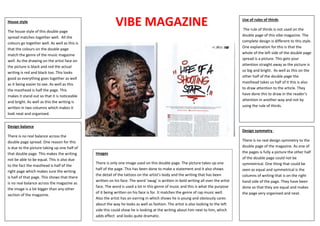
Images
There is only one image used on this double page. The picture takes up one
half of the page. This has been done to make a statement and it also shows
the detail of the tattoos on the artist’s body and the writing that has been
written on his face. The word ‘swag’ is written in bold writing all over the artist
face. The word is used a lot in this genre of music and this is what the purpose
of it being written on his face is for. It matches the genre of rap music well.
Also the artist has an earring in which shows he is young and obviously cares
about the way he looks as well as fashion. The artist is also looking to the left
side this could show he is looking at the writing about him next to him, which
adds effect and looks quite dramatic.
2. Q MAGAZINE
House style
The house style of the magazine is quite
cold and plain colours used. For example
on the pictures and the text colour used.
For example is black. The colours on the
picture are dark cold and not bold and
bright. This is well linked to the genre of
the music as indie music is not that
mainstream and is normally quite chilled
and turned down type of music.
Design balance
There is no real balance across the
double page spread. One reason for this
is due to the picture taking up one half of
that double page. This makes the writing
not be able to be equal. This is also due
to the fact the masthead is half of the
right page which makes sure the writing
is half of that page. This shows that there
is no real balance across the magazine as
the image is a lot bigger than any other
section of the magazine.
Use of rules of thirds
The rule of thirds is not used on this
double page. One way in which we can
see this is due to the picture covering
half of the double page spread. This
means that your eyes are going to see
that before anything. Unlike within the
rule of thirds your eyes will normally
look at the top left corner of anything
first. As well as this the writing is spread
out on the page so that does not draw
your attention that much and definitely
does not consider the rule of thirds
while doing this. Also the start of each
main paragraph the first letter has been
enlarged and in bold this gets attention.
Design symmetry
There is no real design symmetry to the
double page of the magazine. As one of
the pages is fully a picture the other half
of the double page could not be
symmetrical. One thing that could be
seen as equal and symmetrical is the
columns of writing that is on the right
hand side of the page. They have been
done so that they are equal and makes
the page very organised and neat.
Images
The image takes up half of the double page spread. It is a picture of Lana del
ray. The picture shows a portrait of her face. It shows her posing with her eyes
shut and the mouth parted with her hand on her neck. The picture is quite
dramatic and adds a sense of the artist being quite controversial and different.
Also on the picture is spots of light on one side and then on the other side is
dark and red light. This could be insinuating good and bad. It also makes the
image different and this links in well with her style of music as it could be
considered to be quite indie and unique.
.