House Style
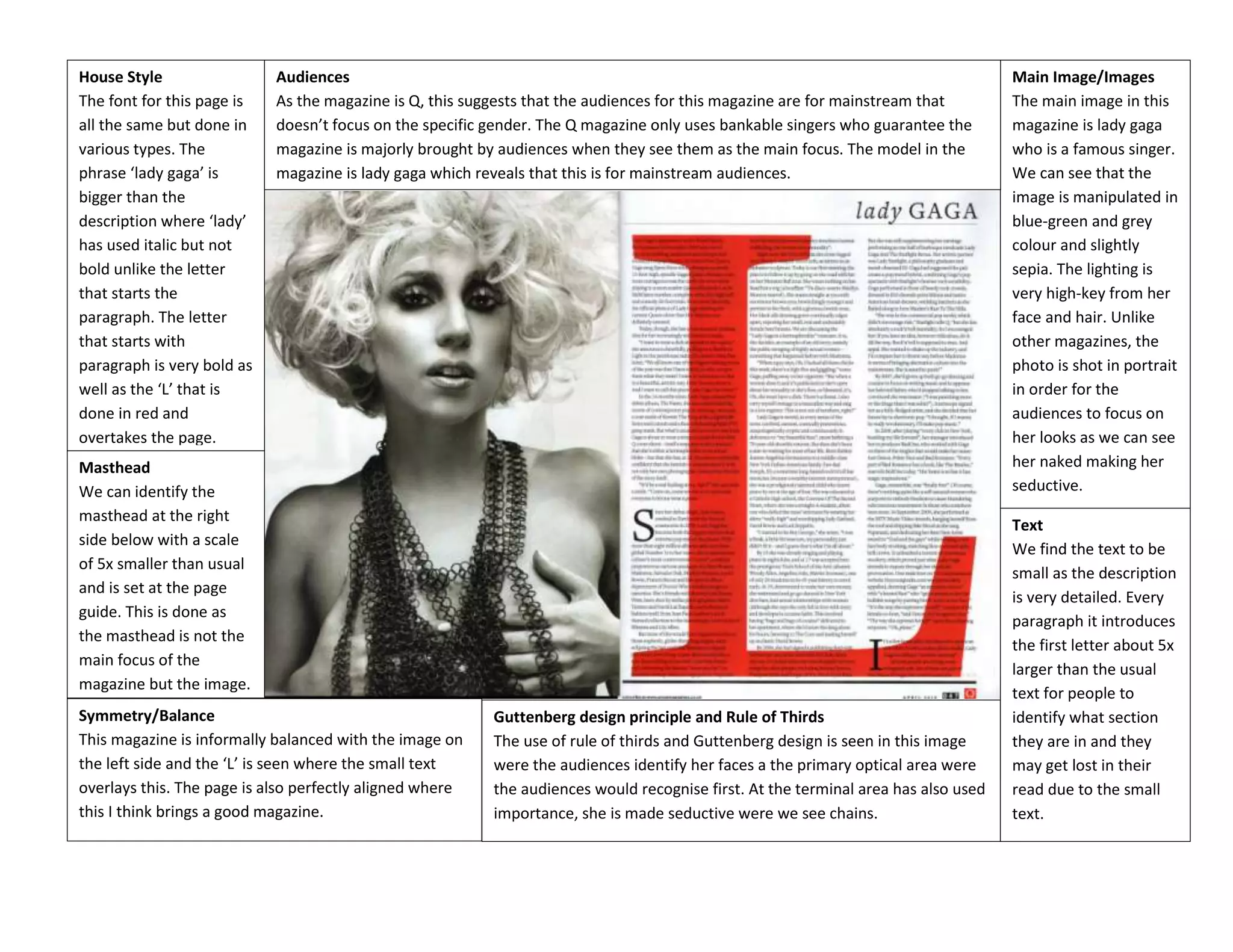
The font for this page is
all the same but done in
various types. The
phrase ‘lady gaga’ is
bigger than the
description where ‘lady’
has used italic but not
bold unlike the letter
that starts the
paragraph. The letter
that starts with
paragraph is very bold as
well as the ‘L’ that is
done in red and
overtakes the page.

Audiences
As the magazine is Q, this suggests that the audiences for this magazine are for mainstream that
doesn’t focus on the specific gender. The Q magazine only uses bankable singers who guarantee the
magazine is majorly brought by audiences when they see them as the main focus. The model in the
magazine is lady gaga which reveals that this is for mainstream audiences.

Masthead
We can identify the
masthead at the right
side below with a scale
of 5x smaller than usual
and is set at the page
guide. This is done as
the masthead is not the
main focus of the
magazine but the image.
Symmetry/Balance
This magazine is informally balanced with the image on
the left side and the ‘L’ is seen where the small text
overlays this. The page is also perfectly aligned where
this I think brings a good magazine.

Guttenberg design principle and Rule of Thirds
The use of rule of thirds and Guttenberg design is seen in this image
were the audiences identify her faces a the primary optical area were
the audiences would recognise first. At the terminal area has also used
importance, she is made seductive were we see chains.

Main Image/Images
The main image in this
magazine is lady gaga
who is a famous singer.
We can see that the
image is manipulated in
blue-green and grey
colour and slightly
sepia. The lighting is
very high-key from her
face and hair. Unlike
other magazines, the
photo is shot in portrait
in order for the
audiences to focus on
her looks as we can see
her naked making her
seductive.
Text
We find the text to be
small as the description
is very detailed. Every
paragraph it introduces
the first letter about 5x
larger than the usual
text for people to
identify what section
they are in and they
may get lost in their
read due to the small
text.
House Style
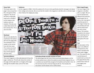
The house style in this
page is very unusual but
fits in the genre of this
magazine. The size of
the fonts is informally
sized such as ‘PEOPLE’
as this relates to the
audience who are
students. This also uses
a black block where the
font overlays this. This is
also very bold

Audiences
As this magazine is NME, I think the audience for this are niche specifically aimed for teenagers and above
from college and university. We can see that the model in this magazine is Lily Allen who is a female singer
that is famous for singing pop songs.

Masthead
We can only identify the
masthead at the bottom
left near the page guide.
The masthead is 5x as
smaller as the normal
from the front cover.
This is done very small
as this is not the main
focus of the page but
the main story.
Symmetry/Balance
This music magazine is informally balanced of how this
page is setted out. The left side shows the context of
the page and the right side is an imagery of the page.
although the headline takes some of the sides.

Guttenberg design principle and Rule of Thirds
The whole page uses the rule of thirds and Guttenberg design as at the
primary optical area is where the audience would firstly recognise this, as
us audience we would firstly recognise the headline and lily Allen’s face. At
the terminal area this is the last thing we will see. This includes the
description and the details of her clothes below.

Main Image/Images
The main image in this
magazine is Lily Allen
who is a singer. We can
see her dressed very
different from what we
would expect her to
dress as her main genre
would be pop but in
this image it shows her
very tomboy and rock
with her black short
hair and a casual
blouse. This could be
revealed to the colours
she is wearing such as
black and red which
again gives off a rock
vibe.
Text
The description of the
page is very different
compared to Q, This
doesn’t introduce the
letters with a bigger
size. The reason for this
may be because it
would cover up more of
the page whereas they
tend to focus more on
the imagery and
headline.
House Style
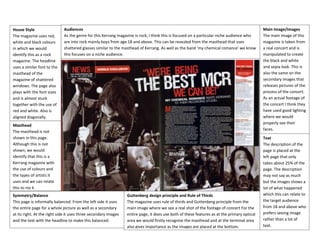
The magazine uses red,
white and black colours
in which we would
identify this as a rock
magazine. The headline
uses a similar font to the
masthead of the
magazine of shattered
windows. The page also
plays with the font sizes
and is almost stuck
together with the use of
red and white. Also is
aligned diagonally.

Audiences
As the genre for this Kerrang magazine is rock, I think this is focused on a particular niche audience who
are into rock mainly boys from age 18 and above. This can be revealed from the masthead that uses
shattered glasses similar to the masthead of Kerrang. As well as the band ‘my chemical romance’ we know
this focuses on a niche audience.

Masthead
The masthead is not
shown in this page.
Although this is not
shown, we would
identify that this is a
Kerrang magazine with
the use of colours and
the types of artists it
uses and we can relate
this to roc k
Symmetry/Balance
This page is informally balanced. From the left side it uses
the entire page for a whole picture as well as a secondary
at its right. At the right side it uses three secondary images
and the text with the headline to make this balanced.

Guttenberg design principle and Rule of Thirds
The magazine uses rule of thirds and Guttenberg principle from the
main image where we see a real shot of the footage of concert For the
entire page, it does use both of these features as at the primary optical
area we would firstly recognise the masthead and at the terminal area
also gives importance as the images are placed at the bottom.

Main Image/Images
The main image of this
magazine is taken from
a real concert and is
manipulated to create
the black and white
and sepia look. This is
also the same on the
secondary images that
releases pictures of the
process of the concert.
As an actual footage of
the concert I think they
have used good lighting
where we would
properly see their
faces.
Text
The description of the
page is placed at the
left page that only
takes about 25% of the
page. The description
may not say as much
but the images shows a
lot of what happened
which this can relate to
the target audience
from 18 and above who
prefers seeing image
rather than a lot of
text.

Double page analysis 1

  • 1.
    House Style The fontfor this page is all the same but done in various types. The phrase ‘lady gaga’ is bigger than the description where ‘lady’ has used italic but not bold unlike the letter that starts the paragraph. The letter that starts with paragraph is very bold as well as the ‘L’ that is done in red and overtakes the page. Audiences As the magazine is Q, this suggests that the audiences for this magazine are for mainstream that doesn’t focus on the specific gender. The Q magazine only uses bankable singers who guarantee the magazine is majorly brought by audiences when they see them as the main focus. The model in the magazine is lady gaga which reveals that this is for mainstream audiences. Masthead We can identify the masthead at the right side below with a scale of 5x smaller than usual and is set at the page guide. This is done as the masthead is not the main focus of the magazine but the image. Symmetry/Balance This magazine is informally balanced with the image on the left side and the ‘L’ is seen where the small text overlays this. The page is also perfectly aligned where this I think brings a good magazine. Guttenberg design principle and Rule of Thirds The use of rule of thirds and Guttenberg design is seen in this image were the audiences identify her faces a the primary optical area were the audiences would recognise first. At the terminal area has also used importance, she is made seductive were we see chains. Main Image/Images The main image in this magazine is lady gaga who is a famous singer. We can see that the image is manipulated in blue-green and grey colour and slightly sepia. The lighting is very high-key from her face and hair. Unlike other magazines, the photo is shot in portrait in order for the audiences to focus on her looks as we can see her naked making her seductive. Text We find the text to be small as the description is very detailed. Every paragraph it introduces the first letter about 5x larger than the usual text for people to identify what section they are in and they may get lost in their read due to the small text.
  • 2.
    House Style The housestyle in this page is very unusual but fits in the genre of this magazine. The size of the fonts is informally sized such as ‘PEOPLE’ as this relates to the audience who are students. This also uses a black block where the font overlays this. This is also very bold Audiences As this magazine is NME, I think the audience for this are niche specifically aimed for teenagers and above from college and university. We can see that the model in this magazine is Lily Allen who is a female singer that is famous for singing pop songs. Masthead We can only identify the masthead at the bottom left near the page guide. The masthead is 5x as smaller as the normal from the front cover. This is done very small as this is not the main focus of the page but the main story. Symmetry/Balance This music magazine is informally balanced of how this page is setted out. The left side shows the context of the page and the right side is an imagery of the page. although the headline takes some of the sides. Guttenberg design principle and Rule of Thirds The whole page uses the rule of thirds and Guttenberg design as at the primary optical area is where the audience would firstly recognise this, as us audience we would firstly recognise the headline and lily Allen’s face. At the terminal area this is the last thing we will see. This includes the description and the details of her clothes below. Main Image/Images The main image in this magazine is Lily Allen who is a singer. We can see her dressed very different from what we would expect her to dress as her main genre would be pop but in this image it shows her very tomboy and rock with her black short hair and a casual blouse. This could be revealed to the colours she is wearing such as black and red which again gives off a rock vibe. Text The description of the page is very different compared to Q, This doesn’t introduce the letters with a bigger size. The reason for this may be because it would cover up more of the page whereas they tend to focus more on the imagery and headline.
  • 3.
    House Style The magazineuses red, white and black colours in which we would identify this as a rock magazine. The headline uses a similar font to the masthead of the magazine of shattered windows. The page also plays with the font sizes and is almost stuck together with the use of red and white. Also is aligned diagonally. Audiences As the genre for this Kerrang magazine is rock, I think this is focused on a particular niche audience who are into rock mainly boys from age 18 and above. This can be revealed from the masthead that uses shattered glasses similar to the masthead of Kerrang. As well as the band ‘my chemical romance’ we know this focuses on a niche audience. Masthead The masthead is not shown in this page. Although this is not shown, we would identify that this is a Kerrang magazine with the use of colours and the types of artists it uses and we can relate this to roc k Symmetry/Balance This page is informally balanced. From the left side it uses the entire page for a whole picture as well as a secondary at its right. At the right side it uses three secondary images and the text with the headline to make this balanced. Guttenberg design principle and Rule of Thirds The magazine uses rule of thirds and Guttenberg principle from the main image where we see a real shot of the footage of concert For the entire page, it does use both of these features as at the primary optical area we would firstly recognise the masthead and at the terminal area also gives importance as the images are placed at the bottom. Main Image/Images The main image of this magazine is taken from a real concert and is manipulated to create the black and white and sepia look. This is also the same on the secondary images that releases pictures of the process of the concert. As an actual footage of the concert I think they have used good lighting where we would properly see their faces. Text The description of the page is placed at the left page that only takes about 25% of the page. The description may not say as much but the images shows a lot of what happened which this can relate to the target audience from 18 and above who prefers seeing image rather than a lot of text.