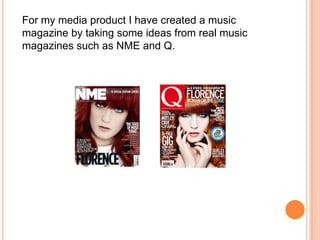
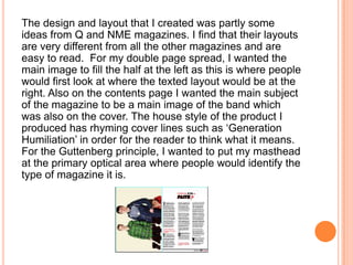
QUESTION 1: IN WHAT WAYS DOES YOUR
MEDIA PRODUCT USE, DEVELOP OR
CHALLENGE FORMS AND CONVENTIONS
OF REAL MEDIA PRODUCTS?
For my media product I have created a music
magazine by taking some ideas from real music
magazines such as NME and Q.
For the title of my magazine I have used a font that will
stand out and is easy to read for the readers. The font can
be used for formal and informal purposes which relates to
the audience that I want to focus this on which is
mainstream. I have used pure bright red as from the real
products that I looked on used red I have also used a
black bold outline. At first, I have struggled on the colour
scheme that I want for my masthead from either green or
red but I thought green was for niche audiences. Unlike
from the real product, I have made my E’s italic in order to
make this stand out and I wanted to create the unique
point of how the audiences will recognise such as the Q
magazine, their unique point is the curve on the Q which
makes this noticeable for the readers. I have chosen the
word ‘encore’ as it’s a word for songs to play again which
indicates of my magazine relating to music and songs.
The design and layout that I created was partly some
ideas from Q and NME magazines. I find that their layouts
are very different from all the other magazines and are
easy to read. For my double page spread, I wanted the
main image to fill the half at the left as this is where people
would first look at where the texted layout would be at the
right. Also on the contents page I wanted the main subject
of the magazine to be a main image of the band which
was also on the cover. The house style of the product I
produced has rhyming cover lines such as ‘Generation
Humiliation’ in order for the reader to think what it means.
For the Guttenberg principle, I wanted to put my masthead
at the primary optical area where people would identify the
type of magazine it is.
For mise en scene, the band wears a green, red and
blue colour to indicate their band is targeted for
mainstream audiences especially with teenagers. I
have also used colour balance on the image by using
hue and saturation in order for this to look
professional and fit in the title. I also wanted to use
rule of thirds were the first row would have the
masthead and probably the eye level of the band.
In my written article I wanted the first letter of the word to
be big such as the T’ this is for the reader to easily catch
the section they are reading whenever they forget to and
this is done to make the layout look better with the black
font used. I wanted the columns to be divided into three as
many readers wouldn’t want too much information, using
pull quotes I made this into a red font and into speech
marks where this is one of the most important thing that
fans would want to read. I wanted the title of the article to
be a rhetorical question for the fans who would want detail
and it gives out a lot of things ‘is this the end of FAITH?’
this is made for the reader to interact the information with
gossips and important things of the band. Magazines such
as heat is where I took this idea from, they use a lot of
rhetorical questions which gained them a lot of audiences
with the celebrities which I wanted to do the same.

Question 1

  • 1.
    QUESTION 1: INWHAT WAYS DOES YOUR MEDIA PRODUCT USE, DEVELOP OR CHALLENGE FORMS AND CONVENTIONS OF REAL MEDIA PRODUCTS?
  • 2.
    For my mediaproduct I have created a music magazine by taking some ideas from real music magazines such as NME and Q.
  • 3.
    For the titleof my magazine I have used a font that will stand out and is easy to read for the readers. The font can be used for formal and informal purposes which relates to the audience that I want to focus this on which is mainstream. I have used pure bright red as from the real products that I looked on used red I have also used a black bold outline. At first, I have struggled on the colour scheme that I want for my masthead from either green or red but I thought green was for niche audiences. Unlike from the real product, I have made my E’s italic in order to make this stand out and I wanted to create the unique point of how the audiences will recognise such as the Q magazine, their unique point is the curve on the Q which makes this noticeable for the readers. I have chosen the word ‘encore’ as it’s a word for songs to play again which indicates of my magazine relating to music and songs.
  • 4.
    The design andlayout that I created was partly some ideas from Q and NME magazines. I find that their layouts are very different from all the other magazines and are easy to read. For my double page spread, I wanted the main image to fill the half at the left as this is where people would first look at where the texted layout would be at the right. Also on the contents page I wanted the main subject of the magazine to be a main image of the band which was also on the cover. The house style of the product I produced has rhyming cover lines such as ‘Generation Humiliation’ in order for the reader to think what it means. For the Guttenberg principle, I wanted to put my masthead at the primary optical area where people would identify the type of magazine it is.
  • 5.
    For mise enscene, the band wears a green, red and blue colour to indicate their band is targeted for mainstream audiences especially with teenagers. I have also used colour balance on the image by using hue and saturation in order for this to look professional and fit in the title. I also wanted to use rule of thirds were the first row would have the masthead and probably the eye level of the band.
  • 6.
    In my writtenarticle I wanted the first letter of the word to be big such as the T’ this is for the reader to easily catch the section they are reading whenever they forget to and this is done to make the layout look better with the black font used. I wanted the columns to be divided into three as many readers wouldn’t want too much information, using pull quotes I made this into a red font and into speech marks where this is one of the most important thing that fans would want to read. I wanted the title of the article to be a rhetorical question for the fans who would want detail and it gives out a lot of things ‘is this the end of FAITH?’ this is made for the reader to interact the information with gossips and important things of the band. Magazines such as heat is where I took this idea from, they use a lot of rhetorical questions which gained them a lot of audiences with the celebrities which I wanted to do the same.