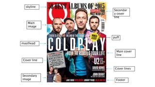
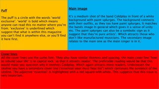
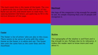
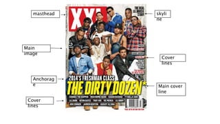
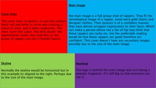
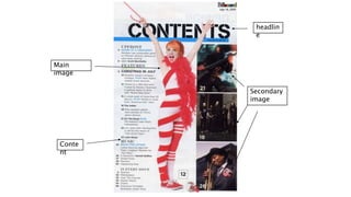
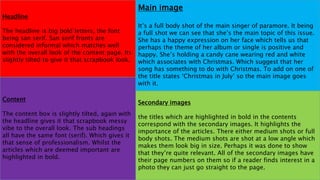
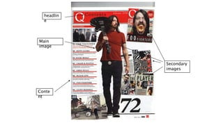
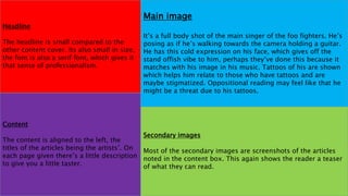
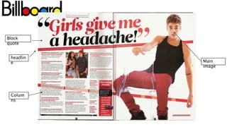
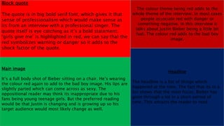
ANALYSIS OF MUSIC
MAGAZINES
By Ann Migichi
masthead
skyline
Cover lines
puff
Main
image
Secondary
image Footer
Main cover
line
Cover line
Secondar
y cover
line
Cover lines
All the cover lines use the same font. They also have similar thinness and spacing. the main cover line ‘how
to rebuild your life’ Is in capital lock so that it attracts reader. The preferable reading would be that this
would make you question why it involves Coldplay. Which again attracts more readers. Underneath the
skyline you have a secondary cover line (‘essential your must hear list’) which continues the sentence of the
skyline. The adjective ‘essential’ is highlighted with a red square with white. This suggests that this issue is
very important.
Puff
The puff is a circle with the words ‘world
exclusive’. ‘world’ is bold which means
anyone can read this no matter where you’re
from. ’exclusive’ is underlined which
suggest that what is within this magazine
you can’t find it anywhere else, or you’ll find
it here first.
Main image
It’s a medium shot of the band Coldplay in front of a white
background with paint splurges. The background connects
with their outfits, as they too have paint splurges. It matches
the bands image In general which gives it a sense of unity
etc. The paint splurges can also be a symbolic sign as it
suggest that they’re pure artists’. Which attracts those who
don’t like manufactured musicians. The secondary image
relates to the main one as the main singer is in it.
The main cover line is the name of the band. The size
is generously big so that those who are fans of this
band can see this and would want to read more. The
spacing between the letters are quite big to fill in the
vertical distance of the page.
Masthead
the logo of the magazine is big enough for people
to see. Its simple meaning that a lot of people will
recognize it.
Footer
The footer is list of artists’ who are also in this issue.
There seems to be sense of unity with the colour
theme as the footer is in white and red. The footer
also uses the same font as the cover lines and the
masthead.
Skyline
The typography of the skyline is serif font and is
big enough to see. Perhaps due to its relevance, it
makes the reader want to know more and read
about it.
masthead
Main
image
Main cover
line
Anchorag
e
Cover
lines
Cover
lines
skyli
ne
Cover lines
The cover lines, in genera, it uses the colours
black red and white in some way creating a
sense of unity, and it looks organized. The
main cover line states ‘the dirty dozen’ the
oppositional reader may read this as this
group of rappers are not a friendly bunch.
Masthead
The logo is behind the main image due to it being a
popular magazine. It’s still big so that everyone can
see it.
Skyline
Normally the skyline would be horizontal but in
this example its aligned to the right. Perhaps due
to the size of the main image.
Main image
the main image is a full group shot of rappers. They fit the
stereotypical image of a rapper, some were gold chains and
designer clothes. Their posture is of a confident manner,
they have almost arrogant expressions on their faces. Which
can make a person whose not a fan of hip hop think that
these rappers are cocky etc. but the preferable reading
would be that these rappers are good therefore act
confident. This cover doesn’t have any secondary images
possibly due to the size of the main image.
headlin
e
Main
image
Secondary
image
Conte
nt
Headline
The headline is big bold letters, the font
being san serif. San serif fronts are
considered informal which matches well
with the overall look of the content page. Its
slightly tilted to give it that scrapbook look.
Main image
It’s a full body shot of the main singer of paramore. It being
a full shot we can see that she’s the main topic of this issue.
She has a happy expression on her face which tells us that
perhaps the theme of her album or single is positive and
happy. She’s holding a candy cane wearing red and white
which associates with Christmas. Which suggest that her
song has something to do with Christmas. To add on one of
the title states ‘Christmas in July’ so the main image goes
with it.
Content
The content box is slightly tilted, again with
the headline gives it that scrapbook messy
vibe to the overall look. The sub headings
all have the same font (serif). Which gives it
that sense of professionalism. Whilst the
articles which are deemed important are
highlighted in bold.
Secondary images
the titles which are highlighted in bold in the contents
correspond with the secondary images. It highlights the
importance of the articles. There either medium shots or full
body shots. The medium shots are shot at a low angle which
makes them look big in size. Perhaps it was done to show
that they’re quite relevant. All of the secondary images have
their page numbers on them so if a reader finds interest in a
photo they can just go straight to the page.
Conte
nt
Main
image
headlin
e
Secondary
images
Main image
It’s a full body shot of the main singer of the foo fighters. He’s
posing as if he’s walking towards the camera holding a guitar.
He has this cold expression on his face, which gives off the
stand offish vibe to him, perhaps they’ve done this because it
matches with his image in his music. Tattoos of his are shown
which helps him relate to those who have tattoos and are
maybe stigmatized. Oppositional reading may feel like that he
might be a threat due to his tattoos.
Headline
The headline is small compared to the
other content cover. Its also small in size,
the font is also a serif font, which gives it
that sense of professionalism.
Content
The content is aligned to the left, the
titles of the articles being the artists’. On
each page given there’s a little description
to give you a little taster.
Secondary images
Most of the secondary images are screenshots of the articles
noted in the content box. This again shows the reader a teaser
of what they can read.
headlin
e Main
image
Block
quote
Colum
ns
Block quote
The quote is in big bold serif font, which gives it that
sense of professionalism which would make sense as
its from an interview with a professional singer. The
quote itself is eye catching as it’s a bold statement.
‘girls give me’ is highlighted in red, we can say that the
red symbolizes warning or danger so it adds to the
shock factor of the quote.
The colour theme being red adds to the
whole theme of the interview. In most cases
people associate red with danger or
something negative. In this interview it
talks about Justin Bieber being a little bit
bad. The colour red adds to the bad boy
image.
Main image
It’s a full body shot of Bieber sitting on a chair. He’s wearing
the colour red again to add to the bad boy image. His lips are
slightly parted which can come across as sexy. The
oppositional reader may think its inappropriate due to his
fans being young teenage girls. But the preferred reading
would be that Justin is changing and is growing up so his
target audience would most likely change as well.
Headline
The headline is a list of things which
happened at the time. The fact that its in a
list shows that the main focus, Bieber has
gone through a lot in a short period of
time. This attracts the reader to read.

Music mag analysis

  • 1.
  • 2.
  • 3.
    Cover lines All thecover lines use the same font. They also have similar thinness and spacing. the main cover line ‘how to rebuild your life’ Is in capital lock so that it attracts reader. The preferable reading would be that this would make you question why it involves Coldplay. Which again attracts more readers. Underneath the skyline you have a secondary cover line (‘essential your must hear list’) which continues the sentence of the skyline. The adjective ‘essential’ is highlighted with a red square with white. This suggests that this issue is very important. Puff The puff is a circle with the words ‘world exclusive’. ‘world’ is bold which means anyone can read this no matter where you’re from. ’exclusive’ is underlined which suggest that what is within this magazine you can’t find it anywhere else, or you’ll find it here first. Main image It’s a medium shot of the band Coldplay in front of a white background with paint splurges. The background connects with their outfits, as they too have paint splurges. It matches the bands image In general which gives it a sense of unity etc. The paint splurges can also be a symbolic sign as it suggest that they’re pure artists’. Which attracts those who don’t like manufactured musicians. The secondary image relates to the main one as the main singer is in it.
  • 4.
    The main coverline is the name of the band. The size is generously big so that those who are fans of this band can see this and would want to read more. The spacing between the letters are quite big to fill in the vertical distance of the page. Masthead the logo of the magazine is big enough for people to see. Its simple meaning that a lot of people will recognize it. Footer The footer is list of artists’ who are also in this issue. There seems to be sense of unity with the colour theme as the footer is in white and red. The footer also uses the same font as the cover lines and the masthead. Skyline The typography of the skyline is serif font and is big enough to see. Perhaps due to its relevance, it makes the reader want to know more and read about it.
  • 5.
  • 6.
    Cover lines The coverlines, in genera, it uses the colours black red and white in some way creating a sense of unity, and it looks organized. The main cover line states ‘the dirty dozen’ the oppositional reader may read this as this group of rappers are not a friendly bunch. Masthead The logo is behind the main image due to it being a popular magazine. It’s still big so that everyone can see it. Skyline Normally the skyline would be horizontal but in this example its aligned to the right. Perhaps due to the size of the main image. Main image the main image is a full group shot of rappers. They fit the stereotypical image of a rapper, some were gold chains and designer clothes. Their posture is of a confident manner, they have almost arrogant expressions on their faces. Which can make a person whose not a fan of hip hop think that these rappers are cocky etc. but the preferable reading would be that these rappers are good therefore act confident. This cover doesn’t have any secondary images possibly due to the size of the main image.
  • 7.
  • 8.
    Headline The headline isbig bold letters, the font being san serif. San serif fronts are considered informal which matches well with the overall look of the content page. Its slightly tilted to give it that scrapbook look. Main image It’s a full body shot of the main singer of paramore. It being a full shot we can see that she’s the main topic of this issue. She has a happy expression on her face which tells us that perhaps the theme of her album or single is positive and happy. She’s holding a candy cane wearing red and white which associates with Christmas. Which suggest that her song has something to do with Christmas. To add on one of the title states ‘Christmas in July’ so the main image goes with it. Content The content box is slightly tilted, again with the headline gives it that scrapbook messy vibe to the overall look. The sub headings all have the same font (serif). Which gives it that sense of professionalism. Whilst the articles which are deemed important are highlighted in bold. Secondary images the titles which are highlighted in bold in the contents correspond with the secondary images. It highlights the importance of the articles. There either medium shots or full body shots. The medium shots are shot at a low angle which makes them look big in size. Perhaps it was done to show that they’re quite relevant. All of the secondary images have their page numbers on them so if a reader finds interest in a photo they can just go straight to the page.
  • 9.
  • 10.
    Main image It’s afull body shot of the main singer of the foo fighters. He’s posing as if he’s walking towards the camera holding a guitar. He has this cold expression on his face, which gives off the stand offish vibe to him, perhaps they’ve done this because it matches with his image in his music. Tattoos of his are shown which helps him relate to those who have tattoos and are maybe stigmatized. Oppositional reading may feel like that he might be a threat due to his tattoos. Headline The headline is small compared to the other content cover. Its also small in size, the font is also a serif font, which gives it that sense of professionalism. Content The content is aligned to the left, the titles of the articles being the artists’. On each page given there’s a little description to give you a little taster. Secondary images Most of the secondary images are screenshots of the articles noted in the content box. This again shows the reader a teaser of what they can read.
  • 11.
  • 12.
    Block quote The quoteis in big bold serif font, which gives it that sense of professionalism which would make sense as its from an interview with a professional singer. The quote itself is eye catching as it’s a bold statement. ‘girls give me’ is highlighted in red, we can say that the red symbolizes warning or danger so it adds to the shock factor of the quote. The colour theme being red adds to the whole theme of the interview. In most cases people associate red with danger or something negative. In this interview it talks about Justin Bieber being a little bit bad. The colour red adds to the bad boy image. Main image It’s a full body shot of Bieber sitting on a chair. He’s wearing the colour red again to add to the bad boy image. His lips are slightly parted which can come across as sexy. The oppositional reader may think its inappropriate due to his fans being young teenage girls. But the preferred reading would be that Justin is changing and is growing up so his target audience would most likely change as well. Headline The headline is a list of things which happened at the time. The fact that its in a list shows that the main focus, Bieber has gone through a lot in a short period of time. This attracts the reader to read.