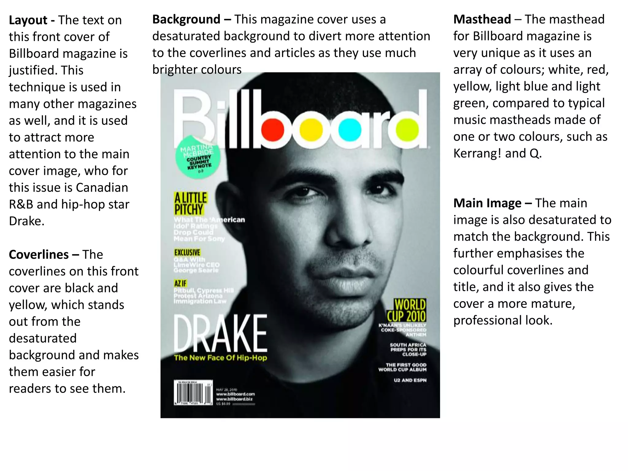
Colourful
masthead to
attract
readers
Large cover image
of popular artist
(close-up)
Artist’s name in big,
bold letters on main
cover line to attract
fans of the artist
Popular event
featured in
magazine
Key
coverlines in
yellow and
black
Bar-code and price
Desaturated
background to
make writing
stand out
Website
Text is
justified on
both sides of
the
magazine
Dateline
Puff
Layout - The text on
this front cover of
Billboard magazine is
justified. This
technique is used in
many other magazines
as well, and it is used
to attract more
attention to the main
cover image, who for
this issue is Canadian
R&B and hip-hop star
Drake.
Coverlines – The
coverlines on this front
cover are black and
yellow, which stands
out from the
desaturated
background and makes
them easier for
readers to see them.
Masthead – The masthead
for Billboard magazine is
very unique as it uses an
array of colours; white, red,
yellow, light blue and light
green, compared to typical
music mastheads made of
one or two colours, such as
Kerrang! and Q.
Background – This magazine cover uses a
desaturated background to divert more attention
to the coverlines and articles as they use much
brighter colours
Main Image – The main
image is also desaturated to
match the background. This
further emphasises the
colourful coverlines and
title, and it also gives the
cover a more mature,
professional look.
Masthead in signature
colour.
Names of several
artists/bands within
the magazine
displayed on the
front to attract their
fans to read the
magazine.
Price of magazine and
date of its release.
Strapline of main
article.
Barcode, price and date.
Interview with popular artist
to attract more readers.
Info on an event related to
the magazine’s genre to try
and encourage readers to
take part.
Several different fonts
and colours are used to
make the cover more
unique and vibrant.
Three more important
sections in the magazine
are displayed here,
helping to attract more
readers who would be
fans of these artists.
Writing is mostly justified onto the sides of the cover.
This helps give the cover model more attention.
Rhetorical question directed
towards the reader to interact
with them.The mise-en-scene for this cover is generally vibrant.
However, Alex Turner is wearing a black shirt and also has
dark hair which is a contrast to the rest of the cover. This
implies that he tries to do things differently to the people
and the world around him.
Masthead
Header showing a
major feature of the
issue
Cover model’s performer
name in big, bold letters.
“Exclusive” attracts attention
as it is the first place where
this interview will be seen.
Quote from the cover model
QR Code to allow readers
to access extra
information using their
devices.
Barcode, price and date
Straplines for other features
included in the issue, other
artists’ names are used
Text is justified to the sides
to give the cover model
more exposure
The mise-en-scene is used to denote T.I’s personality. The lighting on this cover is relatively dark as this has
connotations of aggression and power. He is also sporting a cap and gold chains which suggests that he is
successful and stylish. The picture is a close-up of the model, this gives the impression that he likes to get up in
someone’s face and also further implies aggression.
Logo of magazine at the
top of the page
Chart showing the most
popular music at that
point in time, relates to
Billboard Hot 100 and
200
Pictures of artists featured
in the magazine along with
the page number their
feature is on. This allows
fans of these artists to
immediately view what they
want to view
Section showing which
features of this issue are on
which page, the main
purpose of a contents page.
Date, website and page
number
Page uses traditional
colours related to the
logo of the magazine.
Page numbers of the
major features in the
article along with
photos of the related
artists.
Special subscription offer
for the magazine, tries to
encourage new readers
to keep reading each
issue.
List of regular features of the
magazine (features that appear in
most if not every issue).
Traditional NME colour
palette is used; House-Style
Image of the rapper
Eminem to attract
attention from his fans.
Contents justified to the
right to give the model
exposure.
Mise-en-scene is dark
overall as a symbol of
class, along with Eminem
sporting a dark suit and
tie.
Bright, vibrant
colours to
attract
attention, also
to symbolise
the bright
summer.
Date, website and page number
Writing
justified in
columns, a
typical style in
double-page
spreads
Image of
artist related
to the article
covers the
whole of the
opposite
page.
Image of artist
related to the
article; in this
case, Liam
Gallagher, the
lead singer of the
band Beady Eye.
Quote from the artist
Name of
band and
strapline
Extra info
included
in the
article
Side containing text is
colourful and vibrant,
contradiction with the black-
and-white image of Gallagher
Colloquial language is used in the
article to represent the interview
being casual and informal
Black-and-
white image is
used to imply
Gallagher
attempting to
use a classic
sound in his
music.
Name of
artist in
bold
letters
Colloquial language to help imagine
the interview as a friendly, informal
conversation
The
information
is written in
the present
tense, this
creates a
sense of
realism as
they are
stating what
the artist(s)
are up to at
that very
moment.
Mini-contents page showing features related to
the two artists focused on in this spread.
Large
picture of
cover
model.
Kendrick is
wearing a
white top
behind a
white
background
with a gold
necklace,
this creates
a sense of
heaven and
God, who
Kendrick
looks up to
greatly.

Music mag cover analysis

  • 1.
    Colourful masthead to attract readers Large coverimage of popular artist (close-up) Artist’s name in big, bold letters on main cover line to attract fans of the artist Popular event featured in magazine Key coverlines in yellow and black Bar-code and price Desaturated background to make writing stand out Website Text is justified on both sides of the magazine Dateline Puff
  • 2.
    Layout - Thetext on this front cover of Billboard magazine is justified. This technique is used in many other magazines as well, and it is used to attract more attention to the main cover image, who for this issue is Canadian R&B and hip-hop star Drake. Coverlines – The coverlines on this front cover are black and yellow, which stands out from the desaturated background and makes them easier for readers to see them. Masthead – The masthead for Billboard magazine is very unique as it uses an array of colours; white, red, yellow, light blue and light green, compared to typical music mastheads made of one or two colours, such as Kerrang! and Q. Background – This magazine cover uses a desaturated background to divert more attention to the coverlines and articles as they use much brighter colours Main Image – The main image is also desaturated to match the background. This further emphasises the colourful coverlines and title, and it also gives the cover a more mature, professional look.
  • 3.
    Masthead in signature colour. Namesof several artists/bands within the magazine displayed on the front to attract their fans to read the magazine. Price of magazine and date of its release. Strapline of main article. Barcode, price and date. Interview with popular artist to attract more readers. Info on an event related to the magazine’s genre to try and encourage readers to take part. Several different fonts and colours are used to make the cover more unique and vibrant. Three more important sections in the magazine are displayed here, helping to attract more readers who would be fans of these artists. Writing is mostly justified onto the sides of the cover. This helps give the cover model more attention. Rhetorical question directed towards the reader to interact with them.The mise-en-scene for this cover is generally vibrant. However, Alex Turner is wearing a black shirt and also has dark hair which is a contrast to the rest of the cover. This implies that he tries to do things differently to the people and the world around him.
  • 4.
    Masthead Header showing a majorfeature of the issue Cover model’s performer name in big, bold letters. “Exclusive” attracts attention as it is the first place where this interview will be seen. Quote from the cover model QR Code to allow readers to access extra information using their devices. Barcode, price and date Straplines for other features included in the issue, other artists’ names are used Text is justified to the sides to give the cover model more exposure The mise-en-scene is used to denote T.I’s personality. The lighting on this cover is relatively dark as this has connotations of aggression and power. He is also sporting a cap and gold chains which suggests that he is successful and stylish. The picture is a close-up of the model, this gives the impression that he likes to get up in someone’s face and also further implies aggression.
  • 5.
    Logo of magazineat the top of the page Chart showing the most popular music at that point in time, relates to Billboard Hot 100 and 200 Pictures of artists featured in the magazine along with the page number their feature is on. This allows fans of these artists to immediately view what they want to view Section showing which features of this issue are on which page, the main purpose of a contents page. Date, website and page number Page uses traditional colours related to the logo of the magazine.
  • 6.
    Page numbers ofthe major features in the article along with photos of the related artists. Special subscription offer for the magazine, tries to encourage new readers to keep reading each issue. List of regular features of the magazine (features that appear in most if not every issue). Traditional NME colour palette is used; House-Style
  • 7.
    Image of therapper Eminem to attract attention from his fans. Contents justified to the right to give the model exposure. Mise-en-scene is dark overall as a symbol of class, along with Eminem sporting a dark suit and tie.
  • 8.
    Bright, vibrant colours to attract attention,also to symbolise the bright summer. Date, website and page number Writing justified in columns, a typical style in double-page spreads Image of artist related to the article covers the whole of the opposite page.
  • 9.
    Image of artist relatedto the article; in this case, Liam Gallagher, the lead singer of the band Beady Eye. Quote from the artist Name of band and strapline Extra info included in the article Side containing text is colourful and vibrant, contradiction with the black- and-white image of Gallagher Colloquial language is used in the article to represent the interview being casual and informal Black-and- white image is used to imply Gallagher attempting to use a classic sound in his music.
  • 10.
    Name of artist in bold letters Colloquiallanguage to help imagine the interview as a friendly, informal conversation The information is written in the present tense, this creates a sense of realism as they are stating what the artist(s) are up to at that very moment. Mini-contents page showing features related to the two artists focused on in this spread. Large picture of cover model. Kendrick is wearing a white top behind a white background with a gold necklace, this creates a sense of heaven and God, who Kendrick looks up to greatly.