Download to read offline

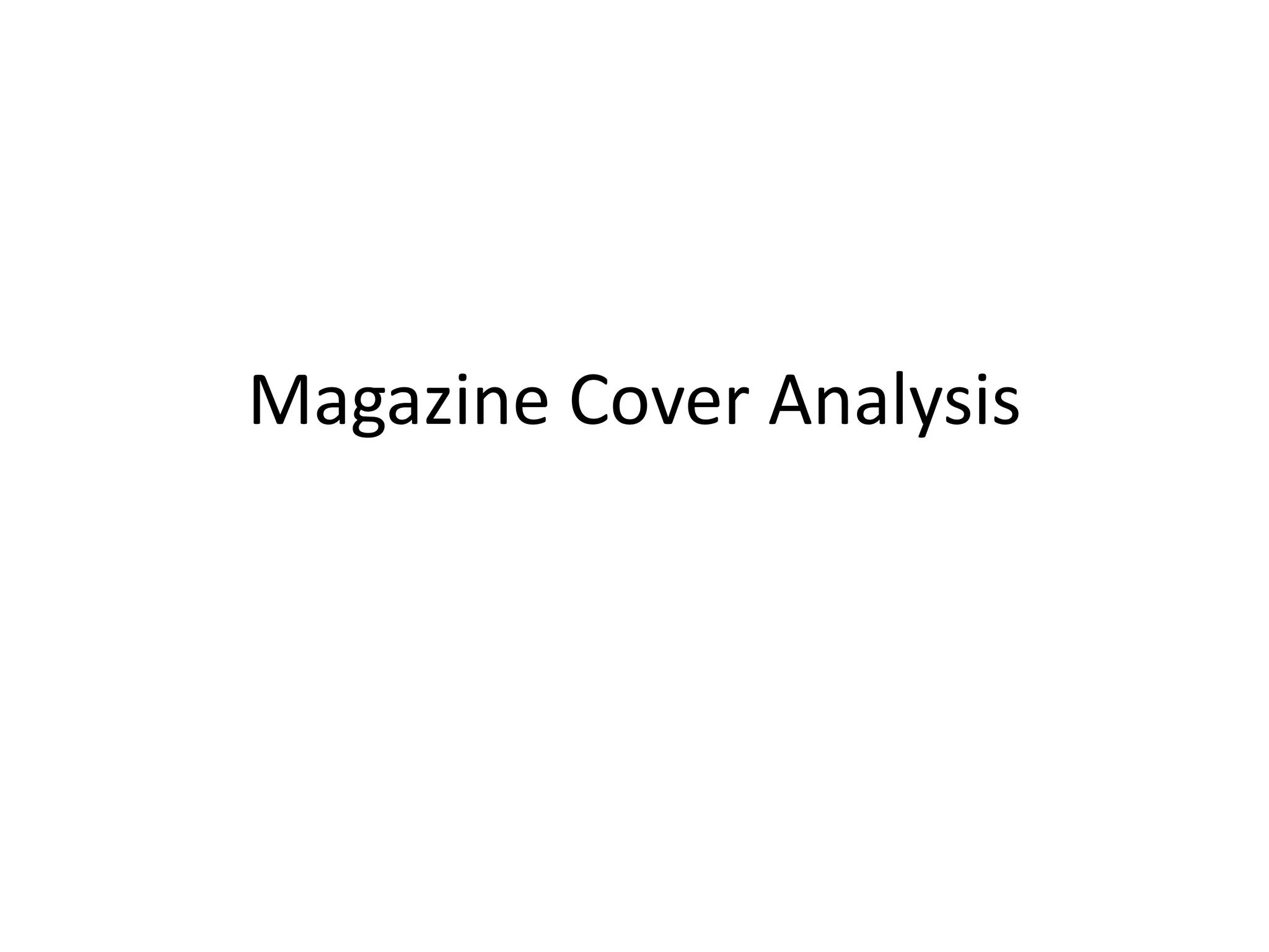

The magazine cover uses design elements like font, layout, images, and color to appeal to its target audience and convey the tone and content of the magazine. The shattered font indicates rock music content. Dark colors and words like "R.I.P." set a depressing mood. Busy layout and cluttered images suggest extensive coverage. Photos of band members in black match this tone. The list of bands and use of their images aims to attract fans of that music genre. Overall the cover uses visual cues to brand itself and draw in the type of reader interested in its style and coverage.


