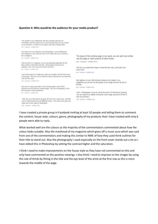
The document discusses feedback received from 10 people on a media product the author created. The feedback indicated that the colors used worked well and were suitable. The masthead design, which conveyed a music aura, was also well-received. The front cover photography stood out after being edited in Photoshop. Areas identified for improvement included the house style, which received no comments, and using the rule of thirds for image placement. The author also discusses design choices made to attract their target audience of female teenagers and above, such as featuring a boy band on the cover, using catchy cover lines, and following magazine layout conventions.