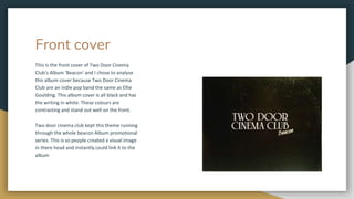
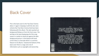
DIGIPAK ANALYSIS
By Joe Hall
Front cover
This is the front cover of Two Door Cinema
Club's Album 'Beacon' and I chose to analyse
this album cover because Two Door Cinema
Club are an indie pop band the same as Ellie
Goulding. This album cover is all black and has
the writing in white. These colours are
contrasting and stand out well on the front.
Two door cinema club kept this theme running
through the whole beacon Album promotional
series. This is so people created a visual image
in there head and instantly could link it to the
album
Back Cover
This is the back cover to the Two Door Cinema
album. It again is keeping in with the old, retro
scheme that Two Door Cinema Club have been
following with this album. The dark washed out
background follows on from the front cover. The
writing on the back displaying all of the song
names is in white to stand out against the dark
background picture. In the bottom left hand
corner there is a barcode which is a common
feature to CD albums. Towards the bottom of the
back cover there is a logo and a lot of
information such as copyrights and ownership.
Inside Front cover
This is the inside of the album case, the
inside front cover is styles a bit differently to
the album cover. It is a shiny red colour, this
makes the inside more eye catching and
interesting to look at maybe representing the
dark outside of the album concealing a bright
and happy inside. Throughout the whole
album this is the only really bright colour
making it noticeable and recognisable. The
writing is in capitals and in red to also make
it stand out.
Digipak 2 - INSIDE OUT - THE KOOKS
The front cover shows the Kooks, an indie band rehearsing in a very
squashed tightly packed shot trying to fit them all in as the photo
needs to fit on a square, creating intimacy and a sense of close
relations which instantly connects the band to the viewer, and
almost giving a promotion of the album as a personal concert for
the. The photo fills the entire cover, however the top half of the
photo is simply bare wall, creating a feeling of emptiness which links
to the title ‘Inside In Inside Out’. The title of the album is fairly small
and quick to the point, therefore creating a more chilled out mood
reflecting upon their indie rock genre, appealing to an audience that
appreciate slower, more mellow songs within the indie rock genre.
The simple design portrays the band in a quiet self entertained
manner, showing they don’t feel the need to boast about their fame
through elaborate graphic design.
Rear
Cover
The inside panels have a black, red and white colour scheme.
The kooks are normally associated with these colours as their
promotional campaign and album artwork all only use these
colours. This genre characteristic of rock attracts the rock
crowd who would enjoy the band’s music. This colour scheme
helps to portray the band’s alternative style of music. The low-
key lighting alongside the faded black and white creates an
almost dirty looking style, which appeals to their more
masculine side of the audience. The chilled out postures and
facial expressions of the band create a sense of comfortability,
which tells us their careless attitude, reflects their chilled indie-
rock genre.
Inside front
cover
The inside front panel consists of the old strips from
a camera film, this is a very retro/indie thing to do as
these people often refer to polaroids etc in there
music. This is showing a progressive still image of the
band fooling around with their instruments, which
shows us the young group carry a very energetic and
reckless, carefree manner. This can be seen as
entertaining and therefore appeals this young adult
audience. The red, black and white colour scheme is
maintained, creating fluency within their brand
image, and therefore building a recognisable
trademark for the band, which helps to build a fan
base and increase demand.
Back Cover
On the back cover of the CD, the same white studio setting seen
on the front cover is used again. This maintains the idea of
emptiness, and potential for the band’s future success that will fill
up the clear white space. A similar photo to the front cover fills up
the the back cover, only the shot is taken further back, letting
more room for the band members by using a medium long shot,
giving this idea of freedom. In the top right hand corner is the
copyright information, this is very important on ny album release.
Announcing the licenses to the material within the album to
ensure no one can steal their material. Located underneath is The
Kook’s website, which gives the fans a referral on where to go to
find out more about the band and get involved with the
community, whilst providing a mail list which acts as a method of
promotion for the band’s products and tours.

Digipack analysis

  • 1.
  • 3.
    Front cover This isthe front cover of Two Door Cinema Club's Album 'Beacon' and I chose to analyse this album cover because Two Door Cinema Club are an indie pop band the same as Ellie Goulding. This album cover is all black and has the writing in white. These colours are contrasting and stand out well on the front. Two door cinema club kept this theme running through the whole beacon Album promotional series. This is so people created a visual image in there head and instantly could link it to the album
  • 4.
    Back Cover This isthe back cover to the Two Door Cinema album. It again is keeping in with the old, retro scheme that Two Door Cinema Club have been following with this album. The dark washed out background follows on from the front cover. The writing on the back displaying all of the song names is in white to stand out against the dark background picture. In the bottom left hand corner there is a barcode which is a common feature to CD albums. Towards the bottom of the back cover there is a logo and a lot of information such as copyrights and ownership.
  • 5.
    Inside Front cover Thisis the inside of the album case, the inside front cover is styles a bit differently to the album cover. It is a shiny red colour, this makes the inside more eye catching and interesting to look at maybe representing the dark outside of the album concealing a bright and happy inside. Throughout the whole album this is the only really bright colour making it noticeable and recognisable. The writing is in capitals and in red to also make it stand out.
  • 6.
    Digipak 2 -INSIDE OUT - THE KOOKS The front cover shows the Kooks, an indie band rehearsing in a very squashed tightly packed shot trying to fit them all in as the photo needs to fit on a square, creating intimacy and a sense of close relations which instantly connects the band to the viewer, and almost giving a promotion of the album as a personal concert for the. The photo fills the entire cover, however the top half of the photo is simply bare wall, creating a feeling of emptiness which links to the title ‘Inside In Inside Out’. The title of the album is fairly small and quick to the point, therefore creating a more chilled out mood reflecting upon their indie rock genre, appealing to an audience that appreciate slower, more mellow songs within the indie rock genre. The simple design portrays the band in a quiet self entertained manner, showing they don’t feel the need to boast about their fame through elaborate graphic design.
  • 7.
    Rear Cover The inside panelshave a black, red and white colour scheme. The kooks are normally associated with these colours as their promotional campaign and album artwork all only use these colours. This genre characteristic of rock attracts the rock crowd who would enjoy the band’s music. This colour scheme helps to portray the band’s alternative style of music. The low- key lighting alongside the faded black and white creates an almost dirty looking style, which appeals to their more masculine side of the audience. The chilled out postures and facial expressions of the band create a sense of comfortability, which tells us their careless attitude, reflects their chilled indie- rock genre.
  • 8.
    Inside front cover The insidefront panel consists of the old strips from a camera film, this is a very retro/indie thing to do as these people often refer to polaroids etc in there music. This is showing a progressive still image of the band fooling around with their instruments, which shows us the young group carry a very energetic and reckless, carefree manner. This can be seen as entertaining and therefore appeals this young adult audience. The red, black and white colour scheme is maintained, creating fluency within their brand image, and therefore building a recognisable trademark for the band, which helps to build a fan base and increase demand.
  • 9.
    Back Cover On theback cover of the CD, the same white studio setting seen on the front cover is used again. This maintains the idea of emptiness, and potential for the band’s future success that will fill up the clear white space. A similar photo to the front cover fills up the the back cover, only the shot is taken further back, letting more room for the band members by using a medium long shot, giving this idea of freedom. In the top right hand corner is the copyright information, this is very important on ny album release. Announcing the licenses to the material within the album to ensure no one can steal their material. Located underneath is The Kook’s website, which gives the fans a referral on where to go to find out more about the band and get involved with the community, whilst providing a mail list which acts as a method of promotion for the band’s products and tours.