
Recommended
More Related Content
What's hot
What's hot (20)
Viewers also liked
Similar to Digipak
Similar to Digipak (20)
More from 07patrguil
Digipak
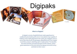
- 1. Digipaks What is a Digipak? A digipak consists of gatefold (book style) paperboard or cardboard outer binding with one or more plastic trays capable of holding a CD or DVD attached to the inside case. Digipaks came in use to describe all soft CD packaging. MeadWestvaco first created it and their product called Digi-pak is trademarked. This benefits the artist and their promotional aspect of the industry, which gives awareness to the artist and encouraging consumers to buy and listen to their music.
- 2. The album title is inred bold fontwhile the artist name is inblack bold font,which compliments each other. The word stands out against the desaturated image and occupies the negative space above them. The artist name is also in the middle of the album title giving the indication that they are all in the center of creating this album. The image show the band all together playing their instruments. It is desaturated and is simply laid out. This shows that the band is still starting out and isn’t clearly seen. It also shows their individuality with their instruments. The track listing is inblack and bold stylesimilar to the artist name. This again occupies the negative space over the band’s heads. Logo The red strip is similar to the album title at the front. It gives a consistent feel to it and goes well with the color scheme. This is the information about the band including the recording companies contact details and the license numbers for the company but more clearer. This is the information about the band including the recording companies contact details and the license numbers for the company. This is the mirror image of the front cover except this is more softened and slightly out of focus. This is a four-paneled Digi-pak and the most common sizes of all the Digi-paks. The finished sixe for this type of CD is 135mm x 125mm. Barcode
- 3. This is some more information about the band and what it is the album about. This gives the audience more insight into who The Kooksare. The red imagesrelates to the consistency in colour scheme. It shows the band’s stills of them playing their instruments. Logo The image is again saturated and goes well with the rest of the design adding to the consistency of it all. It shows the faces of the band members more clearly and this gives the audience the best image of them all. The name is layered on top of the band’s image and this again links in with the colour scheme the design. This is the still of the band playing their instruments and like the red images but these are desaturated. The colour scheme is all consistent throughout.
- 4. This is where the CD is inserted. Logo This is the CD information again including the record companies contacts and the license. The CD is red, which is one of the main colours of the whole design, and it is consistent again. This is the same font as the front cover name which links in the whole consistency through the designs. The album title is the same style and color as the one on the spine of the Digi-pak.