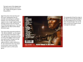
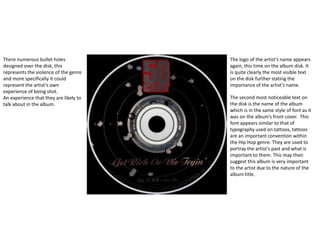
Digipak analysis
50 cent
“Get Rich Or Die Tryin”
The digipak I will be analysing is that of the artist 50 cent of the Hip Hop
genre, this will help my own digipak design as he and my artist are of the
same genre.
The front cover of this digipak
effectively represents the artist’s
star image and the genre in which
they preform.
The main focus of the album cover is
quite clearly the artist themself and the
bullet hole in front of them. This
suggests that the album will largely
focus on this particular artist as he is
standing there looking confident with
his body language and facial expression.
Furthermore the bullet hole represents
the level of violence within this genre of
music, a stereotype that this artist
conforms to as he has been shot 9
times.
The typography of the front of the
digipak has a very specific purpose.
The large, compact and bold lettering
of “50 CENT” is extremely
recognisable and the font used
represents the artist’s star image
perfectly as he himself is very bold.
The bullet hole surrounds the artist’s
cross, suggesting that he is a man a God
and more specifically and Catholic or
Christian. To put this on the front of the
album shows that this plays an
important role on the artist and possibly
their music too.
The artist’s costume consists of very
flashy jewellery and designer
clothes. The symbols of wealth are
stereotypically how artists within
this genre determine how successful
themselves and other artists are, by
how expensive their material
possessions are.
The back cover of this digipak also
effectively represents the artist’s
star image and the genre in which
they preform.
Again the artist is the main focus of
the cover, looking back over his
shoulder and looking less confident
however. He is also placed in what
appears to be a rough neighbourhood,
perhaps similar to the one that the
artist themselves grew up in. This may
suggest that the album will be about
the artist’s past.
The typography listing the songs on
the album contrasts greatly against
the dark background as if to show
them shining through. This can be
taken as the artist using his music
to escape his dark past.
The name of the executive producers,
“DR. DRE & EMINEM”, are the largest
text on the back of the album cover.
This signifies their importance as they
are two of the biggest artists to have
ever performed in the genre of Hip
Hop. This gives the artist an
opportunity for a wider audience as
Dr. Dre and Eminem fans may check
out the artist’s music since they
produced it and it is of the same
genre.
The logo of the artist’s name appears
again, this time on the album disk. It
is quite clearly the most visible text
on the disk further stating the
importance of the artist’s name.
The second most noticeable text on
the disk is the name of the album
which is in the same style of font as it
was on the album’s front cover. This
font appears similar to that of
typography used on tattoos, tattoos
are an important convention within
the Hip Hop genre. They are used to
portray the artist’s past and what is
important to them. This may then
suggest this album is very important
to the artist due to the nature of the
album title.
There numerous bullet holes
designed over the disk, this
represents the violence of the genre
and more specifically it could
represent the artist’s own
experience of being shot.
An experience that they are likely to
talk about in the album.

Digipak analysis

  • 1.
    Digipak analysis 50 cent “GetRich Or Die Tryin”
  • 2.
    The digipak Iwill be analysing is that of the artist 50 cent of the Hip Hop genre, this will help my own digipak design as he and my artist are of the same genre. The front cover of this digipak effectively represents the artist’s star image and the genre in which they preform. The main focus of the album cover is quite clearly the artist themself and the bullet hole in front of them. This suggests that the album will largely focus on this particular artist as he is standing there looking confident with his body language and facial expression. Furthermore the bullet hole represents the level of violence within this genre of music, a stereotype that this artist conforms to as he has been shot 9 times. The typography of the front of the digipak has a very specific purpose. The large, compact and bold lettering of “50 CENT” is extremely recognisable and the font used represents the artist’s star image perfectly as he himself is very bold. The bullet hole surrounds the artist’s cross, suggesting that he is a man a God and more specifically and Catholic or Christian. To put this on the front of the album shows that this plays an important role on the artist and possibly their music too. The artist’s costume consists of very flashy jewellery and designer clothes. The symbols of wealth are stereotypically how artists within this genre determine how successful themselves and other artists are, by how expensive their material possessions are.
  • 3.
    The back coverof this digipak also effectively represents the artist’s star image and the genre in which they preform. Again the artist is the main focus of the cover, looking back over his shoulder and looking less confident however. He is also placed in what appears to be a rough neighbourhood, perhaps similar to the one that the artist themselves grew up in. This may suggest that the album will be about the artist’s past. The typography listing the songs on the album contrasts greatly against the dark background as if to show them shining through. This can be taken as the artist using his music to escape his dark past. The name of the executive producers, “DR. DRE & EMINEM”, are the largest text on the back of the album cover. This signifies their importance as they are two of the biggest artists to have ever performed in the genre of Hip Hop. This gives the artist an opportunity for a wider audience as Dr. Dre and Eminem fans may check out the artist’s music since they produced it and it is of the same genre.
  • 4.
    The logo ofthe artist’s name appears again, this time on the album disk. It is quite clearly the most visible text on the disk further stating the importance of the artist’s name. The second most noticeable text on the disk is the name of the album which is in the same style of font as it was on the album’s front cover. This font appears similar to that of typography used on tattoos, tattoos are an important convention within the Hip Hop genre. They are used to portray the artist’s past and what is important to them. This may then suggest this album is very important to the artist due to the nature of the album title. There numerous bullet holes designed over the disk, this represents the violence of the genre and more specifically it could represent the artist’s own experience of being shot. An experience that they are likely to talk about in the album.

Editor's Notes