Typography and text position:
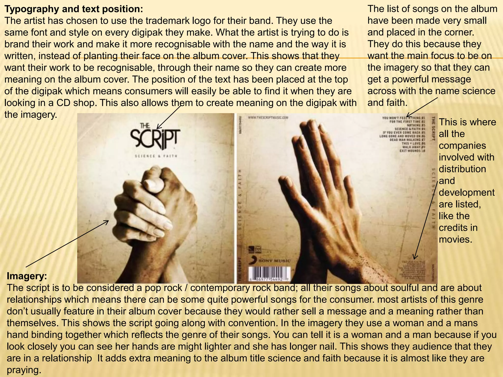
The artist has chosen to use the trademark logo for their band. They use the
same font and style on every digipak they make. What the artist is trying to do is
brand their work and make it more recognisable with the name and the way it is
written, instead of planting their face on the album cover. This shows that they
want their work to be recognisable, through their name so they can create more
meaning on the album cover. The position of the text has been placed at the top
of the digipak which means consumers will easily be able to find it when they are
looking in a CD shop. This also allows them to create meaning on the digipak with
the imagery.
This is where
all the
companies
involved with
distribution
and
development
are listed,
like the
credits in
movies.
The list of songs on the album
have been made very small
and placed in the corner.
They do this because they
want the main focus to be on
the imagery so that they can
get a powerful message
across with the name science
and faith.
Imagery:
The script is to be considered a pop rock / contemporary rock band; all their songs about soulful and are about
relationships which means there can be some quite powerful songs for the consumer. most artists of this genre
don’t usually feature in their album cover because they would rather sell a message and a meaning rather than
themselves. This shows the script going along with convention. In the imagery they use a woman and a mans
hand binding together which reflects the genre of their songs. You can tell it is a woman and a man because if you
look closely you can see her hands are might lighter and she has longer nail. This shows they audience that they
are in a relationship It adds extra meaning to the album title science and faith because it is almost like they are
praying.

Digipak analysis (the script)

  • 1.
    Typography and textposition: The artist has chosen to use the trademark logo for their band. They use the same font and style on every digipak they make. What the artist is trying to do is brand their work and make it more recognisable with the name and the way it is written, instead of planting their face on the album cover. This shows that they want their work to be recognisable, through their name so they can create more meaning on the album cover. The position of the text has been placed at the top of the digipak which means consumers will easily be able to find it when they are looking in a CD shop. This also allows them to create meaning on the digipak with the imagery. This is where all the companies involved with distribution and development are listed, like the credits in movies. The list of songs on the album have been made very small and placed in the corner. They do this because they want the main focus to be on the imagery so that they can get a powerful message across with the name science and faith. Imagery: The script is to be considered a pop rock / contemporary rock band; all their songs about soulful and are about relationships which means there can be some quite powerful songs for the consumer. most artists of this genre don’t usually feature in their album cover because they would rather sell a message and a meaning rather than themselves. This shows the script going along with convention. In the imagery they use a woman and a mans hand binding together which reflects the genre of their songs. You can tell it is a woman and a man because if you look closely you can see her hands are might lighter and she has longer nail. This shows they audience that they are in a relationship It adds extra meaning to the album title science and faith because it is almost like they are praying.