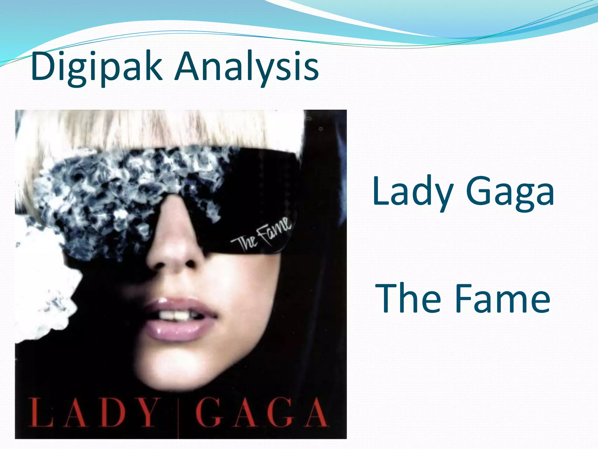
Lady Gaga
The Fame
Digipak Analysis
INTRODUCTION:
 Artist Name: Lady Gaga
 Album Name: The Fame
 The Fame is the debut studio
album by American recording artist
Lady Gaga.
 It was released on August 19,
2008, through Interscope Records.
 The Fame is a synthpop and dance-
pop album that has influences of pop
music from the 1980’s.
 It won the Grammy Award for the
Best Electronic/Dance Album.
The main focus of the image is
Lady Gaga, the solo artist. She is
projecting herself. This digipak
is modeled around the artist
which makes the image
dominant; hence, more
appealing to the audiences. The
front cover portrays a close-up
of lady gaga, wearing black
fashionable goggles with a
diamond reflection on them;
representing a glamorous feel
along with a dark shadowy
effect from the left, making her
more attractive. She’s looking
inside the camera with a bit of
her shiny lips open to gives
more of a sensuous feel to the
viewer’s.
The background is dark due to
which the solo artist is the main
focus. This Front cover image
depicts that the genre of the
music concentrates on the
image of the artist, rather than
the music. Her bold and bright
look makes her stand out from
the rest of the albums. The
conventions include the
shimmer and the blings that
usually pop starts have in their
albums.
The size and the layout of the
Font is appropriate according
to the modern era. Even
though the main image is the
center of attention, the artist’s
name is quite visible as it is
written in capitalized form in
red. She is representing her
name in a bold manner. The
name of the artist is written
in a different font with
pointed edges whereas the
title font seems more of a
signature type, “The Fame”. As
it is placed inside the black
shades, it gives a glamorous
feel and gives a smoky effect.
FRONT
Low Key light has been used.
A light is being projected
from the left. It gives a feel of
a girly persona as shimmer is
used. And she looks like a
celebrity who prefers to stay
in the dark and wants to stay
in her shell, as she’s only
exposed from one side.
Hence, giving a shadowy
effect.
BACK The track list is
printed on the
backside. The
colour scheme has
been kept
consistent like on
the front cover.
The barcode
information is printed
on the backside of the
digipak. The thin and
thick barcode lines is
machine readable
which differentiates
this digibak from the
others and helps to
keep record of huge
amounts of digipaks.
On the Backside, the
artist now, has been
revealed. The image
still portrays a
mysterious touch to
the costume and the
bling. It depicts a
signature style.
The artist is in the
spotlight with a glare
effect; totally in the
limelight now which
connotes a very
famous pop-star; her
body language depicts
a stereo- typical pop
stylized performing a
strong persona.
The copyright statement has been written on the left side of the barcode
text which prevents the unauthorized copying of the album. This is printed
on every digipak, thus following the codes and conventions.
CD 1
First of all, the
compact disc (CD)
inside the digipak,
breaks the
convention of
being consistent.
The Light Blue
colour scheme of
the cd does not
match with the
front or the back
cover of the
digipak; But is in
contrast, giving the
audience a
different feel.
However, the fonts of
the artist and the album
name are kept
consistent making it
more appealing to the
viewer’s.
INSIDE
These stones are
part of her
accessories which
are semi-
translucent. These
reflect the
celebrities image
which connotes her
star persona giving
a glittery effect. And
thus, portraying her
image as being very
conscious about her
accessories and
herself.

Digipak Analysis

  • 1.
  • 2.
    INTRODUCTION:  Artist Name:Lady Gaga  Album Name: The Fame  The Fame is the debut studio album by American recording artist Lady Gaga.  It was released on August 19, 2008, through Interscope Records.  The Fame is a synthpop and dance- pop album that has influences of pop music from the 1980’s.  It won the Grammy Award for the Best Electronic/Dance Album.
  • 3.
    The main focusof the image is Lady Gaga, the solo artist. She is projecting herself. This digipak is modeled around the artist which makes the image dominant; hence, more appealing to the audiences. The front cover portrays a close-up of lady gaga, wearing black fashionable goggles with a diamond reflection on them; representing a glamorous feel along with a dark shadowy effect from the left, making her more attractive. She’s looking inside the camera with a bit of her shiny lips open to gives more of a sensuous feel to the viewer’s. The background is dark due to which the solo artist is the main focus. This Front cover image depicts that the genre of the music concentrates on the image of the artist, rather than the music. Her bold and bright look makes her stand out from the rest of the albums. The conventions include the shimmer and the blings that usually pop starts have in their albums. The size and the layout of the Font is appropriate according to the modern era. Even though the main image is the center of attention, the artist’s name is quite visible as it is written in capitalized form in red. She is representing her name in a bold manner. The name of the artist is written in a different font with pointed edges whereas the title font seems more of a signature type, “The Fame”. As it is placed inside the black shades, it gives a glamorous feel and gives a smoky effect. FRONT Low Key light has been used. A light is being projected from the left. It gives a feel of a girly persona as shimmer is used. And she looks like a celebrity who prefers to stay in the dark and wants to stay in her shell, as she’s only exposed from one side. Hence, giving a shadowy effect.
  • 4.
    BACK The tracklist is printed on the backside. The colour scheme has been kept consistent like on the front cover. The barcode information is printed on the backside of the digipak. The thin and thick barcode lines is machine readable which differentiates this digibak from the others and helps to keep record of huge amounts of digipaks. On the Backside, the artist now, has been revealed. The image still portrays a mysterious touch to the costume and the bling. It depicts a signature style. The artist is in the spotlight with a glare effect; totally in the limelight now which connotes a very famous pop-star; her body language depicts a stereo- typical pop stylized performing a strong persona. The copyright statement has been written on the left side of the barcode text which prevents the unauthorized copying of the album. This is printed on every digipak, thus following the codes and conventions.
  • 5.
    CD 1 First ofall, the compact disc (CD) inside the digipak, breaks the convention of being consistent. The Light Blue colour scheme of the cd does not match with the front or the back cover of the digipak; But is in contrast, giving the audience a different feel. However, the fonts of the artist and the album name are kept consistent making it more appealing to the viewer’s.
  • 6.
    INSIDE These stones are partof her accessories which are semi- translucent. These reflect the celebrities image which connotes her star persona giving a glittery effect. And thus, portraying her image as being very conscious about her accessories and herself.