The document discusses conventions used in digipak album cover designs. Several artists are highlighted:
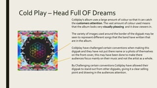
Coldplay challenges conventions by omitting their name and photo from the cover. 67 also omits themselves to focus attention on their music. Rihanna follows conventions by using her image to appeal to audiences as a "sex symbol." Lil Uzi Vert challenges conventions by omitting text and using a cartoon image rather than a photo.