
Recommended
More Related Content
What's hot
What's hot (18)
Viewers also liked
Viewers also liked (14)
Similar to Magazine ad research
Similar to Magazine ad research (20)
More from aimeelowe
More from aimeelowe (7)
Recently uploaded
Recently uploaded (20)
Magazine ad research
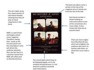
- 1. The band and album name is written at the top of the magazine ad so it stands out from the rest of the text. Each band member is shown holding an instrument which is one of the conventions of a music video. It also shows that they are an acoustic band. The ad is taken up by four equal squares of each band member, showing how they all play an equal importance in the band. NME is a well known and largely valued music magazine. Therefore, having their quote as the first text which isn't the artist/album name will attract the audience attention. Also, the fact that it is a positive review from NME will reflect well on Mumford & Sons. There are more singles from Mumford & Sons which will enlighten the audience who aren't as familiar with them, on what their music taste is like. The record labels which have to be displayed legally, are in the smallest writing because it is not what the audience would be most interested in.
- 2. Katy Perry is in a fairly revealing outfit which would attract a male to her female features such as her legs etc. This would possibly engage a male audience. Katy Perry is the artist and having her take up most of the ad allows the audience to connect the artist with the song. For example, if you have not heard he song but have seen the artist, or heard the song and never seen the artist, it allows the audience to make that connection. The album cover is the same as the background for the magazine ad which is good advertising as it will make the album recognisable to the audience who has seen the advert during marketing. The name of her new single is written on the advert, just above of the release date which is the whole point of the ad, to let people know when the song is being released. She is looking directly at the camera which makes it more personal as if she is looking to sell specifically to the reader. People who know Katy Perry will recognise this writing as it is used on all her albums and products. This is a USP of hers, and with it being the most noticeable part of the advert, bar the image of her, and written in bright pink, makes it stand out from the rest of the text that is on the advert.