
Recommended
More Related Content
What's hot
What's hot (17)
Similar to Arctic monkeys album advert annalysis
Similar to Arctic monkeys album advert annalysis (20)
More from Jasminep_media
More from Jasminep_media (20)
Recently uploaded
Recently uploaded (20)
Arctic monkeys album advert annalysis
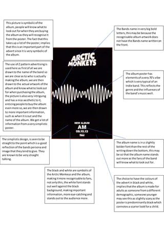
- 1. The Bands name inverybig bold letters,thismaybe because the recognisable albumartworkdoes not have the Bandsname writtenon the front. The albumname is ina slightly bolderfontthanthe rest of the writingdownthe bottom,thismay be so that the albumname stands out more as the fansof the band will know whattolookout for. Thispicture issymbolicof the album,people will know whatto lookout forwhentheyare buying the albumas theywill recognise it fromthe poster.The fact thatthis takesup a lotof the poster,implies that thisisan importantpart of the advertsince itis verysymbolicof the album. The albumposterhas elementsof avery70’s vibe whichisverytypical of an Indie band.Thisreflectsthe genre andthe influences of the band’smusicwell. The simplisticdesign,isseentobe straightto the pointwhichisa good reflectionof the bandspersonaand image that theytendtogive.They are knowntobe verystraight talking. The black and white are symbolicof the Arctic Monkeysandthe album, makingitmore recognisabletofans, not onlythis,the white fontstands out well againstthe black background,makingimportant information,more eye-catchingand standsout to the audience more. The choice to have the coloursof the advertin blackand white, impliesthatthe albumismade for adultsas someone fromadifferent demographic,someone younger may see thisas slightly scaryasthe posterispredominantlyblackwhich connotesa scarierlookfora child. The use of Z patternadvertisingis usedhere as firstof all we are drawnto the name of the band so we are clearas to who isactually makingthe album,we are then drawnto the actual artwork of the albumand knowwhatto lookout for whenpurchasingthe album, the picture isalsovery intriguing and has a nice aesthetictoit, enticingpeopletobuythe album evenmore so,we are thendrawn to more importantinformation, such as whenitisout and the name of the album.We get a lotof informationfromaverysimplistic poster.