The front cover of the magazine uses various techniques to appeal to its target audience. An image of Rihanna uses lighting, angle, and composition following rules of thirds to make her appear powerful and mysterious. Color choices and fonts are also selected strategically. The language and layout are designed to be informative yet intriguing, encouraging readers to learn more about Rihanna exclusively in the magazine. Overall the techniques aim to attract the magazine's target psychographics who want to stay informed about music industry news and artists.
Palestine last event orientationfvgnh .pptxRaedMohamed3
An EFL lesson about the current events in Palestine. It is intended to be for intermediate students who wish to increase their listening skills through a short lesson in power point.
Honest Reviews of Tim Han LMA Course Program.pptxtimhan337
Personal development courses are widely available today, with each one promising life-changing outcomes. Tim Han’s Life Mastery Achievers (LMA) Course has drawn a lot of interest. In addition to offering my frank assessment of Success Insider’s LMA Course, this piece examines the course’s effects via a variety of Tim Han LMA course reviews and Success Insider comments.
The French Revolution, which began in 1789, was a period of radical social and political upheaval in France. It marked the decline of absolute monarchies, the rise of secular and democratic republics, and the eventual rise of Napoleon Bonaparte. This revolutionary period is crucial in understanding the transition from feudalism to modernity in Europe.
For more information, visit-www.vavaclasses.com
Operation “Blue Star” is the only event in the history of Independent India where the state went into war with its own people. Even after about 40 years it is not clear if it was culmination of states anger over people of the region, a political game of power or start of dictatorial chapter in the democratic setup.
The people of Punjab felt alienated from main stream due to denial of their just demands during a long democratic struggle since independence. As it happen all over the word, it led to militant struggle with great loss of lives of military, police and civilian personnel. Killing of Indira Gandhi and massacre of innocent Sikhs in Delhi and other India cities was also associated with this movement.
Read| The latest issue of The Challenger is here! We are thrilled to announce that our school paper has qualified for the NATIONAL SCHOOLS PRESS CONFERENCE (NSPC) 2024. Thank you for your unwavering support and trust. Dive into the stories that made us stand out!
Embracing GenAI - A Strategic ImperativePeter Windle
Artificial Intelligence (AI) technologies such as Generative AI, Image Generators and Large Language Models have had a dramatic impact on teaching, learning and assessment over the past 18 months. The most immediate threat AI posed was to Academic Integrity with Higher Education Institutes (HEIs) focusing their efforts on combating the use of GenAI in assessment. Guidelines were developed for staff and students, policies put in place too. Innovative educators have forged paths in the use of Generative AI for teaching, learning and assessments leading to pockets of transformation springing up across HEIs, often with little or no top-down guidance, support or direction.
This Gasta posits a strategic approach to integrating AI into HEIs to prepare staff, students and the curriculum for an evolving world and workplace. We will highlight the advantages of working with these technologies beyond the realm of teaching, learning and assessment by considering prompt engineering skills, industry impact, curriculum changes, and the need for staff upskilling. In contrast, not engaging strategically with Generative AI poses risks, including falling behind peers, missed opportunities and failing to ensure our graduates remain employable. The rapid evolution of AI technologies necessitates a proactive and strategic approach if we are to remain relevant.
June 3, 2024 Anti-Semitism Letter Sent to MIT President Kornbluth and MIT Cor...Levi Shapiro
Letter from the Congress of the United States regarding Anti-Semitism sent June 3rd to MIT President Sally Kornbluth, MIT Corp Chair, Mark Gorenberg
Dear Dr. Kornbluth and Mr. Gorenberg,
The US House of Representatives is deeply concerned by ongoing and pervasive acts of antisemitic
harassment and intimidation at the Massachusetts Institute of Technology (MIT). Failing to act decisively to ensure a safe learning environment for all students would be a grave dereliction of your responsibilities as President of MIT and Chair of the MIT Corporation.
This Congress will not stand idly by and allow an environment hostile to Jewish students to persist. The House believes that your institution is in violation of Title VI of the Civil Rights Act, and the inability or
unwillingness to rectify this violation through action requires accountability.
Postsecondary education is a unique opportunity for students to learn and have their ideas and beliefs challenged. However, universities receiving hundreds of millions of federal funds annually have denied
students that opportunity and have been hijacked to become venues for the promotion of terrorism, antisemitic harassment and intimidation, unlawful encampments, and in some cases, assaults and riots.
The House of Representatives will not countenance the use of federal funds to indoctrinate students into hateful, antisemitic, anti-American supporters of terrorism. Investigations into campus antisemitism by the Committee on Education and the Workforce and the Committee on Ways and Means have been expanded into a Congress-wide probe across all relevant jurisdictions to address this national crisis. The undersigned Committees will conduct oversight into the use of federal funds at MIT and its learning environment under authorities granted to each Committee.
• The Committee on Education and the Workforce has been investigating your institution since December 7, 2023. The Committee has broad jurisdiction over postsecondary education, including its compliance with Title VI of the Civil Rights Act, campus safety concerns over disruptions to the learning environment, and the awarding of federal student aid under the Higher Education Act.
• The Committee on Oversight and Accountability is investigating the sources of funding and other support flowing to groups espousing pro-Hamas propaganda and engaged in antisemitic harassment and intimidation of students. The Committee on Oversight and Accountability is the principal oversight committee of the US House of Representatives and has broad authority to investigate “any matter” at “any time” under House Rule X.
• The Committee on Ways and Means has been investigating several universities since November 15, 2023, when the Committee held a hearing entitled From Ivory Towers to Dark Corners: Investigating the Nexus Between Antisemitism, Tax-Exempt Universities, and Terror Financing. The Committee followed the hearing with letters to those institutions on January 10, 202
Unit 8 - Information and Communication Technology (Paper I).pdfThiyagu K
This slides describes the basic concepts of ICT, basics of Email, Emerging Technology and Digital Initiatives in Education. This presentations aligns with the UGC Paper I syllabus.
A Strategic Approach: GenAI in EducationPeter Windle
Artificial Intelligence (AI) technologies such as Generative AI, Image Generators and Large Language Models have had a dramatic impact on teaching, learning and assessment over the past 18 months. The most immediate threat AI posed was to Academic Integrity with Higher Education Institutes (HEIs) focusing their efforts on combating the use of GenAI in assessment. Guidelines were developed for staff and students, policies put in place too. Innovative educators have forged paths in the use of Generative AI for teaching, learning and assessments leading to pockets of transformation springing up across HEIs, often with little or no top-down guidance, support or direction.
This Gasta posits a strategic approach to integrating AI into HEIs to prepare staff, students and the curriculum for an evolving world and workplace. We will highlight the advantages of working with these technologies beyond the realm of teaching, learning and assessment by considering prompt engineering skills, industry impact, curriculum changes, and the need for staff upskilling. In contrast, not engaging strategically with Generative AI poses risks, including falling behind peers, missed opportunities and failing to ensure our graduates remain employable. The rapid evolution of AI technologies necessitates a proactive and strategic approach if we are to remain relevant.
Adversarial Attention Modeling for Multi-dimensional Emotion Regression.pdf
Detailed analysis
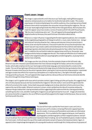
1. Front cover: Image
The image is capturedwitha mid-shotatan eye-level angle,makingRihannaappear
seductive andprovocative asitenableshertodirectlylookatthe reader.Thiscreates
equal powerof relationshipbetweenherandthe audience,thuscreatingasense of bond
betweenthemwhichmanipulatesthe consumerintopurchasingthe magazine.The use
of an eye-level anglewill generate the effectof the male gaze theory.Notonlydoesthis
make herappear sexyittoocreatesa sense of mysterywhichlinkswiththe pull quote,
"My fans don'treallyknow whoI am". This will appeal tothe psychographicsof the
targetedaudience because;theywanttoknow informationaboutartists.
Rihannaisa majorinfluence inappealingthe female targetedaudience;she isrelatable
to the targetedpsychographicsof thatgenre whichis,music,style,fashionicon. Usinga
mid-shotwill notonlyallowherhair,makeupandcostume (mise-enscene)tobe in
frame;to be seenbythe audience,ittooaccentuatesherseriousfacial expression.Her
cream lacycami top createssubtle contrastbetweenherfieryredhairandmatching
lipstickgivingmore attentiontobe attractedtowardsherface ratherthan the lower
part. In additionthe redlipstickmakesher appearbrave andfierce;the purple-navy
backgroundalsohelpstoexaggerate the red. The simple yeteffectiveuse of makeupwill
relate tothe targetedaudience’spsychographicsanddemographics,asyoungmature
womenlove simplicity.
The image usesthe rule of thirds,fromthe example shownonthe lefthand-side,
Rihanna’seye (the interest) ispositionedwhere the linesintersectalongside herbodyiswhere the crossedlines
locate,which addsemphasistothe eye-level angleandthe bodylanguage andrelationshipthiscreatestothe
reader. The use of keylightingonRihannacontributestothe large amountof attentionbeingcreatedonthe artist
because itcreatesmore focuson the artist ingreaterdetail,placingherinprime positionshowcasingheri mportance
and againcreatesthe effectof an mysteriousatmosphere asitimpliesthatshe is,'the lightinthe dark' greatly
linkinguptothe pull quote. Thiswill appeal tothe targetaudience,becausetheycanfamiliarise andeasilyidentify
the artist throughthe helpof these techniques.
The image is setina gardenwithroseswhichconnotescontent,againlinkinguptothe pull quote,thissuggeststhat
she isfinallyatpeace because she hasrevealedtothe magazine 'whoshe reallyis'andoverall thisgeneratesthe
effectof curiositytothe reader.Colourdarknavypurple background,todraw attentiontofontsandensure they
capture the eye of the reader.Rihanna'scostume iscream;cream symbolizesthe ideaof innocence andpurity.
Howeverthe guntattoothat is beingrevealedcouldbe suggestingtothe audience thatshe isbeingpresentedas
somethingelseshe isnot,andafterreadingthismagazine youwill gettoknow hertrue self. Imagesof celebrities
are conventionalforamagazine,the use of Rihannawouldhelpappeal tothe targetmarketbecause,theycaneasily
familiarisewiththe artist.
Typography
The overall fontstyle usedforthe frontcoverissans serif,thisis
because sansserif iscreates a relaxingeffectandisappealingto the
eye of a reader,it conveys proffesionalisimandmakesaninformative
appearance.Thisissuitable forthe magazine because,itwill apeal to
psychographicsanddemographicsof theirtargetedaudience andwill
ensure toattract themwiththe proffesional impressionthey’remaking. Sanserif styledfontsgivesamodernlookto
the front cover,itrefreshingtothe eye of the readerandstands outyetstill givesaformal presentation.Again,it
appealstotheirtargetedage demographicof a youngadultaudience andthroughthisithelpsachieve itspurpose of
2. servingprimarysource of informationtoreaderswhoare involvedinthe musicindustrye.g.promoters,high
exectutivesandpublishers.Themastheadusesadifferentstyle of sanserif,andlargerfontsize whichallowsto
create subtle yeteffective contrastbecause asmallerfontisnotwhere the route of the eye wouldattractfirst.The
magazine alsodoesthiswiththe name of the artist,‘ Rihanna’theyboth use blockcaptitalsto captivate andengage
the readerbecause ittoo createsattentiononthe celebrity, the font stylesusesboldeditalicsgivingafashionable
edgyand trendy appearance whichrelatestothe targeted female audience of ‘youngandfashion-concious’. The
significantcoverlinesare inblackcapital blocksandplacedinfrontof a white puff togive variationandcreate some
attentionduringthe route of the eye.Overall the magazineusesaconventional typography foritstrendypop genre.
However,the colourpalette (house of style) isunconventional foritsfemaletargetedaudienceasitusesprimary
colourssuch as red,yellowandblue thatdonot specificallyappeal toone gender.
Colour
Rihanna'scostume iscream; creamsymbolizesthe ideaof innocence andpurity.Howeverthe guntattoothatis
beingrevealedcouldbe suggestingtothe audience thatshe isbeingpresentedassomethingelseshe isnot,and
afterreadingthismagazine you will gettoknow hertrue self,whichattractsto the interestsof the audience;toread
somethingthatisinformative.
White isfor almostthe entire typographyaside,fromthe sub-headingwhichisyellow. Yellow isthe mosteye-
catchingcolour anddifferentiatesfromthe maincolourpalette usedforthe issue, ithighlightsthe textdue toits
warm undertone,itcounteractswiththe neutral basedtonessuchasthe whitesused,makingitmore popping. The
purpose of thiswasto create contrastbetweenthe fontstoensure the sub-headingishighlighted attentionbecause;
it wantsto promote the magazinesofferof registeringthe film&TV musicconference eventtoitsmarket,inways
persuadingthemtobuythe product or missouton thisgreat offer.
There ismany use of brightreds,thisgeneratesafeelingof excitementandattractionbecause itisperceivedas
lively asit’sconnotative forlove,passionand strengthanditsbrightnessdrawsgreatattentionanditsimplication
helpsrelate tothe psychographicsof the audience whichistohave some formof greatpassionformusic.It offersa
variety of undertonestocreate an the effectof awelcomingfeelingtothe readerencouragingthemtoreadfurther.
The colourspurple,navy,redandcream are insome ways unconventional andconventional forthe targeted
audience.Itisunconventional becausethe targeteddemographicgenderisfemale,andIas girl donot interpretthis
magazine as,‘girly’ asit lacksthe conventionaluse of pinks,pastels/neonetc.Insome waysthe palette usedis
conventional asitdoesappeal toolderwomenbecause,of itssimplicityandricherratherthanbrightcolours,and it
doeslinkupto the genre the artistis whichiscrossedbetweenseveral types.
Language
The language PromethusGlobal Media(the publishers) isinformative andmanipulative,forinstance theyhave used
the pull quote "Don'treallyknowwhoI am" toprovide anideaof whather feature isbasedonand toallure the
readerintofindingoutmore aboutRihannainorderto get closertoher, thatis onlyexclusive inthe magazine,
overall teasesthemintopurchasingthe product.Thisisbecause;the pull quotedisclosesthe informationforthe
magazine itself itusesaninvitingandintriguingtone;onlythe readerwhobuysitwill know,readersdesirehaving
that accessto exclusive,notonlythe targetedaudience butalsothe fanbase of Rihannaherself. Anotherexampleis
‘the reinventionof Rihanna’ itismanipulative;itsuggeststhe same ideaof anew undiscoveredRihannaonly
exclusivetothismagazine,tosummarise boththese points,itwouldhelpappeal tothe psychographicsof the
targetedaudience andRihanna’sfanbase because bothwanttoknow the latestnewsandmore informationabout
an artist(especiallyRihannawhenitcomestoherfans).Theyhave alsoofferedintertextualitybyreferencingother
artistsand brands like,‘Pitbull’sMultiformat,MultimediaTakeover’and‘KillerApp’andinadditionpromote and
advertise theirofferof ‘Registernow!FILM& TV MUSIC CONFERENCE’.These intertextualitiesoffered are appealing
to the psychographicsanddemographicsof theirtargeted audience becausetheywouldfamiliarise withthe other
artists,the software andeventreference.The language usesforthe coverlineshave apersuasiveandinformative
tone, an example of thisis,‘Digitalsalessettoexceedphysical’whichmake the article more excitingforthe
audience toread,the writershave alsousedplayonwithwordssuch as ‘Multiformat MultimediaTakeover’thissets
3. a fast pace,intriguingtone suitable forthe informativetheme.Thissetsaninformal mode of addressbecause of the
playon the words,thoughitis still suitablebecause itstone isshortandquick. Overall the language usedforthe
frontcover createsan invitingrelationshiptomake a unique sellingpoint.
Layout
The image of Rihannaisoverlappingthe mastheadwhichisimplyingthatshe isdominant
and representingwomanbeingpowerful.AndalsosuggeststhatBillboardisstillpopular
as it can still be identifiedbycostumers’asidethe overlappingimage.The mastheadistoo
positionedinthe centre;othermagazineshave positionedtheirmastheadmore onthe
left-handsideforeasieridentificationbythe audiencewhenthe magazinesare stacked
on the shelf,suggestingthatitisa well-knownmagazineanddoesn't have todothisso.
The margin givesaformal,ordered format,itisa L shape layout,meaningthe readerwill
readfrom lefttoright,thisallowsthemtonotice the coverlines thatare mainly
positionedonthe lefthandside (dominantarea) thisisnotconventional foramagazine
as it doesn’tfollowthe Zshape the route of the eye offers.Althoughaformal layoutwill tooappeal the mature
target marketand its purpose of servicingprimarysourcesof informationto fans,artists,
highexecutives,publishers,promotersandmanymore,as all of these targetaudience
are stereotypedtodesiringinformation organisedformallyandeasilywhereasif an
informal messylayoutwasuseditwouldbe toappeal toa veryyoungtarget audience.
The contentin the magazine relatestothe targetedaudience,asitkeepsupwiththe
latestmusicandgossip.The magazine hasa house of style as itincludesspecificfeatures
and elementsexpectedbythe audience. The rule of thirdsisalsousedtoo,the coverlines
are positionedonthe lefthandthird,whichisseenasthe dominantside because not
onlydoesitpositionthe majorityof the coverlinesitalsowhere barcode,date issues
locates,the righthandside islessdominantincomparison.Hername extendsacross
fromthe righthandside to the left;pull quote belowthis inordertocreate attention,herface beingpositionedin
the centre, the purpose of thisisso that whenthe readersare searchingforwhat content,mastheadandcoverlines
theyare mostappealed itiseasilyidentified.Anotherreasonissothat Rihanna’sface reachesthe main focal point.
Conventions
The use of Rihannabeingfeaturedonthe magazine andthe artist(Pitbull) thathave beenreferenced(intertextuality)
are conventionalforthe modern crossedgenre Billboardfollows,andisconventional inthe musicindustry.
Rihanna'sgenre of musiccrossesbetweenR&B,Rockand Hip-hopwhichissuitableandwill linkuptoBillboard
magazine’sgenre asittendsto variate anddoesnot conformto one style.Thisisallowinghavingarange of audience
that do nothave one preference toaccessBillboardbecause itisachart magazine anddoesn'thave a specified
genre. The frontcover howeverisconventionallyasitincludesconventionssuchasa bar code,date issue andprice
that are displayed.Aspartof the brandidentity,billboardisfeaturedoneveryissue.The magazinealsousesa
conventional technique of,'Rule of Thirds'tocreate a professional appearance andhelpstokeepthe coverlines,and
image presentedwell withingooddistance fromeachother.Thiswill attractthe age demographicsof theirs,(16and
above yearsof age).The frontcoveralsoincludesothergenericconventionssuchasmaincoverline,anda sub-
4. headingwhichispositionedabove the artist.Rihannaisa well-knownyoungartistwhichhelpstoattractthe age
demographicsof Billboard. Inadditionhave alsomade referencestoconventionsof the magazine throughoutthis
analysissuchas,‘route of the eye’,rule of thirds andas well asthe coloursused.
Contents page: Image
The celebritiesusedforthe imagesinthe contentspage are a variety,
althoughsome of the audience are unable tofamiliarise andidentifythe
artistswhoare on thispage,the imageswill still helptoachieve Billboard’s
crossedgenre andhelpto appeal toitsmass audience andbecause,Promeus
Global Media(the publishers) are basedinAmerica,readersinternationally
are unable toeasilyidentifywhothe featuredcelebritiesare thisisbecause,
these artistsmayhave a biggerfan base inthe USA as oppose to here inthe
U.K. The imagesused have differentshottypesandanglestovariate the
images,andgenerate anexcitinglookforthe reader.The main significant
image locatedinthe centre isa larger size,itistakenwithin amid-shot
capturingherbody language whichiscrouchingdownandappearsto be
lookingatthe text,the textsare positionedbesideherbodywhichis
suggestingtothe audience toreadthe text, andalsoher bodylanguage
insinuatesthatshe ispresentingsomething(thetext). Thisisintendedbythe
publisherssothattheyreadthe prime text,thenfollow ontothe othercoverstories. Thisimage hassignificance
because itcreatesan invitingfeelingtoreader.However,thisshottype andbodyisnon-conventionalforamagazine
because itdoesn’tpreciselyshowthe artist’sface therefore makingitdifficulttoidentifythe artist quickly forthe
reader,the artistusedas the personnel appealstothe psychographicsanddemographicsof the targetaudience as
she isyoung andappearsto be a fashionicon. The otherthree imageslocatedabove are variatedtogenerate an
exciting,welcomingfeelingtothe firstpage of the magazine. ‘23’ and‘29’ are takeninmid-close upshotthisisto
emphasise theirfacial expressionsandtheiremotions,anditmakesiteasierforthe audience torecognise who will
be featuredinthe issue.‘14’is takenwitha wide-shottoshow the artistssurroundings.
Colour
The coloursusedon the contentspage do notfollow the colourpalette of navy,redandpurple inthe frontcover,it
doeshoweveruse acolourscheme of dark grey,lightgrey,white,blueandyellow.Althoughinsome waysthis
colourscheme maybe interpretedtobe non-conventional because ithasa stereotypical manlycolourscheme
(meaningitdoesn’treachthe expectationsof the targeted audience),the publishershave chosenthiscolourscheme
to reach equilibrium betweenthe variouscoloursusedforthe charts,because the targetedaudienceismature they
musthave that balance to keepthatmature impression.The variouscolours(pink,purple,blue,green) usedonthe
charts are brightwhichconveyhappiness,creatingawelcoming,excitingfeelingforthe readerencouragingthemto
readfuther. The white andlightblue usedonthe majorityof the page connotesimpurityandthe ideaof newwhich
associateswiththe ‘neverseenbefore’/exclusive articles.Darkgreyandgreyare insome waysa negative
5. connotation,althoughonthe otherhanditconveysmaturity,butthe publishershave pickedthisinintentionsto
bringexaggerationtothe importanttextsandareas.
Layout
The layoutformat of the contentspage is similartothe frontcover;it is formal
and orderedgivingthe magazine asophisticatedappearance whichhelpsto
appeal tothe targetedaudience becauseitrelatestotheirpsychographicsand
demographics,andinadditionitwouldbe easierforthe readertosearch and
lookaroundthe page.The layoutfollowsthe route of the eye ‘Z’shape.The
readerreadsthe across the top first,enablingthemtoidentifythe magazine
name Billboardensuringtheyare aware of what magazine itis,andto know
the page numbers(centre third) ,‘No.1’.The readerwill thenreadacrossthe
page throughto the sectionwhere itinformsthe audience whatisineach
page of the magazine,the reasonforthisisto helpthe readernavigate the
magazine quicklyandoverall justtokeepiteasyandorganised,again
appealingtothe psychographicsof the targetmarketbecause women prefer
to be much more organisedandneat.The textaroundthe page numbers
aroundthe mainimage/artist/personnel toavoidcreatingamessand
keepingthatneatness. Finallythe eye of the readerwill goacrossthe bottom
feature;itprovidesadditional informationonwhatisfeaturedinthe
magazine, itisdistinguishedinsub-headings.Itkeepsitsformalitythrough
thisand,givingtease tothe audience makesthemencouragedtoread the full
article. The charts are keptinthe eye line (left-handside),because theyhave
brightcoloursand theircolourscheme differentiatesfromthe otherhalf,
there isstill attentionbroughttowardsitsoitis notforgottenor notseen
easily. The rule of thirds isappliedonthe contentspage.The leftthirdof the
page is where the chartsis positioned,servingitspurpose of beingaprimary
source of musicinformationinthiscase topcharts/hottestof the week,itis
alsoa conventionalfeatureof amusicmagazine;tohave some form of
reference tothe latesthits of thisweek/month/year.The centre thirdisthe
mostsignificantitprovideswhatisfeaturedforthisissue,whichis
conventional foramagazine because it’swhatthe audience expectsto
receive whenreadingamagazine.Inadditionthe route of the eye crosses
throughthissectionagainmakingit the dominantareaof thispage. It givesthe audience afeelingof organisation
rather thanrandom placement.
Typography
The font style variesonthe contentspage,itisa mixture of serif andsansserif fontstocreate contrastand highlight
the importanttextstobringthemout ensuringtheycanbe seenbythe reader;althoughthe majorityof the textis
usedinthe sans serif style,to keepthatmature,professionallook inordertoappeal the target.The masthead,
‘contents’,coverlines ‘home front,upfront,features,music’etc.are inlargersize fontsincomparisontoothertexts
such as captionstoagain contrast themandaccentuate the elements,thismakesitexcitingforthe readerand
intrigue thembecause,the contrastsshowsclearlythatthere ismuchto readfrom, latestgossipof theirselling
artiststo the musiccharts. Contents(masthead) iswrittenatthe top,it iswhere the readerlooksatfirstand is
where the route of the eye crossessuggestingitssignificance.Ithasan aestheticyetformal block style,generatinga
touch of originality andconveysasense of importance whichappealstothe targetedaudience because theydesire
to readsomethinginteresting,original,funyetinformative.The colourof the mastheadisblackwhichis
unconventional forthe female audience.Itdoeshowever create anandrogynouslook insinuatingit’sforall genders
and addsa welcomingtouchtoit. To create livelinesstoit,blue isaddedtosome coverlines toencourage the read
to continue readingbecause itthe colourconnotes harmony.
6. Language
The language usedinthe contents page is a formal tone ratherthan colloquial, toappeal tothe targeted
demographicage,andto create a good impressionespeciallybecauseBillboardisknowntobe the primarysource of
informationforpeopleinvolvedthe musicindustry,andforthisitusesspecialisedterminologyforinstance,‘upfront’
and ‘features’.Thisistocreate thatsense of professionalism, whichwouldencouragethe readertofurthercontinue
readingthe magazine asit isintriguingandrelatestothe psychographicsof the targetedaudience because they
wouldknowwhatthe definitionsof the wordsused; appealingtothem. Thishowevercouldfail toappeal tothe
youngeraudience inthe targetedage bracket,asusingspecialisedterminologycouldlimitunderstanding andthis
coulddiscourage themfromfurtherreadingbecause,theyfeelit’stooprofessionalfortheirunderstanding. However
theirmaintargetedreaderisto be someone whoworks/hashighknowledge aboutthe industry,throughthisit
achievestheiraimof appealing tothem.Anotherwaytheyappeal tothe masstarget audience throughthe use of
language isthroughreference todifferentgenressuchas,‘latinand/orcountrymusic’.Thissignifiestheirmass
audience andmakesthe readerfeel thatthismagazine isfor all preferencesof music.The use of specialised
terminologyandreference todifferentgenresof musicisconventional foramusicmagazine asitis whatthe
audience wouldexpectamagazine wouldmention.The mode of addressisformal,familiarwiththe frontcover;it
speaksinformativelytoitsaudience throughoutthispage.
Conventions
ThroughoutmyanalysisIhave referredtoconventionsusedinthispage.Inadditiontothisanothernon-
conventional feature inthismagazine isthatcoloursfromthe frontcover,doesn’tmatchthe majorityof the colour
scheme inthe contentspage.Thisisdue to the fact that, Rihanna’s(artistonthe frontcover) crossedgenre wasthe
influenceforthe colourpalette. Thislistof featuresisalsounconventionalasitisusuallylocatedonthe lefthand
side ratherthan the centre. Thismakesitunconventionalbecause the pagesdonotappeartohave an easily
recognisable familiarity. A conventional feature is the Publishershave keptthe Billboardlogo positioned onthe left
handside,overall signifyinghowprofessional Billboardis. The use of featuredartistsisconventional becauseit
appealstoa massgenre.Itis conventional foramagazine toalsohave page numbersforthe featuresincluded.
Double page spread: Layout
For the double page spread,the layoutcontinuestofollowa
similarappearance of formalityandsophistication,inorderto
appeal tothe targeteddemographicsof the audience;young
adults.The rule of thirds (orange lines) isapplied, the lines
intersectiswhere the artist(TaylorSwift) ispositionedandis
where the article islocated.Thisinsome wayssignifiesequal
dominance,andtherefore the readershave twofocal points.It
createsan organisedmannertoappeal to the psychographicsof
the targetedfemale audience.Acrossthe tophorizontal line
includesmastheadandthe artist’sface,whichimpliesthisis
where the dominantareaislocated,itisalsoconventional
because the mastheadandthe artistare usuallyalignedonthe same line/area.Taylorispositionedontothe
opposite side of the page,whichbecomesmore attractingtothe readerbecause itappearsto be organisedand
sophisticatedwhichthe audiencewouldappealtothisformatmore. The double page spreadtoousesthe route of
the eye.Itbeginswiththemseeingthe mastheadthatinformsthemsomebasiscontentof the article,following
across for themtoacknowledge the artist, whichwillgenerate the feelingof excitementforthembecause,the
target audience canfamiliarise andidentifythe artist,makingthemfeel excitedtolearnmore informationabouther.
Finallythe eye thenmovestothe article.
7. Image
The shot type usedto capture thisimage isa wide shot,to show herentire bodyandthe blankbackground,which
helpsthe audience identifythe artisteasilyespeciallyfromata distance. The image usedisconventional because
Tayloris seentobe performinganditis conventionalforperformance imagestobe usedinmusicbasedmagazines,
althoughinsome waysthe image isunconventionalasthe cameraangle isat an eye level angle(similarlytothe front
cover).PromeusGlobal Mediahave intendedthisto,generateawelcomingrelationshipbetweenthe artistandthe
readerdue to the equal dominance itconveys,whichappealstothe targetedaudience astheyare mature and are
lesscontroversial.Ittoocreatesa homely,relaxingvibe. Taylor’sbodylanguageisverylaidbackandlooks
comfortable,herperformingmakesthe readerfeel like she’s doingapersonal performance whichthe audience
wouldlike,andlinkswiththe overviewof the magazine. The feature of TaylorSwiftisappealingtothe
psychographicsof the targetedaudience because, theycanrecognise her.TaylorSwiftcanalsobe a relatable figure
to the interestsof the female readers, typically the female audience will notice the costume used,throughthisshot
type enablestoall of that whichwill intriguethemandinadditionbecause,she ispositionedinthe intersectinglines
(rule of thirds) she isinthe focal point.The costume usedon herissimple chic, itsstylishcomfyappearance relates
to the psychographicsof the audience,whichmakesthemappeal toheras theywouldlike hertrendycostume and
have a familiarstyle. Inadditionthisrepresentsthe magazinetobe modernandagainmakesthe targetedage
bracketof (16-25 yearolds) to be appealed. The Guitar(prop) isalsoTaylor’ssignature image andamajorfactor in
howshe beganin the musicindustry,linkingupto the masthead‘Primarycolours’,vastmajorityof the audience will
be aware of thisand it will connote asense of purityandpassiontothem, enablingthemtoappeal itaswithintheir
psychographicstheyhave some formof passioninmusic. Forher makeupredlipstickisappliedsimilarlytoRihanna
inthe frontcover.Redconveyslove,passionanddanger,whichcouldsuggestthatTaylorisfierce anda strong
independentwoman,thisisaspirationaltechnique usedbythe publisher’s makesthe audienceaspire toher;
therefore they wanttoknowwhatthe article isabout.
Colours
The colour redis a use of ironyas it greatlylinksupwiththe artist’salbum, ‘Red’.The redlipstickisalsowornonthe
coverof thisalbumwhich the publishershave intended inordertothe audience have thatsignature and
personalisedfeel.Forthe backgroundgreyhasbeenused,greyconnoteswithmaturityandassociateswiththe idea
of a professional/sophisticated careerwhichthe audiencewouldappeal tobecause,theyare the rightdemographic
age.Yellowconveyshappinessappealingtothe audience asthat’show theywantto feel.Red,yellow andblue are
knownas primarycolours,linkingwiththe title.The textisplacedbehindawhite puff,white generatesthe sense of
puritythiscouldinsinuate thatthe article isa richsource and is exclusive only.
Typography
In thisdouble page spreaditoffersamixture of bothsansserif andserif style. The kickerisusedatthe start of the
article;‘T’is usedto linkwithhername,Taylorandcapturesthe attentionof the reader. For the standfirstthere is
use of serif styledfont,tocreate contrastbetweenthe mastheadandarticle whichare writteninsanserif,makingit
appearoutstanding,eye-catchingenoughforthe readertoreadthe informationprovided.The byline inthe article is
too serif howeveritisinitalicstoemphasise contrastandbringattentionfromthe readertoit. ‘Billboardbiz’the
logoiswrittenonbottomright side inredrelatingtothe name of article,‘PrimaryColors’.The mastheadisstyled
almostas if it waspop upin a book, it isbrightlycoloured.Thisgeneratesthe feelingof excitementtothe reader
because,popupsconveyenergyandenthusiasm,whichishow the readwantsto feel inordertobe captivated.The
sans serif style usedhowever,keepsitformality,stylish,simplicityand maturitytoappeal tothe psychographicsof
the targetedaudience yetstill make itfeel funandcalm, assan serif isveryrelaxingtothe eye. Thistypography is
conventional because forthe genre of Billboardaspopmusicisexciting,upliftingandmodern.
8. Language
The language usedinthe double page spreadagainfollowstobe formal,whichappealstothe psychographicand
demographictargetedaudience because,the mature tone willappeal totheirvibe.Itwill alsoofferawiderrange of
audience aseveryone Inthe standfirstthere isanexample of artsyuse of language,‘andpalette of producers,
songwriters,experiencesandemotionsshe usedtocreate it’.Palette isassociatingitwithpaintingobviously
involvingcolours;thisisreferringtothe title ‘primarycolours’ itcouldsuggestthat these palettes of primarycolours
ledto the creationof her blockbusterhit. Thiswouldengagetothe audience becausewithintheirpsychographics
theyare passionate aboutmusicandare informative people, whichwill allure intoreadingthe full copybecause they
are intrigued. The contentisalsorelatabletothe audience,whichmakes themfeel happytoreadit.
Conventions
Throughoutmyanalysisof the double page spreadIhave mentionedelementsof the piece thatare unconventional.
An conventionisthatthe article,title andcopyare alignedinone column placedonone side,making itrelatestothe
psychographicsof the audience because it’sneatandnicelyarranged,theyare more likelytoreaditas it appealsto
them. Coloursthatassociate withthe genre of hermusic isalsoa convention,inadditionthe yellow,blueandred
dotsthat are includedare seenonthe mastheadof the logo,thiscreatesa sense of familiarityandabrand image,
whichmakesiteasierforthe readerto identify.