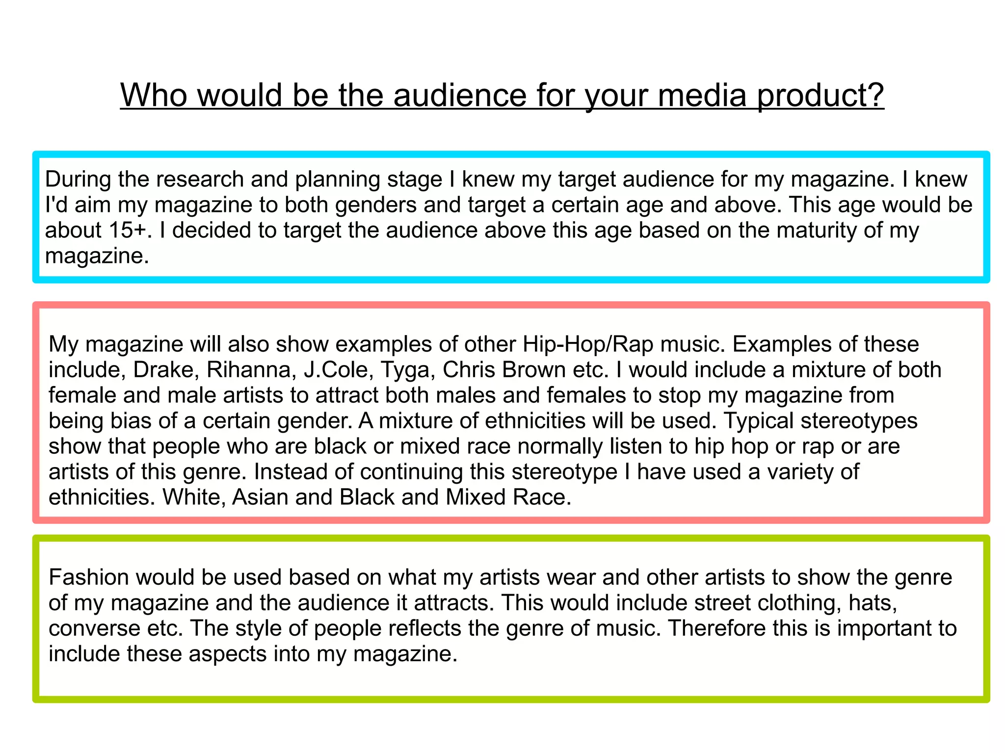
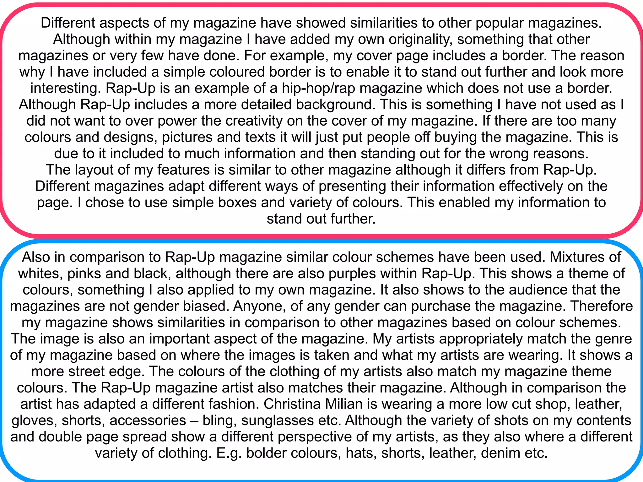
- The document describes the target audience and design choices for a hip hop/rap magazine called "Dope Beatz".
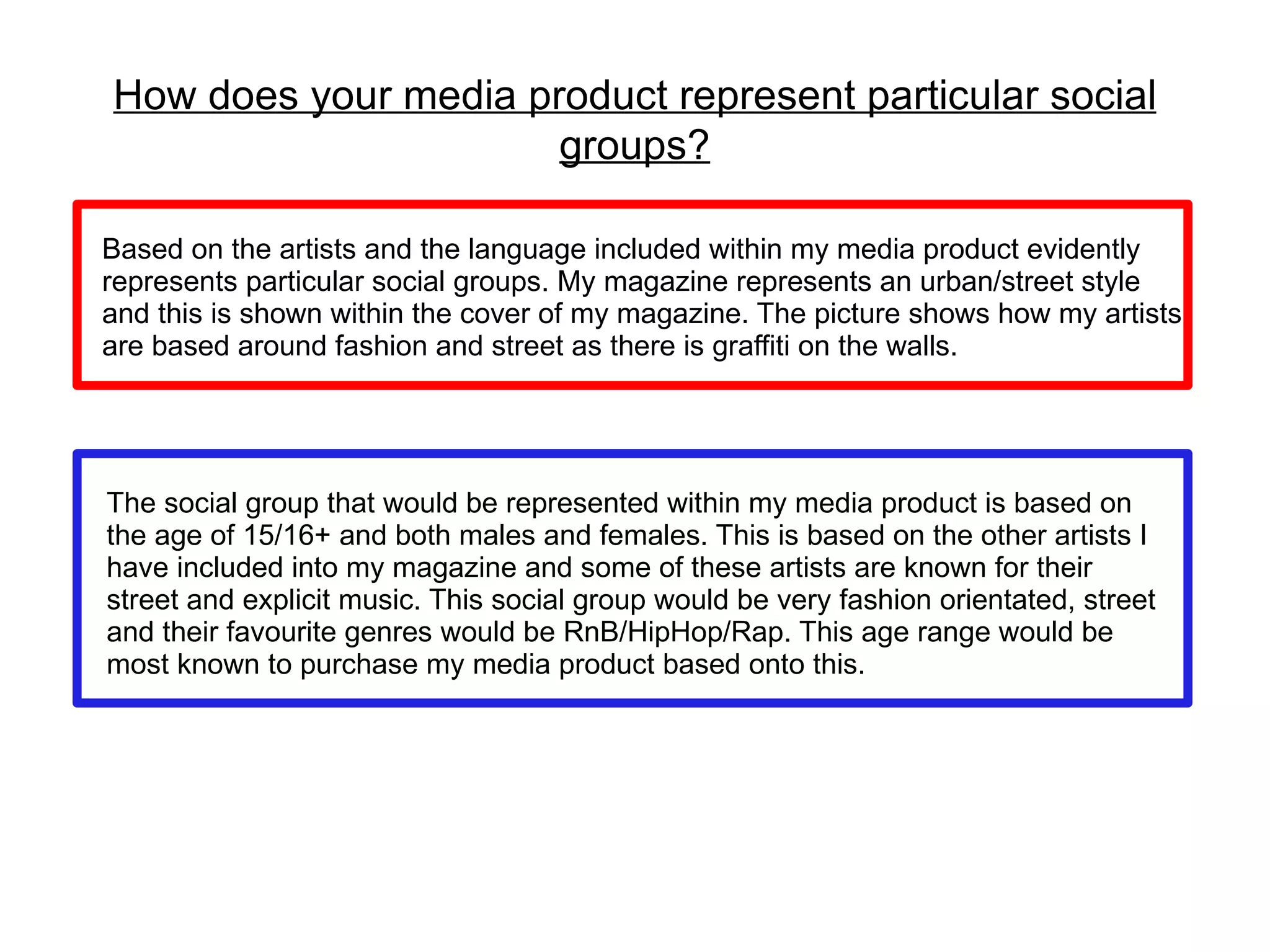
- The target audience is ages 15+ of both genders. Artists featured represent a variety of ethnicities to avoid stereotypes.
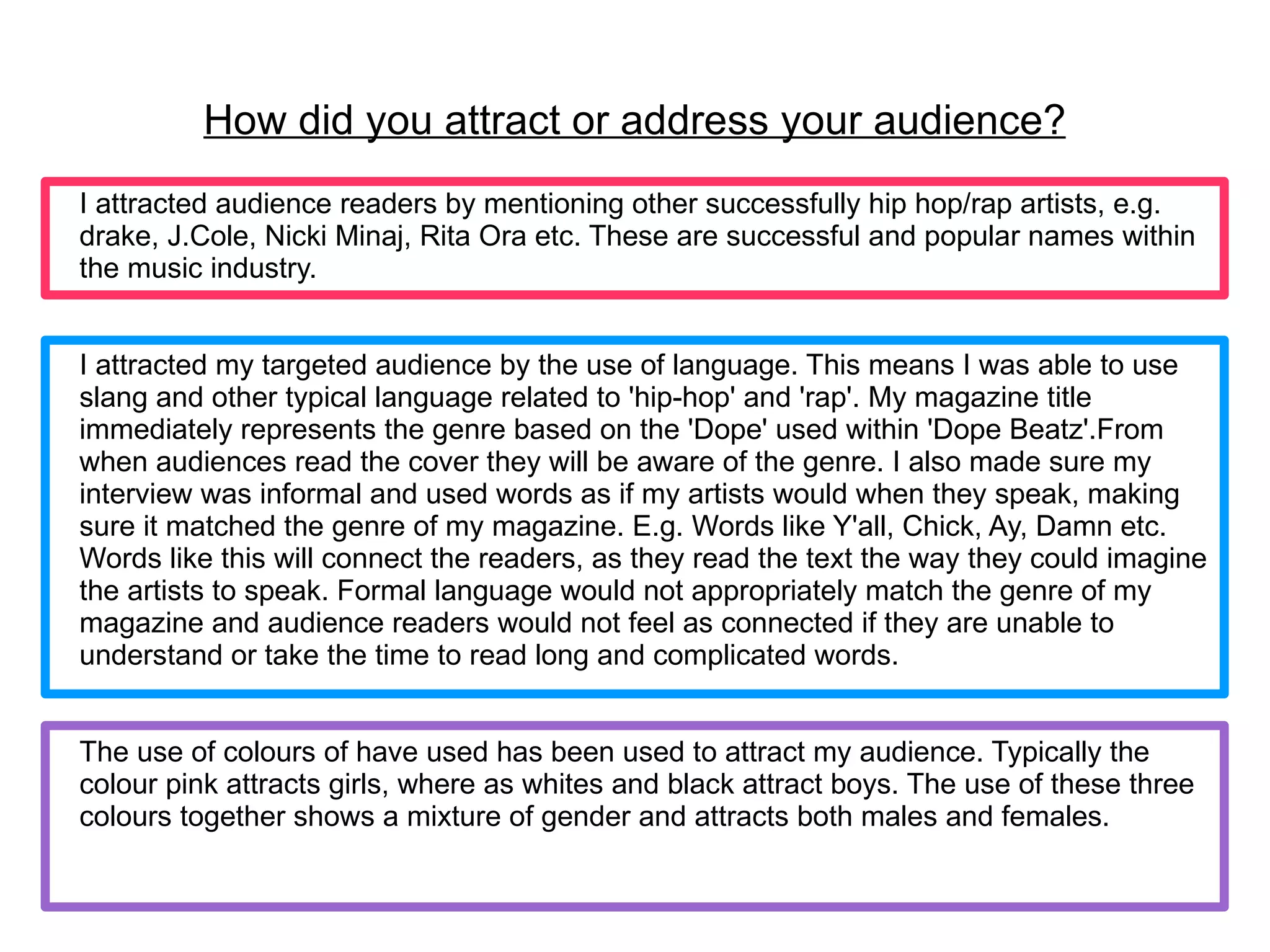
- Language, colors, and fashion elements used attract the target audience and represent the hip hop/rap genre.


![Media%20 evaluation%20questions[1]](https://cdn.slidesharecdn.com/ss_thumbnails/media20evaluation20questions1-120302063519-phpapp01-thumbnail.jpg?width=640&height=640&fit=bounds)


