The document discusses how the author attracted and addressed their target audience of 16-24 year olds for their indie music magazine "Original". Key points:
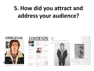
- Models and artists featured were within the target age range to be relevant.
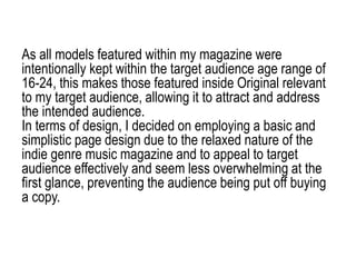
- Page design was simple and basic to appeal to the target audience and indie genre.
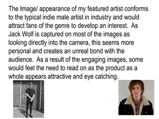
- Images of the featured artist created a personal bond and engaged the audience visually.
- Styling and appearances of models conformed to typical indie styles to attract fans of the genre.
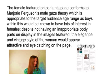
- Font, layout, colors and visual elements on the cover were designed to stand out and attract attention on store shelves.
- Language, tone and content were crafted to effectively engage and