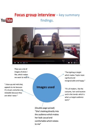
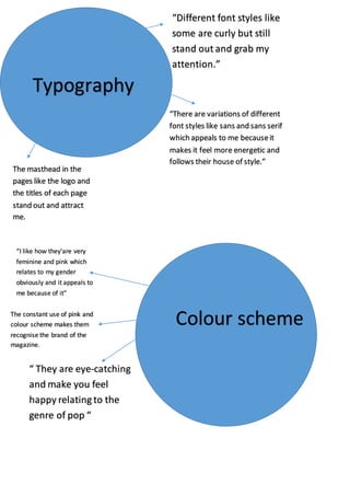
Focus group interview – key summary
findings.
Images used
“ close up and mid shot,
appeals to me because
it’s visual, costumes are
relatable because they
are what I wear.”
“The lighting is bright
which makes Taylor more
signfcant and
recognaisable and happy.”
“It’s all modern, like the
costume, hair and location
and in the trends which is
what us target audience
want.”
They use a lot of
images of atists I
like, which makes
me want to read it.
(Double-pagespread)
“She’s looking directly into
the audience which makes
her look casualand
comfortable which relates
to me”
Typography
“Different font styles like
some are curly but still
stand out and grab my
attention.”
The masthead in the
pages like the logo and
the titles of each page
stand out and attract
me.
“There are variations of different
font styles like sans and sans serif
which appeals to me becauseit
makes it feel more energetic and
follows their house of style.”
Colour scheme
“I like how they'are very
feminine and pink which
relates to my gender
obviously and it appeals to
me because of it”
“ They are eye-catching
and make you feel
happy relating to the
genre of pop “
The constant use of pink and
colour scheme makes them
recognise the brand of the
magazine.
Layout
I like the layout,
because you don’t get
confused on whereI
should start reading.
Itmakes everything stand out, though
there’s a randomfeature on bottom
right of the front cover that is not
coventional and annoys me as a reader
because, it doesn’tlook right.
“It’s ordered which is
what I can relate to,
because I like it.”
Mode of address
I like the use of informal
language because it relates
to me because of my age
and the way I think about
things.
Informal language
helps to make
them understand
which intrgues
them.
“ A lot of informal
elements, and a few
formal elements like We
promise to.. which relates
to us as a target audience
aswell and the house of
style.”

Focus group key summary

  • 1.
    Focus group interview– key summary findings. Images used “ close up and mid shot, appeals to me because it’s visual, costumes are relatable because they are what I wear.” “The lighting is bright which makes Taylor more signfcant and recognaisable and happy.” “It’s all modern, like the costume, hair and location and in the trends which is what us target audience want.” They use a lot of images of atists I like, which makes me want to read it. (Double-pagespread) “She’s looking directly into the audience which makes her look casualand comfortable which relates to me”
  • 2.
    Typography “Different font styleslike some are curly but still stand out and grab my attention.” The masthead in the pages like the logo and the titles of each page stand out and attract me. “There are variations of different font styles like sans and sans serif which appeals to me becauseit makes it feel more energetic and follows their house of style.” Colour scheme “I like how they'are very feminine and pink which relates to my gender obviously and it appeals to me because of it” “ They are eye-catching and make you feel happy relating to the genre of pop “ The constant use of pink and colour scheme makes them recognise the brand of the magazine.
  • 3.
    Layout I like thelayout, because you don’t get confused on whereI should start reading. Itmakes everything stand out, though there’s a randomfeature on bottom right of the front cover that is not coventional and annoys me as a reader because, it doesn’tlook right. “It’s ordered which is what I can relate to, because I like it.” Mode of address I like the use of informal language because it relates to me because of my age and the way I think about things. Informal language helps to make them understand which intrgues them. “ A lot of informal elements, and a few formal elements like We promise to.. which relates to us as a target audience aswell and the house of style.”