This document discusses the importance of usability and aesthetics in design. It summarizes Donald Norman's view that usability need not conflict with aesthetics, and that designers must find a harmony between the two. The document then provides examples of design principles from Norman's book "The Design of Everyday Things", such as visibility, affordances, mapping, constraints, and feedback. It emphasizes that good design should follow these principles to ensure intuitive use, rather than violating them for aesthetic reasons. The document concludes by outlining iterative and user-centered design processes that focus on learning through creation and reworking.
A lightening speed introduction to the world of digital design. Targeted at people from graphic design, advertising or marketing backgrounds who are looking to make the transition into the digital design world.
Design tenets: One Step closer to a pixel perfect experiencePetr Stedry
This presentation will tell you:
- what design tenets are
- when and why use them
- how co create your own tenets
This version was user on the UX Camp Europe 2011 in Berlin at June 11.
Less, But Better - Dieter Rams' Principles of Good Design3Pillar Global
A presentation from 3Pillar Senior UX Designer David Rhyne on Dieter Rams' 10 Principles of Good Design. Among the principles put forward by Rams as most important to design are that it is innovative and makes a product useful and understandable.
Developers, you're designing experiences (and you didn't even know it)P.J. Onori
Designers are from Venus, developers are from Mars. For far too long, the two groups have had difficulties working together. At best, it is dysfunctional, at worst, impossible. In return, we have been drowned in a sea of horrible products.
Great experiences come from design and technology working together to complement each other. In this presentation, the focus in on how developers can be integrated into the design process earlier and more effectively.
1 Pixel to the Left: Why Visual Design Details MatterEmily Rawitsch
Although we have all heard someone passionately declare, “UX is not UI,” visual design is a fundamental part of the user experience. Good design is in the details. It builds trust. It creates hierarchy of information. It makes buttons look clickable. It has the power to transform a functional experience into a delightful experience.
So how we can ensure that the visual details we design are brought to life as intended? Can moving an object 1 pixel to the left really make a difference? In an attempt to find a common language between designers and developers, we will discuss what details are worth fighting for versus when to let go.
Good design is a myth - Zoltan Kollin @ UX Cambridge 2017 & UX Scotland 2017Zoltan Kollin
Everyone agrees that well-designed products are intuitive, simple, clean, honest, innovative...except when they're not. It's not the design principles that matter the most - it's the users.
In this session I'll show how focusing on the users' needs might end up with you creating amazing products even when it sometimes means barbarously breaking widely accepted design guidelines.
Pulling Rabbits Out of Your Ass - UX Design FundamentalsCiprian Pălici
This is a presentation I did a few years ago for a student organization about the the fundamentals of User Experience Design. It was meant to be funny and the drawings were done using an iPad and my fingers, in order to illustrate the idea that Tools Don't Matter :)
Good design is... a myth - Zoltan Kollin - UX Copenhagen 2017Zoltan Kollin
There is no good recipe for great design. Environments, technology, and sometimes even users are constantly changing. Context is everything, and these days, you need more than generic guidelines to define good products. This talk is about how product designers are sometimes “breaking” all guidelines and principles, but still end up creating successful products that users love.
Data Visualization & Design with School of DataSchool of Data
We all know data presentation (visualization) plays a large part in our School of Data workshops as a fundamental aspect of the data pipeline. But how do you know that, beyond using D3 or the latest dataviz app, you are helping people actually communicate visually?
The guest of this skillshare was Code for South Africa/School of Data Fellow, Hannah Williams
Schoolofdata.org
Okfn.org
http://code4sa.org/
Date: Thursday (Sept. 25, 2014)
www.hannahwilliams.co.za
hello@hannahwilliams.co.za
In this brief talk we analyse different type of leadership styles and focusing on authoritarian (fear & pressure) style we analyse its effects on a software development team and on the project dynamics & delivery.
WORKSHOP: Making the World Easier with Interaction DesignCheryl Platz
An updated version of an Intro to Interaction Design workshop I've taught intermittently since 2012. Intended age level is middle to high school age students, but is also appropriate for adults curious about the field.
The first portion (excluding the optional heuristic review) can be taught, though tight, in approximately 90 minutes. With the optional second portion, allocate a minimum of 2 hours. More time allows for better discussion and perhaps expansion of the sketching into some flows. See the back of the deck for additional instructor notes.
Recommended materials:
Printer paper (~5 sheets per student minimum)
Pencils and erasers
I have delivered this workshop to over 500 students:
Amazon GirlsWhoCode Camp - 2015
Microsoft DigiGirlz Camp (Redmond) - 2012, 2013, 2014
UW's Dawgbytes Camp - 2012
For a blog post about the pilot sessions in 2012, as well as some examples from student sketches, see http://blog.cherylplatz.com/?p=181
To inquire about booking me to teach this workshop in your environment, email cheryl@cherylplatz.com.
If you want to learn more about emotional design, check out our Skillshare course: http://skl.sh/1jqYHZ5
This talk has been presented at:
- UXPA 2015
- SoCal UX Camp 2015
- SDXD September Meetup
- Zillow Speaker Series
I created this pack of slides to lead a workshop on Design Thinking - mostly problem identification and solution generation - for the "URBAN DATA SCIENCE BOOTCAMP", a professional school crash-course on how the science of urban data can be applied to solve metropolitan issues. The course was held both in Milan and Amsterdam.
Feel free to contact me to know more, or invite me over to run it.
This course was organized for the CrowdInsights project (crowdinsights.eu), though my workshop and its slides are being continuously edited and improved (tested already 5-6 times on university and high school students, and adults from both public and private sectors).
Indonesia Digital Landscape Study 2012 by IdeosourceAndi Boediman
Indonesia Digital Landscape Study 2012 is a document to understand about Indonesian mobile and Internet potential.
Ideosource is a venture capital for Indonesian startup focusing on content, media, ecommerce and its digital infrastructure.
You don’t have to be a gaming company to develop VR/360 content for brands and business. Vote for this SXSW workshop and get the scoping and technical knowledge to start creating content and compete in the exploding VR/360 space.
Investing in Brazil and Russia - Fabrice GrindaLe Web
The Trials and Tribulations of Angel Investing in Brazil, Russia and around the world
Fabrice Grinda's video at LeWeb 2011: http://youtu.be/EvfyUb42tuc
And his blog : http://www.fabricegrinda.com
Blink tends to win its pitches for creative campaigns and online strategies. We came to a set of best practices and formed these into a set of rules which we follow. Everytime. We want to share some of our secrets with you. Just ad genius people, a creative spirit (and to utmost secret rules).
Er is een reden waarom Blink pitches wint. We hebben namelijk onze eigen regels en door de practices te verzamelen. Alle sexy voorbeelden (en 2 regels) delen we natuurlijk niet. Dat zijn tenslotte onze gouden eieren. Maar, ben je uitgenodigd om te pitchen dan is dit een best handig spiekblaadje. Vooral als je tegen Blink mag pitchen &;-)
This is a presentation regarding the main point of Malcolm Gladwell's book, "The Tipping Point." I added a little Halloween flair since we presented a few days before the candy-laden holiday.
Title page created by me in Adobe Photoshop CS6. I'm the zombie in the middle up top.
USeful extracts from the amazing book 'The tipping Point'.
If you are starting a new venture, you will love this.
Please give me feedback at nsnarang@gmail.com
A Short Journey to Discover Yourself .Talk to yourself and find your life purpose in order to achieve real happiness.Find your Life Purpose-Discover Yourself (A Short Motivational Slideshow to Discover Yourself )
Interface Design Concepts and Planning: 532 lecture 2Don Stanley
We talk about the importance to analyzing and studying interface design for a research prospective. Great/Effective Design starts with research. Think like a detective and anthropologist of your audiences and you plan your site. Once you are done with the planning, use Design CRAP to create interfaces that communicate and guide your viewers.
Usability vs Design – When Does One Trump the Other? AI (Alexander Interactiv...Josh Levine
I recently presented at the Internet Retailer Web Design Conference (IRWD) down in Orlando (Feb 13). The topic was "How to achieve harmony between usability and design". Special thanks to Jordan Lustig, from Saks Fifth Avenue, for joining me up on stage. We had a great time. Thank you all for joining us!
Talk at the UAlberta Students Design Association onDesign series about user experience, what it is, and how upcoming visual and industrial designers can get involved in UX.
A short introductory presentation on User Experience and it's importance to Consumers. Briefly touching the different aspects of User Experience, from general Rule of Thumbs in User Experience Design to more in-depth concepts such as Lean UX and Holistic Design.
Wireframes are an important step in the creative process & Design Thinking. It's one of the first times that your team actually sees the product come together. The presentation explores the basics of wireframes and how they fit into the process of Human-centered Design.
This deck was part of workshop held by General Assembly on the Intro to Wireframing on 2-10-2015
Design Principles: The Philosophy of UXWhitney Hess
The visual principles of harmony, unity, contrast, emphasis, variety, balance, proportion, repetition, texture and movement (and others) are widely recognized and practiced, even when they aren’t formally articulated. But creating a good design doesn’t automatically mean creating a good experience.
In order for us to cultivate positive experiences for our users, we need to establish a set of guiding principles for experience design. Guiding principles are the broad philosophy or fundamental beliefs that steer an organization, team or individual’s decision making, irrespective of the project goals, constraints, or resources.
Whitney will share a universally-applicable set of experience design principles that we should all strive to follow, and will explore how you can create and use your own guiding principles to take your site or product to the next level.
The elements of product success for designers and developersNick Myers
All software, whether it's for consumers or workers, needs to meet the ever growing demands people have in today’s world. Greater user expectations and influence are forcing companies to create and deliver better products, but not every organization has a rich heritage in software creation like tech giants Apple and Google. Most companies need to be more customer-focused, become design specialists, and transform their cultures as they shift to become both software makers and innovators.
Myers, head of design services at Cooper, will share the elements of product success that companies need to possess and be market leaders: user insight, design, and organization. Myers will share principles and techniques that successful innovative companies use to truly understand their customers. He’ll also discuss the methods effective designers use to support their customers and create breakthrough ideas and delightful experiences. And he’ll finish by sharing the magic formula organizations need to deliver ground-breaking experiences to market.
This talk was given at UX Day.
D4D Boston 2010: Great Design - Why It's Important and How to Achieve ItJared Ponchot
This presentation was given at Drupal Design Camp Boston 2010. It covers a brief definition of design, some examples of why it's so important, and some tips for how to produce great design.
This presentation was revised/improved/enhanced for DCATL so check that out here: http://www.slideshare.net/jponch/dcatl-2010-the-importance-of-great-design
Web usability is about making a website easy to use and this presentation is from our workshop on the topic based on Steve Krug's book don't make me think.
Stickiness factor of a product starts from its own DNA, which is the quality offering. Then comes the differentiation which is introduced by innovation. Storytelling is often used to engage consumer. A case study of Blue Band, Walls and many others.
Is Design a Profitable Business? And how design business should be modelled?
Being RESPONSIBLE is a designer's passion, and the three other things to be understood that design has potential to be a good busines are: PROFITABLE, SUSTAINABLE and SCALABLE.
Use a new media mix to maximize your Return on Investment
Use social media as part of media mix and combine with conventional media
Understand your target market and involve them to co-create your brand
Bali – international gateway for Indonesia creative industryAndi Boediman
Bali is a true destination brand. And Bali can become a brand by itself. This presentation explore the thesis why Bali is potentially can become the gateway for Indonesia creative industry.
Digital Studio College - School of Visual Communication The pioneer in creative education, offering international program in design, animation and filmmaking
Between Filth and Fortune- Urban Cattle Foraging Realities by Devi S Nair, An...Mansi Shah
This study examines cattle rearing in urban and rural settings, focusing on milk production and consumption. By exploring a case in Ahmedabad, it highlights the challenges and processes in dairy farming across different environments, emphasising the need for sustainable practices and the essential role of milk in daily consumption.
7 Alternatives to Bullet Points in PowerPointAlvis Oh
So you tried all the ways to beautify your bullet points on your pitch deck but it just got way uglier. These points are supposed to be memorable and leave a lasting impression on your audience. With these tips, you'll no longer have to spend so much time thinking how you should present your pointers.
Unleash Your Inner Demon with the "Let's Summon Demons" T-Shirt. Calling all fans of dark humor and edgy fashion! The "Let's Summon Demons" t-shirt is a unique way to express yourself and turn heads.
https://dribbble.com/shots/24253051-Let-s-Summon-Demons-Shirt
Can AI do good? at 'offtheCanvas' India HCI preludeAlan Dix
Invited talk at 'offtheCanvas' IndiaHCI prelude, 29th June 2024.
https://www.alandix.com/academic/talks/offtheCanvas-IndiaHCI2024/
The world is being changed fundamentally by AI and we are constantly faced with newspaper headlines about its harmful effects. However, there is also the potential to both ameliorate theses harms and use the new abilities of AI to transform society for the good. Can you make the difference?
Dive into the innovative world of smart garages with our insightful presentation, "Exploring the Future of Smart Garages." This comprehensive guide covers the latest advancements in garage technology, including automated systems, smart security features, energy efficiency solutions, and seamless integration with smart home ecosystems. Learn how these technologies are transforming traditional garages into high-tech, efficient spaces that enhance convenience, safety, and sustainability.
Ideal for homeowners, tech enthusiasts, and industry professionals, this presentation provides valuable insights into the trends, benefits, and future developments in smart garage technology. Stay ahead of the curve with our expert analysis and practical tips on implementing smart garage solutions.
You could be a professional graphic designer and still make mistakes. There is always the possibility of human error. On the other hand if you’re not a designer, the chances of making some common graphic design mistakes are even higher. Because you don’t know what you don’t know. That’s where this blog comes in. To make your job easier and help you create better designs, we have put together a list of common graphic design mistakes that you need to avoid.
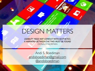
1. DESIGN MATTERS
USABILITY NEED NOT CONFLICT WITH AESTHETICS.
A HARMONY BETWEEN THE TWO MUST BE FOUND
DONALD NORMAN
Andi S. Boediman
andisboediman@gmail.com
@andisboediman
9. MENTAL MODEL
mental models are
what people really
have in their heads
and what guides
their use of things.
10. PRINCIPLES OF DESIGN
• Make things visible
• Provide a good conceptual model
• Affordance
• Mapping
• Constraints
• Feedback
11. VISIBILITY
Just by looking the user should know the
state of the system & possible actions
The correct parts must be visible and they
must convey the correct message.
Visibility problems occur when clues are
lacking or exist in excess
Don’t violate these principles to make
something “look good”!
12. AFFORDANCE
Just by looking at the object, a user should
know how to use it.
Make the appropriate actions visible and
make the inappropriate actions invisible.
13. MAPPING
Controls and displays should exploit
natural mapping.
Natural mapping takes advantage of
physical analogies and cultural standards.
Physical: Steering wheel
Cultural: red means stop, green means go.
14. CONSTRAINTS
Constraints limit the ways in which
something can be used.
Ensure correct procedure by making it
impossible to do otherwise.
15. FEEDBACK
Feedback are clues given to the user that
they have been successful
Good design contains feedback
17. ITERATIVE DESIGN
“Iterating is designing and, more specifically,
understanding what one is designing through actually
creating it. . . . Iterative design also means that until
you have actually built what you are designing, you are
not going to be able to fully understand it.
--Anders Ramsay, http://www.andersramsay.com/2009/03/01/three-reasons-to-start-
designing-iteratively
“learning by creating”
“learning by reworking”