EXPLORA x Pepperclip - Visualization
•
0 likes•265 views

Cours du 22 septembre 2016 @EDHEC Lille pour Explora Digital Certificate

Recommended
More Related Content
What's hot
What's hot (20)
Similar to EXPLORA x Pepperclip - Visualization
Similar to EXPLORA x Pepperclip - Visualization (20)
More from Dorian Dawance
Recently uploaded
Recently uploaded (20)
EXPLORA x Pepperclip - Visualization
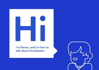
- 1. HiI’m Dorian, and I’m here to talk about Visualization
- 2. Visualization? Wait, why should I care?Wait, why should I care?
- 3. It’s not really about ugly or pretty HINT
- 4. Raw information Why so much hate?Why so much hate?
- 5. Thank God for interns!Thank God for interns!
- 6. Got it, let’s rule the world Got it, let’s rule the world
- 7. It’s about transmitting ideas to an audience But there’s a twistBut there’s a twist
- 8. Visualization is a bit like non-verbal communication
- 9. Design is important And you don’t need to be a designer to care And you don’t need to be a designer to care Today’s obvious slide :
- 10. Design is what brings ideas to life
- 11. Why me? 4 commonplaces you should forget right away Methodology advice Bonus tips & resources On the menu today
- 12. Prepa Business School ? That’s destinyThat’s destiny
- 13. … + internships That’s lifeThat’s life
- 14. DESIGN EVERYWHERE But no design school…
- 16. 4 commonplaces you should forget right now
- 19. Example 1- One Dollar Shave Club Ideas mean nothing
- 20. Ideas mean nothing Execution is everything
- 21. Countless executions of the same idea Countless executions of the same idea
- 22. Ideas mean nothing What takes time and makes a business unique is HOW , not what, not why… MY CONVICTION
- 26. Copying is good for you
- 27. Copying is good for you Don’t worry about « original » ideas Don’t worry about legitimacy COPY / COMBINE / TRANSFORM MY CONVICTION
- 28. Copying is good for you Good artists copy, great artists steal Good artists copy, great artists steal That’s Pablo, not Escobar >
- 30. Cute but not so cute
- 31. But with a true personnality fun, surprising, really different from what you expect
- 32. It can work
- 34. Cute but not so cute Old and with « traditions »
- 36. But the logo design is not what makes their success Their branding is somewhere else
- 40. Branding is not a logo it’s what people say about you MY CONVICTION
- 41. Branding is not a logo Je suis le meilleur Croyez-moi, c’est le meilleur Je suis le meilleur Je suis le meilleurJe suis le meilleur Je suis le meilleur Je comprends que tu es le meilleur Marketing RP Publicité Branding
- 44. MY CONVICTION Good design is often design you don’t notice
- 45. Good design is invisible
- 46. Good design is invisible
- 47. Let’s recap 1. Ideas mean nothing, execution is what makes the difference 2. Copying is good 3. Branding is personality, not logo 4. Design is visible AND invisible
- 48. Visualization 101 Design with no design education, no money, no team, no woman, no cry
- 49. Let’s start with a bit of Methodology
- 51. Methodology Look for what has been done well / poorly by others and skip as much of the exploration as possible second mover advantage
- 52. Methodology
- 55. Methodology Keep in mind for which audience you are designing format medium platform objective
- 56. Methodology content needs to be tailored & relevant
- 57. What about the medium Bonus Always wonder why you choose a medium over another Always wonder why you choose a medium over another Book / Magazine / app / website / text service / Restaurant…
- 60. Methodology If you need to say too much… it’s probably because your proposition is too weak
- 61. Methodology 90+ words 4 colors 3 visuals 90+ words 4 colors 3 visuals 40 words 2 colors 1 picture 40 words 2 colors 1 picture
- 62. Methodology It’s always better to have people ask for more than have them overdose A good way to figure out if it’s too much A good way to figure out if it’s too much
- 63. Methodology Simplicity is the ultimate sophistication Simplicity is the ultimate sophistication That’s Leo, not Di Caprio >
- 64. Methodology Keep It Stupid Simple You would be amazed how stupid users can be… You would be amazed how stupid users can be… Minimum distraction, maximum simplicity
- 65. Methodology Minimize decision making for the user Hick’s lawHick’s law more choices = longer decision = higher abort rate
- 66. Methodology
- 68. Methodology Avoid generic visuals as much as you can Your visuals need to echo the spirit of your project and be consistent throughout the experience
- 71. Make it easy to digest
- 72. Methodology Oldie but goodieOldie but goodie fr.slideshare.net/jessedee/steal-this-presentation-5038209
- 73. Methodology IN A NUTSHELL (1/2) • Killer Opening slide • Stick with a color scheme (and a couple of fonts max) • Use quality imagery (or none at all) > quality meaning hi-def and when possible relevant / genuine (If you need to show graphs / tables > explain what you’re supposed to see) • Avoid overdose (try to avoid >30% text)
- 74. Methodology IN A NUTSHELL (2/2) CRAP acronym : Contrast Repetition Alignment Proximity Padding, whitespace… Stick with a layout if it works (habituation)Stick with a layout if it works (habituation) Elements that go together should be togetherElements that go together should be together
- 75. Pitchdeck Ok MyloPitchdeck Ok Mylo
- 77. Graphic guidelines or UX ? Bonus#1
- 78. Crafting the identity of the project / STYLESCAPES / GRAPHIC GUIDELINES Document guidelines of visual identity to insure brand consistency in a variety of contexts MINIMUM VERSION Logo Colors Typographies
- 79. Crafting the identity of the project / CHOOSING TYPOGRAPHIES A typography with a strong personality A more neutral typography with at least 2 weights 2 to 3 max !2 to 3 max ! For body copy and good legibility For body copy and good legibility For headings, titles and attribution For headings, titles and attribution Serif : use to be for print Sans-serif : use to be for displays
- 80. Crafting the identity of the project / EXPLORA by edhec Explora by Edhec is a Disruptive and Fast-track Digital Training co-designed with Blue Chip Digital Companies and Start-up EXAMPLE
- 81. Crafting the identity of the project / WHERE TO FIND TYPOGRAPHIES fonts.google.com fontsquirrel.com dafont.com behance.net freebiesbug.com graphicburger.com adobe typekit HOW TO KNOW WHICH FONTS TO MATCH fontsinuse.com typewolf.com fontface.ninja
- 82. Crafting the identity of the project / CHOOSING COLORS Select a maximum of 2 colors (black/ white and grey not being colors) you’ll use variations of those colors if more colors are really needed More than 2 = school science fair More than 2 = school science fair Try one main and one « accent » Try one main and one « accent »
- 83. Crafting the identity of the project / COLOR PSYCHOLOGY harmony / rest / passivity / infinity / performance cold / melancholy / friendly / peaceful… hope / tolerance / nature / health / youth trust / fresh / toxic ... passion / love / strength / courage / warmth / joy / hate / danger / wrath / erotism ... Do not overthink… but do not ignore! It’s all about context /culture… Do not overthink… but do not ignore! It’s all about context /culture…
- 84. Crafting the identity of the project / HOW TO KNOW WHICH COLORS TO USE / MATCH color.adobe.com dribbble.com colourlovers.com/palettes/most-loved/all-time/meta chrome inspector
- 85. Crafting the identity of the project / CRAFTING A LOGO Think about : Context Legibility Differenciation . . . Originality
- 86. Crafting the identity of the project / DIFFERENT TYPES OF LOGOS
- 87. Crafting the identity of the project / CRAFTING YOUR LOGO Search for inspiration, copy, combine, transform. In case you don’t know where to begin, you can start with 3 options : TYPO / CALK / ICON / ABSTRACT
- 88. Crafting the identity of the project / EXAMPLES 3 letters overlapping in a serif font Redraw of an archive box from a picture Abstract version of a sunrise (just a circle w/ gradient + cut out lines to symbolise water ripples)
- 89. Crafting the identity of the project / SEARCHING FOR VISUAL IDEAS dribbble.com behance.net ---- thenounproject.com tailorbrands.com HAVE SOMEONE DO THE WORK HAVE A ROBOT DO THE WORK dribbble.com behance.net --- fiverr.com creativemarket.com market.envato.com
- 90. UX tips Bonus#2
- 91. Crafting a product / Sketch or mockup as QUICKLY as you can You don’t really know what you’re doing until it’s done… You don’t really know what you’re doing until it’s done…
- 92. Crafting a product Start thinking in terms of funnels & user stories If your product is made for one purpose, each step should be a step towards expected goal
- 93. Crafting a product Measure where users encounter problems or quit the funnel Measure where users encounter problems or quit the funnel Study your usersStudy your users
- 95. Crafting a product / Be aware of UX patterns Safe Exploration Instant Gratification Satisficing Changes in Midstream Deferred Choices Incremental Construction Habituation Microbreaks Spatial Memory Prospective Memory Streamlined Repetition Keyboard Only Other People’s Advice Personal Recommendations EXAMPLES OF BEHAVIORAL PATTERNS + FUNCTIONAL PATTERNS + COGNITIVE PATTERNS How things workHow things work How your brain worksHow your brain works
- 96. Crafting a product / pttrns.com nicelydone.club GETTING INSPIRATION uxpin.com/studio/ ui-patterns.com/patterns LEARN MORE ABOUT UI - UX marvelapp.com invision.com popapp.in CRAFT PROTOTYPES (NO CODE) ui8.net/categories/ui-kits pixelbuddha.net/freebies/tag/ui-kits START FROM A KIT
- 97. Crafting a product / Always track what your users do particularly at the beginning And no matter whatAnd no matter what google analytics / mixpanel / amplitude
- 99. Resources recap / Find nice color palettes & freelancers for hire dribbble.com Find nice typography & freelancers behance.net
- 100. Code & design freebies freebiesbug.com Design & mockup freebies graphicburger.com
- 101. Where to learn how to use Photoshop / Illustrator etc. design.tutsplus.com & youtube.com Where to learn about UI and UX uxpin.com/studio
- 102. List of resources organized by type : cmd-t.webydo.com/75-of-the-best-resources-for-web- designers-98208e8709a#.ypmy0ayg9