“Going all the way to the edge is the only way to jolt
the user into noticing what you’ve done. If they notice
you, they’re one step closer to talking about you.”

                                       — SETH GODIN
Usability
Usability is about the
      ease of use of human-made objects.
This includes door knobs, spoons, washing machines,
and websites too.
Web Usability
•  Web usability is about making a website easy to use
    §  reducing unpleasantry as much as possible
    §  It’s not about fancy designs and shiny buttons, but about practical &
        efficient design.


•  A good web design should allow the users to get to what they want from the
   website as quickly and painlessly as possible.
 

           Steve Krug, author of  "Don't Make Me Think", the most highly
   recommended book on Web usability, outlines his first law of Web usability:


                  "Don't Make Me Think"
The less a user has
to think about
making a decision,
the easier it is for
them to use a
website.
Coming next in the slides…


      Some guiding principles w.r.t
Web Usability as outlined by Krug in his book
First law of web usability

DON’T MAKE ME THINK
The rule basically boils down to
making things self-evident
 
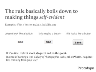
Examples: if it's a button make it look like one


doesn't look like a button     this maybe a button      this looks like a button


 If it's a title, make it short, eloquent and to-the-point.
 Instead of naming a link Gallery of Photographic Items, call it Photos. Requires
 less thinking from your user
Affordances
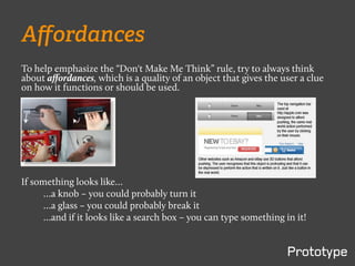
To help emphasize the “Don't Make Me Think” rule, try to always think
about affordances, which is a quality of an object that gives the user a clue
on how it functions or should be used.


If something looks like…
      …a knob – you could probably turn it
      …a glass – you could probably break it
      …and if it looks like a search box – you can type something in it!
No. 2

HOW WE REALLY
USE THE WEB
We don’t read. We scan.
  §    Our attention spans are not that great
  §    We're always in a hurry
  §    We're selective about what we want
  §    We know what's important to us
We satisfice
When given options we choose the
first immediately reasonable option
without giving much thought. We
don't consider all available options.
We muddle through
§    We don't figure out how things work
§    We don't usually read all instructions
§    We make assumptions – click around, and fill out
      boxes without really considering implications or
      accuracy of our actions or how things really work
Example:
Yahoo's search box – a survey revealed that people used to type
Web addresses into Yahoo's search box and it took them to their
desired location. They never considered that it was wrong or
changed how they accessed website because it simply worked.
To them, Yahoo was the Internet!
Designing pages for scanning, not reading

BILLBOARD DESIGN 101
Since we have established that people don't read but merely
scan pages, click around, and make assumptions, here are some
guidelines on designing for usability:

Create a clear visual hierarchy
    §    Examples: Prominence. Grouping (visual-logical connection).
    §    Nesting.

Take advantage of conventions
    §    Don't be too smart

Break pages up into clearly defined areas

Make it obvious what's clickable

Minimize noise (busy-ness and background noise)
No. 4

ANIMAL, VEGETABLE
OR MINERAL
It doesn't matter how many times I have to click, as
long as each click is a mindless, unambiguous choice.
•  Number of clicks VS click difficulty
•  Three easy clicks equal one difficult click
•  Users should not have to read endless instructions in order to find what
   they are looking for:
No. 5

OMIT NEEDLESS WORDS
Omit needless words
•  Get rid of half of the words on each page, then get
   rid of half of what's left.
•  Cut down Happy Talk & Instructions!
•  Benefits:
   –  easier to get to important content
   –  saves time
   –  makes the website more organized
   –  makes the website more approachable
No. 6

DESIGNING NAVIGATION
Designing Navigation
•    Navigation should be consistent
•    Inform the user of where they are
•    Inform the user of how they got to where they are
•    Define the bounds and what's available on the website in
     terms of content.
No. 7

DESIGNING THE HOMEPAGE
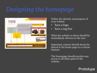
Designing the homepage
              Define the identity and purpose of
              your website
              •  have a logo
              •  have a tag line

              What the website is about should be
              immediately obvious to the user.

              Important content should always be
              placed in the home page in a concise
              manner.

              The homepage should provide easy
              access to all other parts of the
              website.
No. 8

THE FARMER AND THE COWMAN
SHOULD BE FRIENDS
Common Web design team arguments...
We're all web users, ergo personal preferences.
•  We tend to think that all Web users are like us.
•  Every person on the team has a different opinion on what makes a good
   design good, according to their own professional inclinations.
•  Hype culture VS craft culture
     –  Upper management, business development, etc. VS
        programmers and designers. The burden of executing
        promises provided by the hyper culture falls down to the craft
        culture.

•  Myth of the average user
     –  Every person is unique in their behavior.
•  Antidote to debates: testing.
     –    Asking whether most people like something is not the right
          approach to the solution. The question needs to be more
          contextual and relevant to the problem at hand and the
          intended target audience.
No. 9

USABILITY TESTING ON
10 CENTS A DAY
Focus groups VS usability tests
 §  Testing with outsiders is important
 §  Focus groups are good for getting initial feedback on abstract notions
     such as concept and feasibility of the website
 §   Little testing is better than no testing
 §  Testing early is better than testing late
 §  Testing early & often is more important than the type of users
 §  Testing is about getting informed insight
 §  Testing is iterative

How to do testing the affordable way
§  All that is needed is a PC, a person to conduct the test, a consenting
    test subject and some time

Measuring results
§  Implement feedback (taken in the form of notes and actual logged
    usage) from the users and then perform more tests
No. 10

USABILITY AS COMMON
COURTESY
The reservoir of goodwill
Every person has a reservoir of goodwill towards a brand - Making sure this
reservoir is full is important.

Decreasing goodwill
Hiding information, forcing users to your ways, asking for too much
information, fake niceties, making the user wait through splashes or intros,
looking sloppy and unprofessional.

Increasing goodwill
Make the things people want to do on your site obvious, be honest and
generous with information, make my life easier, put effort, have a FAQ
section, make errors recoverable, inform and apologize to the user if you
can't help them.
Types of usability testing
•  Heuristic Evaluation (inspection)

•  Prototype Testing (testing)

•  Card Sorting  (testing)

•  Usability Testing (testing)

•  Logging Actual Use (inquiry)

•  Focus Groups (inquiry)
                      ...and many more!
prototype-­‐interac,ve.com	
  

Web Usability July 2011

  • 2.
    “Going all theway to the edge is the only way to jolt the user into noticing what you’ve done. If they notice you, they’re one step closer to talking about you.” — SETH GODIN
  • 3.
    Usability Usability is aboutthe ease of use of human-made objects. This includes door knobs, spoons, washing machines, and websites too.
  • 4.
    Web Usability •  Webusability is about making a website easy to use §  reducing unpleasantry as much as possible §  It’s not about fancy designs and shiny buttons, but about practical & efficient design. •  A good web design should allow the users to get to what they want from the website as quickly and painlessly as possible.   Steve Krug, author of  "Don't Make Me Think", the most highly recommended book on Web usability, outlines his first law of Web usability: "Don't Make Me Think"
  • 5.
    The less auser has to think about making a decision, the easier it is for them to use a website.
  • 6.
    Coming next inthe slides… Some guiding principles w.r.t Web Usability as outlined by Krug in his book
  • 7.
    First law ofweb usability DON’T MAKE ME THINK
  • 8.
    The rule basicallyboils down to making things self-evident   Examples: if it's a button make it look like one doesn't look like a button this maybe a button this looks like a button If it's a title, make it short, eloquent and to-the-point. Instead of naming a link Gallery of Photographic Items, call it Photos. Requires less thinking from your user
  • 9.
    Affordances To help emphasizethe “Don't Make Me Think” rule, try to always think about affordances, which is a quality of an object that gives the user a clue on how it functions or should be used. If something looks like… …a knob – you could probably turn it …a glass – you could probably break it …and if it looks like a search box – you can type something in it!
  • 10.
    No. 2 HOW WEREALLY USE THE WEB
  • 11.
    We don’t read.We scan. §  Our attention spans are not that great §  We're always in a hurry §  We're selective about what we want §  We know what's important to us
  • 12.
    We satisfice When givenoptions we choose the first immediately reasonable option without giving much thought. We don't consider all available options.
  • 13.
    We muddle through §  We don't figure out how things work §  We don't usually read all instructions §  We make assumptions – click around, and fill out boxes without really considering implications or accuracy of our actions or how things really work Example: Yahoo's search box – a survey revealed that people used to type Web addresses into Yahoo's search box and it took them to their desired location. They never considered that it was wrong or changed how they accessed website because it simply worked. To them, Yahoo was the Internet!
  • 14.
    Designing pages forscanning, not reading BILLBOARD DESIGN 101
  • 15.
    Since we haveestablished that people don't read but merely scan pages, click around, and make assumptions, here are some guidelines on designing for usability: Create a clear visual hierarchy §  Examples: Prominence. Grouping (visual-logical connection). §  Nesting. Take advantage of conventions §  Don't be too smart Break pages up into clearly defined areas Make it obvious what's clickable Minimize noise (busy-ness and background noise)
  • 16.
  • 17.
    It doesn't matterhow many times I have to click, as long as each click is a mindless, unambiguous choice. •  Number of clicks VS click difficulty •  Three easy clicks equal one difficult click •  Users should not have to read endless instructions in order to find what they are looking for:
  • 18.
  • 19.
    Omit needless words • Get rid of half of the words on each page, then get rid of half of what's left. •  Cut down Happy Talk & Instructions! •  Benefits: –  easier to get to important content –  saves time –  makes the website more organized –  makes the website more approachable
  • 20.
  • 21.
    Designing Navigation •  Navigation should be consistent •  Inform the user of where they are •  Inform the user of how they got to where they are •  Define the bounds and what's available on the website in terms of content.
  • 22.
  • 23.
    Designing the homepage Define the identity and purpose of your website •  have a logo •  have a tag line What the website is about should be immediately obvious to the user. Important content should always be placed in the home page in a concise manner. The homepage should provide easy access to all other parts of the website.
  • 24.
    No. 8 THE FARMERAND THE COWMAN SHOULD BE FRIENDS
  • 25.
    Common Web designteam arguments... We're all web users, ergo personal preferences. •  We tend to think that all Web users are like us. •  Every person on the team has a different opinion on what makes a good design good, according to their own professional inclinations. •  Hype culture VS craft culture –  Upper management, business development, etc. VS programmers and designers. The burden of executing promises provided by the hyper culture falls down to the craft culture. •  Myth of the average user –  Every person is unique in their behavior. •  Antidote to debates: testing. –  Asking whether most people like something is not the right approach to the solution. The question needs to be more contextual and relevant to the problem at hand and the intended target audience.
  • 26.
    No. 9 USABILITY TESTINGON 10 CENTS A DAY
  • 27.
    Focus groups VSusability tests §  Testing with outsiders is important §  Focus groups are good for getting initial feedback on abstract notions such as concept and feasibility of the website §   Little testing is better than no testing §  Testing early is better than testing late §  Testing early & often is more important than the type of users §  Testing is about getting informed insight §  Testing is iterative How to do testing the affordable way §  All that is needed is a PC, a person to conduct the test, a consenting test subject and some time Measuring results §  Implement feedback (taken in the form of notes and actual logged usage) from the users and then perform more tests
  • 28.
    No. 10 USABILITY ASCOMMON COURTESY
  • 29.
    The reservoir ofgoodwill Every person has a reservoir of goodwill towards a brand - Making sure this reservoir is full is important. Decreasing goodwill Hiding information, forcing users to your ways, asking for too much information, fake niceties, making the user wait through splashes or intros, looking sloppy and unprofessional. Increasing goodwill Make the things people want to do on your site obvious, be honest and generous with information, make my life easier, put effort, have a FAQ section, make errors recoverable, inform and apologize to the user if you can't help them.
  • 30.
    Types of usabilitytesting •  Heuristic Evaluation (inspection) •  Prototype Testing (testing) •  Card Sorting  (testing) •  Usability Testing (testing) •  Logging Actual Use (inquiry) •  Focus Groups (inquiry) ...and many more!
  • 31.