Downloaded 73 times


![[email_address] http://amedee.be http://twitter.com/amedee http://be.linkedin.com/in/amedee http://facebook.com/amedee.vangasse](https://image.slidesharecdn.com/commonmistakesindatavisualization-091227035856-phpapp02/85/Common-Mistakes-In-Data-Visualization-9-320.jpg)


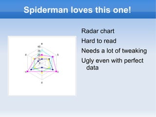
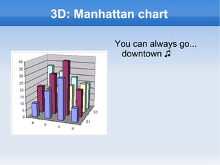
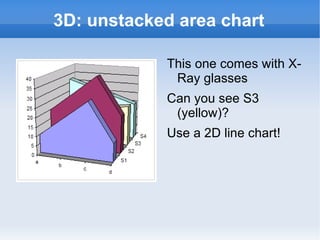


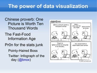
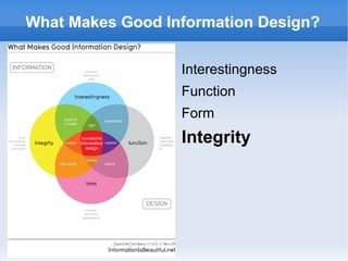
Common mistakes in data visualization include misusing pie charts, using misleading axes scales, and including unnecessary embellishments that obscure the data. Effective data visualization focuses on clearly communicating the key messages and considers the audience. Charts should use colors and scales appropriately and focus on conveying meaning over aesthetics. Proper preparation of data and understanding the limitations of visualization tools are important to avoid unintentionally misleading audiences.