Download to read offline

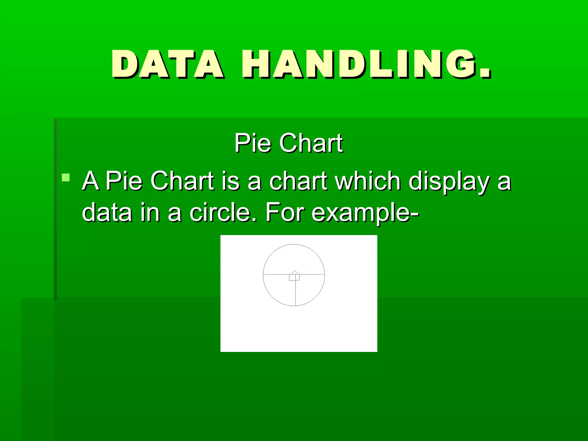
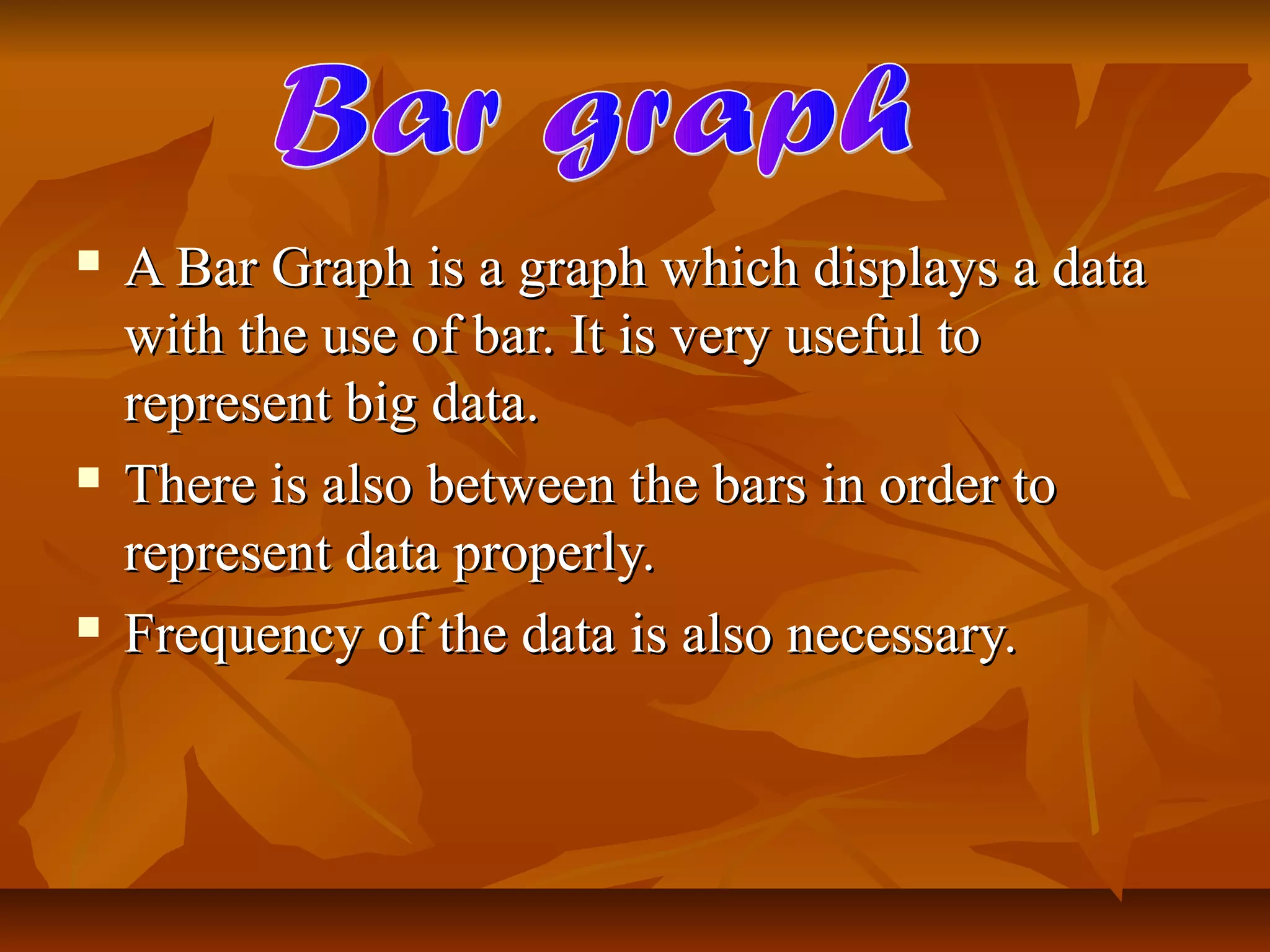
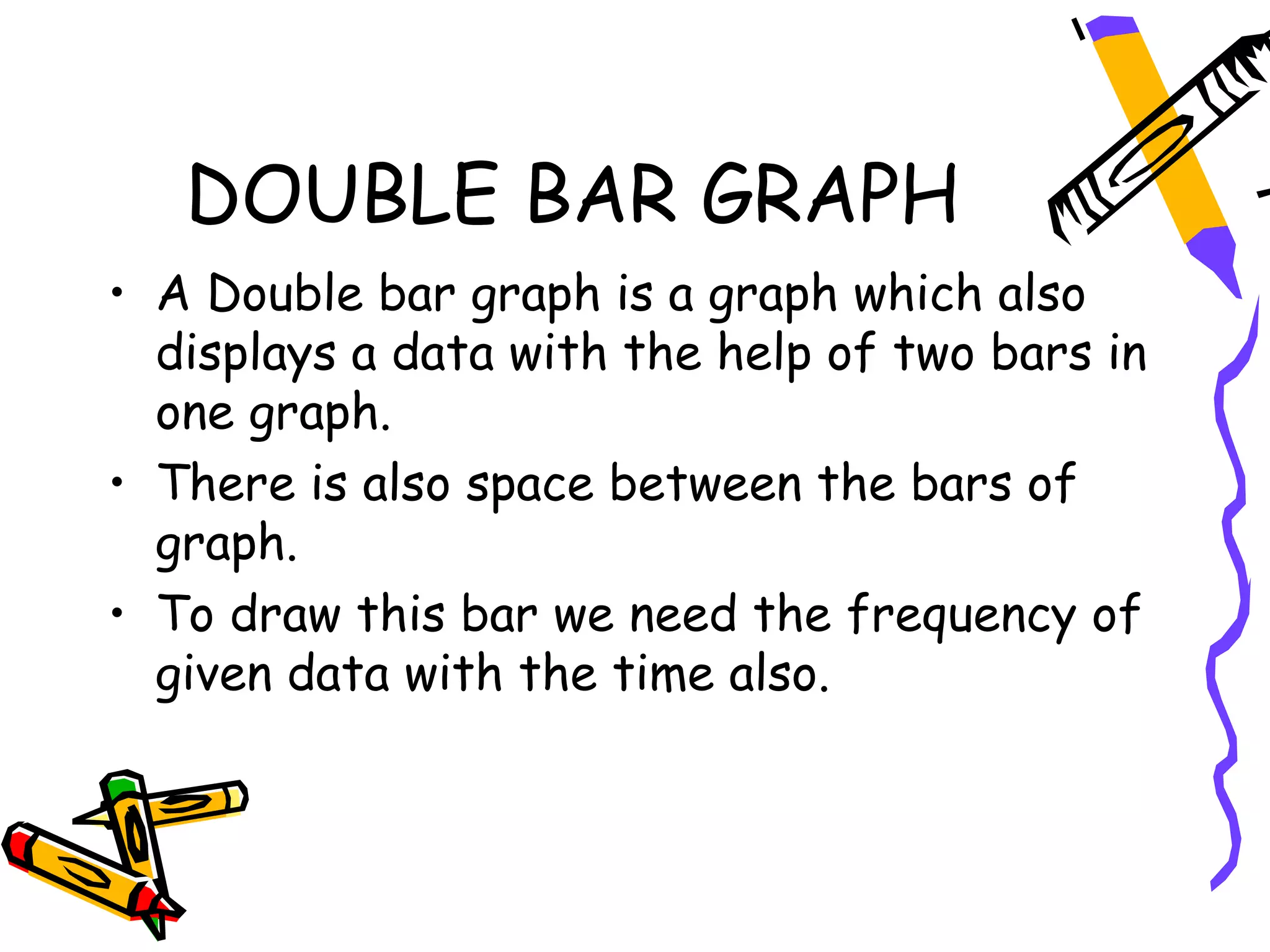


This document provides information about different types of charts used to visualize data including pie charts, bar graphs, double bar graphs, and histograms. It explains that pie charts display data in a circular format, bar graphs use bars to represent data with space between them, double bar graphs have two sets of bars to show data over time, and histograms use class intervals and frequency to represent data distribution with red lines indicating gaps between intervals.