Cover Analysis
•Download as DOCX, PDF•
0 likes•144 views
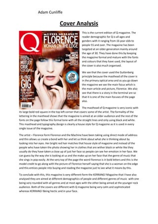
Q magazine targets readers aged 16 to 55, focusing on the 30-year-old demographic. The formal fonts and organized layout appeal to older readers. The cover follows design principles like placing the masthead in the primary optical area and featuring the main article. The large red masthead in a distinctive house style has appeared on every Q magazine issue. The cover portrait of Florence focuses closely on her emotive face to entice readers about her featured article and implied message that she is "a woman on the edge." In conclusion, Q magazine differs from Kerrang! in its older, calmer design targeting a broader audience versus Kerrang!'s younger rock fans.
Report
Share
Report
Share
Recommended
Task 1
Mojo is a UK music magazine first published in 1993 that focuses on rock and indie music. It has varying cover designs but always displays "free cd inside" to attract readers. The target audience is older male music fans interested in music history.
Q Magazine, first published in 1986, focuses on rock and pop. It has a consistent design with the letter Q always in red on a white background. The target audience is males aged 15-25 interested in current music.
NME Magazine has been published since 1949 and focuses on pop music. It always prominently displays its masthead in a large, bold font to stand out from busy covers that include musician photos. This appeals to its target audience of men aged
Task 1
Mojo is a UK music magazine first published in 1993 that focuses on rock and indie music. It has varying cover designs but always displays "free cd inside" to attract readers. The target audience is older male music fans interested in music history.
Q Magazine, first published in 1986, focuses on rock and pop music. It has a consistent design with the letter Q always in red on a white background. The target audience is males aged 15-25 interested in current music.
NME Magazine has been published since 1949 focusing on pop music. It always prominently displays its masthead in a large, bold font to stand out on its usually busy, informal covers aimed at attracting men aged 17-30.
Task 1
Mojo is a UK music magazine first published in 1993 that focuses on rock and indie music. It has varying cover designs but always displays "free cd inside" to attract readers. The target audience is older male music fans interested in music history.
Q Magazine, first published in 1986, focuses on rock and pop. It has a consistent design with the letter Q always in red on a white background. The target audience is males aged 15-25 interested in current music.
NME Magazine has been published since 1949 and focuses on pop music. It always has its masthead in a large, bold font to stand out from busy covers that feature musicians. This appeals to its target audience of men aged 17-30
Names and masthead
This document discusses different types of magazine mastheads including acronyms, connotative names, compound words, and phrases. It provides examples such as NME, Kerrang, Q magazine, and Rolling Stone. For each example, it analyzes the meaning and relevance of the name as well as the graphology used in the masthead design, discussing elements like font, color scheme, and layout. The masthead names and designs are meant to represent the magazine's genre of music and target audience clearly and memorably.
Music Magazine Research
The document summarizes different music magazine styles based on genre:
- "Kerrang!" magazine for rock music uses dark colors and glimpses of color like yellow and pink with a smashed black masthead to portray a rocky, punk style.
- Magazines for pop music use bright colors like yellow and pink along with bubbly fonts and celebrity pictures to attract younger audiences.
- NME magazine for indie music uses both dark and bright colors, focusing on one featured band per cover alongside small photos of others to entice readers. Bold text is used in a "grungy" style.
- Classical FM magazine emphasizes clean lines, white, black and red colors, and bold text to look
Preliminary Research
The document analyzes and summarizes several magazine covers. For a magazine featuring Tyra Banks, the large celebrity image and cover lines about love, money, and career would attract female readers interested in Banks as a role model. A music magazine featuring the band Muse uses bold red text that stands out against the dark image of the lead singer, appealing to fans of heavy rock music. A fashion magazine called Glamour uses a bright pink masthead and headlines that contrast with the black and white celebrity image, drawing attention from its target female audience.
Magazine Planning
The document outlines plans for four magazine covers. The first cover features a model wearing black and red clothing photographed on a bridge. The second cover features a model in a black shirt and bomber jacket photographed in front of a graffiti wall. The third cover features a model wearing beige and blue clothing photographed in a park. The fourth cover again features the same model photographed near a river at dusk. Each cover includes proposed taglines and details on the photographic style and background focus.
3rd magazine analysis
This document analyzes the cover of a Rolling Stone magazine issue featuring the band The Strokes. It discusses the magazine's target audience as older rock music fans. It notes the cover predominantly features white band members, with only one band shown. The Strokes are depicted in their typical style of clothes representing their rebellious image. Non-visible acts mentioned inside include Outkast to attract more readers through their popularity.
Iconology form
This document discusses various aspects of iconology and form that can be analyzed when examining visual artworks:
1) The genre, central subject matter, setting, historical period, time of day, or particular moment depicted
2) The primary or natural subject matter versus secondary or conventional subject matter and intrinsic content
3) How the artwork uses elements like line, mass, space, light, shade, and color rather than just the literal subject matter
It provides examples of artworks to analyze using these approaches, such as paintings by Constable, Hopper, Crewdson, van Eyck, and Pollock.
Colour scheme
The document discusses potential color scheme options for a rock magazine called Voice Magazine. It considers nude/brown tones which would reference the grunge subgenre but challenge conventions. A green scheme is suggested for its boldness though it may be too bright alone. Finally, neon blues and reds are proposed for a specific edition as they are attractive yet dark enough for rock while conforming to conventions of bold colors typically used in rock magazines.
Double page analysis
The document summarizes the design elements of a magazine double page spread featuring an interview with pop star Cher Lloyd. The color scheme uses pink, black and yellow to appeal to the target audience of girls. Bright colors and a fun style make the magazine engaging for its young readers. A large image of Cher Lloyd dominates the page to identify her as the focus of the article. Excerpts from the interview tease revelations about Cher and encourage readers to learn more secrets within.
Title block analysis
The document analyzes the title blocks of three rock music magazines: Kerrang!, Rolling Stone, and NME. For Kerrang!, the black font, smashed capital letters, and onomatopoeic title evoke rock music. Rolling Stone uses red text and font appealing to rock fans. NME features black and red colors and bold font associated with rock and targets mainly men ages 17-30.
Title Block Analysis
The document analyzes the title blocks of three rock music magazines: Kerrang!, Rolling Stone, and NME. For Kerrang!, the black font, smashed capital letters, and onomatopoeic title evoke rock music. Rolling Stone uses red text and font appealing to rock fans. NME features black and red colors and bold font associated with rock and targets mainly men ages 17-30.
Planning For Double Page Spread
Lucy Clarke is planning a double page spread for her magazine featuring her friend Esther as a model. Esther's look and poses will be inspired by singer Ellie Goulding to appeal to Lucy's target audience of teenage girls who enjoy pop and chart music. Lucy will emphasize Esther's fun, down-to-earth, and uniquely stylish personality through her clothing choices, poses holding a guitar, and smiling expression for the camera. She aims to portray Esther as energetic, outgoing, and playful like Ellie Goulding to engage younger readers. Lucy will use pink initials behind the images and text for visual interest while keeping the color scheme otherwise light to appeal to her sophisticated target age range of 11
Double Page Spread Deconstruction
This is a deconstruction of a music magazine double page spread. this is similar to the double page spread I might want to base mine around
Mainstream and niche
Mainstream media like Vogue and Cosmopolitan appeal to large audiences with their coverage of popular topics like fashion, beauty, and celebrities. They use techniques like camera angles that portray power and confidence to attract readers. Niche media have smaller audiences focused on more specialized interests, like smooth jazz magazines using dark lighting and costumes to set a moody atmosphere for that music genre. The document contrasts the broad popular appeal and techniques of mainstream media versus niche media with smaller, targeted audiences.
Research
The magazine cover features Cheryl Cole as the main image with the masthead in white text on a red box at the top to stand out from the black background. The close-up shot of Cheryl Cole and her seductive expression and red lipstick are intended to attract male readers. Additional details like Cole being covered in water and four colors instead of the usual three are used to catch readers' attention. The cover breaks conventions by using five different fonts to give an urban feel relevant to the magazine.
Double Page Spread Deconstruction
This is a deconstruction of a double page spread. this helped me understand double page spread, which will help me make one myself. I used this double page spread as the target audience is near the same age gap as mine and the magazine "Billboard" is of the same genre of music, my magazine is. this means I can use this for inspiration when making my double page spread.
7 w poster rubric 2 24
The document provides instructions for a 7th grade assignment on an Austrian composer. Students must choose an Austrian composer, research their biography, era, ensemble composed for, one famous work, and include a link to hear the work. The poster must include the composer's title, birth/death dates, era, ensemble, famous work, audio link, and a fun fact. It must be typed with direct quotes cited and include a graphic relating to the composer or work with its source cited. The poster is due March 3rd and will count as a test grade, being evaluated based on inclusion of required information.
Kommentar zum Immobilienaktienmarkt: Europäische Aktienmärkte erneut schlecht...
Kommentar zum Immobilienaktienmarkt: Europäische Aktienmärkte erneut schlecht...Ellwanger & Geiger Privatbankiers
Kommentar zum Immobilienaktienmarkt:
Europäische Aktienmärkte erneut schlecht gestartet
Alexander Schäfer, Fondsmanager bei Ellwanger & Geiger Privatbankiers
Stuttgart, 13. April 2012
Bloque2 activ 18
El documento presenta un informe preliminar de evaluación interna de un estudiante llamado Rafael que está teniendo dificultades en las materias de Matemáticas y Español. Se describen sus debilidades académicas y factores contextuales como falta de apoyo familiar. Se propone un plan de intervención personalizado con actividades de apoyo, seguimiento de un tutor y compromiso de las partes involucradas para que Rafael logre los objetivos educativos.
MONSA
El documento describe una audiencia en el Ministerio de Trabajo, Empleo y Seguridad Social de Argentina entre representantes de la Unión Tranviarios Automotor (UTA) y el Subdirector Nacional de Relaciones del Trabajo. La UTA reconoce haber recibido una presentación de la empresa Microomnibus Norte S.A. y promete expresarse sobre ella oportunamente, mientras continúa presionando por mejoras laborales. El Subdirector intima a los trabajadores a acatar la conciliación obligatoria y convoca a una nueva reunión para negociar
Alexander hernandez100213
Este documento describe el polinomio de Lagrange y la interpolación polinómica. Explica cómo encontrar el polinomio interpolador dado un conjunto de puntos mediante el uso de diferencias divididas y la fórmula de Newton. También incluye ejemplos para ilustrar estos conceptos.
Page 23
Zimbabwe's longtime ruler Robert Mugabe has refused to resign after the army seized power and placed him under house arrest, saying "I am still the president." The 93-year-old Mugabe has led Zimbabwe since independence in 1980 but has faced increasing calls to step down amid economic turmoil and allegations of human rights abuses. The military intervention came after Mugabe fired his vice president and positioned his wife to succeed him.
Polo a tieera
El documento explica qué es un polo a tierra, cómo instalar uno y el mantenimiento requerido. Un polo a tierra es una varilla enterrada en la tierra conectada a un cable de cobre que conduce el voltaje perdido a tierra para proteger los equipos. Para instalar uno, se entierra una varilla de bronce y se conecta a un cable grueso que va al panel eléctrico. Requiere revisión anual de la continuidad eléctrica y cada dos años de la resistencia a tierra, y cada cinco años del aislamiento
More Related Content
What's hot
3rd magazine analysis
This document analyzes the cover of a Rolling Stone magazine issue featuring the band The Strokes. It discusses the magazine's target audience as older rock music fans. It notes the cover predominantly features white band members, with only one band shown. The Strokes are depicted in their typical style of clothes representing their rebellious image. Non-visible acts mentioned inside include Outkast to attract more readers through their popularity.
Iconology form
This document discusses various aspects of iconology and form that can be analyzed when examining visual artworks:
1) The genre, central subject matter, setting, historical period, time of day, or particular moment depicted
2) The primary or natural subject matter versus secondary or conventional subject matter and intrinsic content
3) How the artwork uses elements like line, mass, space, light, shade, and color rather than just the literal subject matter
It provides examples of artworks to analyze using these approaches, such as paintings by Constable, Hopper, Crewdson, van Eyck, and Pollock.
Colour scheme
The document discusses potential color scheme options for a rock magazine called Voice Magazine. It considers nude/brown tones which would reference the grunge subgenre but challenge conventions. A green scheme is suggested for its boldness though it may be too bright alone. Finally, neon blues and reds are proposed for a specific edition as they are attractive yet dark enough for rock while conforming to conventions of bold colors typically used in rock magazines.
Double page analysis
The document summarizes the design elements of a magazine double page spread featuring an interview with pop star Cher Lloyd. The color scheme uses pink, black and yellow to appeal to the target audience of girls. Bright colors and a fun style make the magazine engaging for its young readers. A large image of Cher Lloyd dominates the page to identify her as the focus of the article. Excerpts from the interview tease revelations about Cher and encourage readers to learn more secrets within.
Title block analysis
The document analyzes the title blocks of three rock music magazines: Kerrang!, Rolling Stone, and NME. For Kerrang!, the black font, smashed capital letters, and onomatopoeic title evoke rock music. Rolling Stone uses red text and font appealing to rock fans. NME features black and red colors and bold font associated with rock and targets mainly men ages 17-30.
Title Block Analysis
The document analyzes the title blocks of three rock music magazines: Kerrang!, Rolling Stone, and NME. For Kerrang!, the black font, smashed capital letters, and onomatopoeic title evoke rock music. Rolling Stone uses red text and font appealing to rock fans. NME features black and red colors and bold font associated with rock and targets mainly men ages 17-30.
Planning For Double Page Spread
Lucy Clarke is planning a double page spread for her magazine featuring her friend Esther as a model. Esther's look and poses will be inspired by singer Ellie Goulding to appeal to Lucy's target audience of teenage girls who enjoy pop and chart music. Lucy will emphasize Esther's fun, down-to-earth, and uniquely stylish personality through her clothing choices, poses holding a guitar, and smiling expression for the camera. She aims to portray Esther as energetic, outgoing, and playful like Ellie Goulding to engage younger readers. Lucy will use pink initials behind the images and text for visual interest while keeping the color scheme otherwise light to appeal to her sophisticated target age range of 11
Double Page Spread Deconstruction
This is a deconstruction of a music magazine double page spread. this is similar to the double page spread I might want to base mine around
Mainstream and niche
Mainstream media like Vogue and Cosmopolitan appeal to large audiences with their coverage of popular topics like fashion, beauty, and celebrities. They use techniques like camera angles that portray power and confidence to attract readers. Niche media have smaller audiences focused on more specialized interests, like smooth jazz magazines using dark lighting and costumes to set a moody atmosphere for that music genre. The document contrasts the broad popular appeal and techniques of mainstream media versus niche media with smaller, targeted audiences.
Research
The magazine cover features Cheryl Cole as the main image with the masthead in white text on a red box at the top to stand out from the black background. The close-up shot of Cheryl Cole and her seductive expression and red lipstick are intended to attract male readers. Additional details like Cole being covered in water and four colors instead of the usual three are used to catch readers' attention. The cover breaks conventions by using five different fonts to give an urban feel relevant to the magazine.
Double Page Spread Deconstruction
This is a deconstruction of a double page spread. this helped me understand double page spread, which will help me make one myself. I used this double page spread as the target audience is near the same age gap as mine and the magazine "Billboard" is of the same genre of music, my magazine is. this means I can use this for inspiration when making my double page spread.
7 w poster rubric 2 24
The document provides instructions for a 7th grade assignment on an Austrian composer. Students must choose an Austrian composer, research their biography, era, ensemble composed for, one famous work, and include a link to hear the work. The poster must include the composer's title, birth/death dates, era, ensemble, famous work, audio link, and a fun fact. It must be typed with direct quotes cited and include a graphic relating to the composer or work with its source cited. The poster is due March 3rd and will count as a test grade, being evaluated based on inclusion of required information.
What's hot (12)
Viewers also liked
Kommentar zum Immobilienaktienmarkt: Europäische Aktienmärkte erneut schlecht...
Kommentar zum Immobilienaktienmarkt: Europäische Aktienmärkte erneut schlecht...Ellwanger & Geiger Privatbankiers
Kommentar zum Immobilienaktienmarkt:
Europäische Aktienmärkte erneut schlecht gestartet
Alexander Schäfer, Fondsmanager bei Ellwanger & Geiger Privatbankiers
Stuttgart, 13. April 2012
Bloque2 activ 18
El documento presenta un informe preliminar de evaluación interna de un estudiante llamado Rafael que está teniendo dificultades en las materias de Matemáticas y Español. Se describen sus debilidades académicas y factores contextuales como falta de apoyo familiar. Se propone un plan de intervención personalizado con actividades de apoyo, seguimiento de un tutor y compromiso de las partes involucradas para que Rafael logre los objetivos educativos.
MONSA
El documento describe una audiencia en el Ministerio de Trabajo, Empleo y Seguridad Social de Argentina entre representantes de la Unión Tranviarios Automotor (UTA) y el Subdirector Nacional de Relaciones del Trabajo. La UTA reconoce haber recibido una presentación de la empresa Microomnibus Norte S.A. y promete expresarse sobre ella oportunamente, mientras continúa presionando por mejoras laborales. El Subdirector intima a los trabajadores a acatar la conciliación obligatoria y convoca a una nueva reunión para negociar
Alexander hernandez100213
Este documento describe el polinomio de Lagrange y la interpolación polinómica. Explica cómo encontrar el polinomio interpolador dado un conjunto de puntos mediante el uso de diferencias divididas y la fórmula de Newton. También incluye ejemplos para ilustrar estos conceptos.
Page 23
Zimbabwe's longtime ruler Robert Mugabe has refused to resign after the army seized power and placed him under house arrest, saying "I am still the president." The 93-year-old Mugabe has led Zimbabwe since independence in 1980 but has faced increasing calls to step down amid economic turmoil and allegations of human rights abuses. The military intervention came after Mugabe fired his vice president and positioned his wife to succeed him.
Polo a tieera
El documento explica qué es un polo a tierra, cómo instalar uno y el mantenimiento requerido. Un polo a tierra es una varilla enterrada en la tierra conectada a un cable de cobre que conduce el voltaje perdido a tierra para proteger los equipos. Para instalar uno, se entierra una varilla de bronce y se conecta a un cable grueso que va al panel eléctrico. Requiere revisión anual de la continuidad eléctrica y cada dos años de la resistencia a tierra, y cada cinco años del aislamiento
Producaoalunos tem saci_na_vila_palmares
Para que esta produção de texto se concretizasse, percorremos um longo caminho, foi necessário um trabalho contextualizado com as atividades de leitura e interpretação previamente desenvolvidas. Foi aproveitado o mesmo tema e tipo de texto discutido anteriormente para propor produção de texto aos alunos.
TRC Public Sector
TRC Public Sector has been providing recruitment services to the public sector in Australia since 2004. They are approved to supply IT staff to the NSW government and are a leading member on several large federal government department panels, making them a market leader in government recruitment. TRC Public Sector has a dedicated team of account managers with extensive experience recruiting for the public sector and specializes in areas like state government, federal government, education, and transport. They have built a solid portfolio of completed recruitment projects and are considered one of the premier government recruitment consultancies in Australia due to their expertise, results, and unrivaled service in the public sector market.
2 poll for teachers
The document is a survey for teachers involved in the Comenius transnational project. It asks teachers questions about project activities, skills developed in students, cultural awareness, use of interdisciplinary principles, language development, parental involvement, motivation of students, and objectives of the project. The questions cover topics like interactive activities, information filtering tailored to students, improved skills, cultural and religious tolerance, application of multiple academic disciplines, foreign language communication, productive work activities, parental involvement after the project, activation of vocabulary knowledge, student independence and confidence, and primary objectives.
Etapa4ativ1 dulcelenecosta
O documento apresenta um resumo de um módulo de formação continuada sobre convergência de mídias na educação. O módulo aborda a composição do cenário digital e inclui citações de Paulo Freire sobre a importância da mudança e trechos de músicas dos Titãs sobre viver o momento presente.
Viewers also liked (16)
Kommentar zum Immobilienaktienmarkt: Europäische Aktienmärkte erneut schlecht...
Kommentar zum Immobilienaktienmarkt: Europäische Aktienmärkte erneut schlecht...
09 veidlapa klientu_pieteikums_atgriezt_klud_parskait_naudas_summu
09 veidlapa klientu_pieteikums_atgriezt_klud_parskait_naudas_summu
Similar to Cover Analysis
Front Cover Analysis
The document analyzes the front covers of two music magazines: Uncut and Mixmag. It summarizes the target audiences, design elements, and techniques used to attract readers for each magazine. For Uncut, the summary highlights the black and white cover with a red masthead and photo of Keith Richards to appeal to older rock fans. For Mixmag, it notes the colorful cover with yellow masthead and competition advertisement aimed at younger electronic music listeners. Overall, the document evaluates how visual design and content marketing strategies are used to engage different demographic groups.
Magazine cover presntation
The document describes the design elements of Q magazine, an indie music magazine. It notes that the target audience is mature music lovers but is purchased by people of all ages. The cover features a large close-up image of Florence from Florence and the Machine that uses the colors blue and red to coordinate with her appearance. The magazine uses bright fonts and colors to encourage readers to purchase it and the logo is always found in the top left corner.
Researching genres –
The document summarizes three genres of music magazines: hip hop/rap, rock, and classical. For hip hop/rap magazines, the covers typically feature a well-known artist like T.I. depicted in a way that fits their image or persona. Rock magazines target both male and female audiences and showcase bands through photos of them looking happy and dressed in a style fitting of a rock band. Classical magazines aim for an older audience and feature composers with a peaceful appearance and smart clothing to attract that demographic. Common magazine design elements across genres include the masthead covering a large part of the cover photo and subheadings around the page edges.
Media studies front cover[1]
The document compares and contrasts the front covers of two music magazines, Q and NME. Q targets older audiences in their 30s-40s interested in music itself. NME targets younger audiences aged 16-20s interested in fashion, gossip, and new bands. Both magazines use consistent mastheads as their logos to identify the brand. When applying the Gutenberg design principle of reading top to bottom, left to right, the magazines place their mastheads in the primary optical area to identify the magazine. The main images also differ - Q uses a close-up of Florence to look sophisticated for its older audience, while NME uses a long shot of The Maccabees to show fashion and appear fun for younger people
Magazine Conventions
This document summarizes the key design conventions used on magazine covers:
1. Magazine covers typically use consistent color schemes and fonts to create brand recognition while also relating to the theme or artist. For example, Q magazine commonly uses black, white, and red colors.
2. Headlines, images, and text are purposefully placed in specific areas of the cover to guide the reader's eyes. Main images and headlines are largest to draw attention.
3. Photography techniques like full-body shots are used to make the artist appear larger than life and convey a sense of success or iconic status. Poses and backgrounds can symbolize new images or music.
4. Negative space allows the artist to stand out without being
Magazine front covers
This document analyzes and compares four music magazines: Kerrang, Billboard, Vibe, and Top of the Pops. It finds that all four magazines have large mastheads that make them easily identifiable, with a main image as the focus. The magazines differ in terms of coverlines, color schemes, and amount of text based on their genre and target audience. For example, the Billboard magazine has simpler design suited to an older readership. The document also examines representations of the audiences for each magazine based on factors like the celebrities featured and music genres covered.
Cover page analysis
Q magazine is a music magazine published by Bauer Media that features popular artists. The document analyzes the cover of a Q magazine issue. It notes that the cover has a large central image taking up 70% of the page with bright colors and clearly laid out information. The masthead and cover lines are prominently displayed in white, capital letters against a red backdrop. The cover aims to attract readers using eye-catching images and headlines about artists like Noel Gallagher along with promotional messages about special features inside.
Front cover essay
This document analyzes and compares the cover designs of two music magazines - "Top of the Pops" and "Uncut". It summarizes the target audiences, images, design principles and house styles used in each magazine cover. The target audience of "Top of the Pops" is young girls aged 13-17, featuring pop stars like Justin Bieber. In contrast, "Uncut" targets an older audience aged 16+ interested in rock music, featuring an image of Joy Division's Ian Curtis. Both magazine covers effectively use the Gutenberg design principle and follow conventions like direct eye contact of the cover star, but have distinctly different house styles appropriate to their audiences.
2 contents page media
The document contains analyses of a magazine contents page from multiple perspectives:
1) The colours on the contents page indicate the magazine covers both classic and pop genres, with whites and blacks highlighting the classic side and bright colours emphasizing the pop side.
2) According to the Gutenberg principle, the name of the magazine at the top left is the primary optical area, drawing the reader's eye to subsequent areas of the page.
3) The target audience is analyzed as older or middle-aged people, as the artists featured are older and not current, though bright colours may also attract middle-aged people; younger people are not seen as the target due to the bold, extravagant style.
Market research1
This document analyzes and compares several UK music magazines, including Kerrang, Q, and NME. Kerrang targets younger readers with a more chaotic layout, vibrant colors, and exaggerated language. Q targets older readers (average age 34) with a more sophisticated style. NME's average reader is 23 so it aims for a simple layout and relevant artists. The magazines each use design elements like colors, images, and text styles to appeal to their intended audiences.
Cover page analysis
Q magazine is a music magazine published by Bauer Media that covers current and past music trends. It targets mature music lovers rather than teenagers. The front cover has a large central image taking up 70% of the page with eye-catching cover lines and promotions for articles and special features around it. The design uses red, white, and black colors and bold capitalized fonts to create a premium, professional look while maintaining an informal friendly feel. The cover features artists like Noel Gallagher, Kate Tempest, and Prince to appeal to a wide audience of men and women interested in various music genres.
Cover page analysis
Q magazine is a music magazine published by Bauer Media that covers current and past music trends. It targets mature music lovers rather than teenagers. The front cover has a large central image taking up 70% of the page with eye-catching cover lines and promotions for articles and special features around it. The design uses red, white, and black colors and bold capitalized fonts to stand out and look premium. The cover features artists like Noel Gallagher, Kate Tempest, and Prince to appeal to its target audience of men and women music fans.
Magazine conventions for arctic monkeys Q
The magazine cover uses conventions like a masthead, anchorage, and tagline to attract readers. The masthead is a bold red "Q" that stands out against the page. The anchorage introduces the main story about Arctic Monkeys returning. The tagline "Discover great music" suggests a mature target audience. Overall the design aims to appear sophisticated yet simple, with a formal tone and mature language, targeting older readers seeking factual music coverage.
Analysis of Front Cover Music Magazine
The document analyzes the front covers of several music magazines, comparing their design elements and how they target different audiences. For Top of the Pops magazine, which targets teenage girls, the analysis notes the use of bright colors, celebrities, and slang to appeal to readers. Billboard magazine, aimed at ages 16-28 of both genders, features Katy Perry and uses pink and blue to attract multiple demographics. Kerrang magazine, focused on rock music, has a bold title and short headlines featuring exclamation points to grab attention. Across magazines, common design elements include the masthead, barcodes, and consistent color schemes, while language, images and styles are tailored to each publication's unique genre and readership.
Cover Analysis
The document analyzes the front covers of two magazines - Kerrang and Mixmag. It summarizes the target audiences, design principles, and similarities and differences between the magazines. For Kerrang, the target is 15-40 year olds from lower socioeconomic groups. For Mixmag it is 15-50 year olds who enjoy dance and pop music. Both magazines follow the Guttenberg design principle and place barcodes and prices in dead corners. The main difference is their musical focus - Kerrang on rock and Mixmag on dance.
Liiar Analysis - Music magazine - Cover and contents page
The document analyzes the cover and contents page of Q magazine.
For the cover: It summarizes the use of Florence Welch's image to emphasize sex appeal and attract readers. It also describes the magazine's color scheme and design elements used.
For the contents page: It summarizes the close-up image of James Blunt and how his expression conveys emotion. It also describes the magazine's color scheme and focus on readability for this page.
The summary provides the key aspects and analyses of the document's examination of the magazine pages in 3 sentences.
Fornt cover analysis 1
The document analyzes the cover of the magazine Kerrang!. It summarizes that Kerrang! targets younger rock fans aged 16-25. The masthead uses a black font on a white background to symbolize rock and rebellion. Photos on the cover use direct eye contact to create a connection with readers. The layout follows design principles to draw the eye to the band photo and article. The large, bold text and rebellious tagline about the band promote an image of rock stardom to appeal to younger readers. Included free posters and a gig guide section further target this audience.
Vibe magazine cover analysis
This magazine targets men aged 18-30. Its genre is rap, hip-hop, R&B, and dance music. The main image takes up the entire front page and features the house music artist Deadmau5 dressed in black. Additional elements on the front page include the lead article in white text to stand out from the black background, and a variety of colorful coverlines and banners designed to catch the reader's eye.
Kerrang analysis
Kerrang! is a UK-based magazine devoted to rock music. It was initially focused on heavy metal genres but expanded its coverage in the 2000s. While sales declined after the nu-metal trend ended, adopting emo and metalcore helped boost readership. Kerrang! primarily targets 16-24 year old males and appeals to them through imagery of iconic male bands. It maintains a devoted audience through diverse online content that keeps readers engaged between issues.
Front cover analysis
The model makes direct eye contact with the audience in a close-up shot against a neutral background, intended to draw readers in. The masthead "Billboard" is prominently displayed at the top center as expected. Pink and white cover lines highlighting artists and stories stand out against the grey backdrop. The simplistic language and style suggests the target audience enjoys popular music.
Similar to Cover Analysis (20)
Liiar Analysis - Music magazine - Cover and contents page
Liiar Analysis - Music magazine - Cover and contents page
More from adamcunliffe
How effective is the combination of your main product and ancillary texts?
1) The document discusses the album artwork and ancillary materials created by Adam Cunliffe for his music project.
2) He took inspiration from various genres and album styles, including Coldplay, Kings of Leon, and Jay-Z, in designing the digipack, cover art, back cover, and disc for his album.
3) Adam aimed to achieve synergy across his album, music video, and poster by basing all of the visual elements and styles on the same setting and conventions of rock/indie genres.
In what ways does your media product use, develop or challenge forms and conv...
The document discusses various forms and conventions used in media products such as setting, costumes, camerawork, editing, black and white film, speed, cross fading, narrative structure, genre, and character introduction. It notes that while the media product could have used a conventional narrative, it takes an unconventional elliptical approach leaving pieces for the audience to decide, allowing them to determine the meaning of lyrics for themselves.
Focus group
The document summarizes feedback from a focus group on a music video created by Adam Cunliffe. Feedback was generally positive about the locations filmed in Manchester. Audience members felt the video conveyed a concept of feeling lonely through shots of the singer. Shots of the performer were thought to represent the song's lyrics about wanting companionship. Early shots establishing the setting and shots using black and white or fast editing during performances were highlighted as favorite parts. Room for improvement included steadier camera work, having female characters, and finishing minor video adjustments.
Market Research Questionnaire
The document is a 14 question multiple choice questionnaire about music videos, asking respondents about their gender, age, employment status, favorite music genres and artists, how they watch music videos, what attracts them to music videos, and their opinions on common music video styles and concepts.
Music video ideas generation
The document provides ideas for creating a music video for the song "Use Somebody" by Kings of Leon. It discusses generating ideas based on the lyrical meaning, choosing a concept/narrative/performance style for the video, incorporating appropriate iconography and genre conventions of rock music. It also offers suggestions for camera work, characters, settings, lighting, editing, and digital effects to include. The overall goal is to convey feelings of loneliness, love, and other emotions from the lyrics through visuals in the video.
Focus Group
This document contains responses from 4 people regarding a music magazine:
- Person 1 and 2 chose the double page spread as the most professional layout.
- Person 3 felt the contents page looked like a real magazine contents page.
- Responses were also mixed on whether the magazine had good variety and would attract buyers, with suggestions to add more cover lines, competitions, and represent more genres.
Double Page Analysis 2
This document summarizes a Kerrang magazine article about a band. It uses a large title and band photo as the main focus, with body text in a sans serif font. The photo shows the band standing together in a smoky room, with the lead singer's knuckles bandaged to portray a rock and roll lifestyle. Short quotes and a small section about the band's songs are included to engage readers. The design draws the eye from the large title to the body text at the bottom, following the Guttenberg principle used in Q magazine.
Double Page Analysis 1
This document summarizes and analyzes the design elements of a magazine article and page. The main article uses a large drop cap letter and pull quote to structure the text visually. The second page features two large pictures of the band Take That jumping off a wall, with a small text box providing context for the photos. The page layout follows the Gutenberg principle by drawing the eye from the large drop cap down the text and then to the balancing large pictures on the right side.
Media portfolio evalation
The document provides guidance on how to summarize a media product by addressing key questions about its conventions, representation of social groups, intended audience and distribution, and what was learned from constructing it. Specifically, it suggests considering the product's use of real media forms, the audience it aims to attract, and technologies learned from the process.
Contents analysis 2
The document summarizes the contents page design of the Kerrang! magazine. It has a recognizable masthead with a smashed look. The main article is featured prominently with a large image of the band You Me At Six. Additional details like issue numbers, dates, and subscription information are placed in less prominent areas to guide the reader's eyes according to design principles.
Media Portfolio Evalation
The document provides guidance on how to summarize a media product by addressing questions about how it uses or challenges real media conventions, represents social groups, potential distributing institutions, intended audience, and technologies learned. Key details include targeting a 16-35 female audience through exclusive content in a style similar to Kerrang magazine.
Contents Analysis 1
The magazine features a large cover image of Take That to highlight the main focus of the issue. This cover photo shows the band reunited and appearing childish as they enjoy their comeback tour. The magazine also displays winners of the Q awards to promote what readers voted for and enjoyed. A brief excerpt from a review is also shown to entice readers to learn more in the full article. The overall layout aims to engage the intended audience by highlighting enjoyable content.
Article
The interviewee discusses what they would buy with their newfound fame at age 17, including filling their swimming pool with jelly and buying a Porsche Cayenne and house to live in with family. They explain that their debut album 'BACKLASH' was inspired by past love interests and everyday thoughts, and that their first single was about an experience with a girl at the zoo. When asked about comparisons to Justin Bieber, they say they try to give back more to fans and hope people don't hate them as much. They also discuss an upcoming tour and aspirations to be as successful as Ed Sheeran and Example in 5 years.
Masthead designs
Creative Director
I am an experienced creative director with over 10 years of experience leading design teams and managing projects for both print and digital media. I specialize in branding, website design, and print collateral. Some of my clients include Nike, Starbucks, and Amazon. For the past 5 years, I have been the creative director at a large design agency in Seattle where I oversaw a team of 15 designers. I am passionate about design and storytelling through visual communication. I am looking for a new opportunity to continue growing my skills and taking on bigger challenges. Please let me know if you would like to discuss how I can help take your brand to the next level through innovative and memorable design.
Band photos
This document analyzes and summarizes several music artist promotional photos based on compositional techniques like rule of thirds and use of lighting, clothing, and positioning to convey information about the artist's genre and persona. Key signs identified across photos of The Wombats, Eminem, My Chemical Romance, Lady Gaga, Foster the People, and Kanye West that provide clues about their music styles and images.
Market research
The document summarizes the results of a market research questionnaire conducted to help determine the target audience and content for a new magazine. Most respondents were male (70%) and between the ages of 17-25 (40%). Rock and indie music genres were most popular (40%). Most would pay between £3-4 for the magazine and are attracted to magazines based on the cover picture and color. Therefore, the summary concludes the magazine should target younger males, focus on rock music but include various genres, price around £3-4, and feature engaging cover images and design.
Questionaire
This document contains a survey with questions about demographics, music preferences, spending habits related to music magazines, current behaviors around reading music magazines, and factors considered when evaluating the covers and inside content of music magazines. The questions cover gender, age, favorite music genre, willingness to pay, current readership, cover design elements, and inside content priorities.
More from adamcunliffe (19)
How effective is the combination of your main product and ancillary texts?
How effective is the combination of your main product and ancillary texts?
In what ways does your media product use, develop or challenge forms and conv...
In what ways does your media product use, develop or challenge forms and conv...
Recently uploaded
13062024_First India Newspaper Jaipur.pdf
Find Latest India News and Breaking News these days from India on Politics, Business, Entertainment, Technology, Sports, Lifestyle and Coronavirus News in India and the world over that you can't miss. For real time update Visit our social media handle. Read First India NewsPaper in your morning replace. Visit First India.
CLICK:- https://firstindia.co.in/
#First_India_NewsPaper
Essential Tools for Modern PR Business .pptx
Discover the essential tools and strategies for modern PR business success. Learn how to craft compelling news releases, leverage press release sites and news wires, stay updated with PR news, and integrate effective PR practices to enhance your brand's visibility and credibility. Elevate your PR efforts with our comprehensive guide.
Gabriel Whitley's Motion Summary Judgment
Here is Gabe Whitley's response to my defamation lawsuit for him calling me a rapist and perjurer in court documents.
You have to read it to believe it, but after you read it, you won't believe it. And I included eight examples of defamatory statements/
Youngest c m in India- Pema Khandu Biography
Pema Khandu, born on August 21, 1979, is an Indian politician and the Chief Minister of Arunachal Pradesh. He is the son of former Chief Minister of Arunachal Pradesh, Dorjee Khandu. Pema Khandu assumed office as the Chief Minister in July 2016, making him one of the youngest Chief Ministers in India at that time.
在线办理(latrobe毕业证书)拉筹伯大学毕业证Offer一模一样
学校原件一模一样【微信:741003700 】《(latrobe毕业证书)拉筹伯大学毕业证》【微信:741003700 】学位证,留信认证(真实可查,永久存档)原件一模一样纸张工艺/offer、雅思、外壳等材料/诚信可靠,可直接看成品样本,帮您解决无法毕业带来的各种难题!外壳,原版制作,诚信可靠,可直接看成品样本。行业标杆!精益求精,诚心合作,真诚制作!多年品质 ,按需精细制作,24小时接单,全套进口原装设备。十五年致力于帮助留学生解决难题,包您满意。
本公司拥有海外各大学样板无数,能完美还原。
1:1完美还原海外各大学毕业材料上的工艺:水印,阴影底纹,钢印LOGO烫金烫银,LOGO烫金烫银复合重叠。文字图案浮雕、激光镭射、紫外荧光、温感、复印防伪等防伪工艺。材料咨询办理、认证咨询办理请加学历顾问Q/微741003700
【主营项目】
一.毕业证【q微741003700】成绩单、使馆认证、教育部认证、雅思托福成绩单、学生卡等!
二.真实使馆公证(即留学回国人员证明,不成功不收费)
三.真实教育部学历学位认证(教育部存档!教育部留服网站永久可查)
四.办理各国各大学文凭(一对一专业服务,可全程监控跟踪进度)
如果您处于以下几种情况:
◇在校期间,因各种原因未能顺利毕业……拿不到官方毕业证【q/微741003700】
◇面对父母的压力,希望尽快拿到;
◇不清楚认证流程以及材料该如何准备;
◇回国时间很长,忘记办理;
◇回国马上就要找工作,办给用人单位看;
◇企事业单位必须要求办理的
◇需要报考公务员、购买免税车、落转户口
◇申请留学生创业基金
留信网认证的作用:
1:该专业认证可证明留学生真实身份
2:同时对留学生所学专业登记给予评定
3:国家专业人才认证中心颁发入库证书
4:这个认证书并且可以归档倒地方
5:凡事获得留信网入网的信息将会逐步更新到个人身份内,将在公安局网内查询个人身份证信息后,同步读取人才网入库信息
6:个人职称评审加20分
7:个人信誉贷款加10分
8:在国家人才网主办的国家网络招聘大会中纳入资料,供国家高端企业选择人才
Howard Fineman, Veteran Political Journalist and TV Pundit, Dies at 75
Howard Fineman, Veteran Political Journalist and TV Pundit, Dies at 75LUMINATIVE MEDIA/PROJECT COUNSEL MEDIA GROUP
From his beginnings with a daily newspaper, he moved easily through Newsweek magazine to cable news and, later, to the frontiers of online journalism.Recently uploaded (8)
Howard Fineman, Veteran Political Journalist and TV Pundit, Dies at 75
Howard Fineman, Veteran Political Journalist and TV Pundit, Dies at 75
Cover Analysis
- 1. Adam Cunliffe Cover Analysis This is the current edition of Q magazine. The reader demographic for Q is all ages and genders with it ranging from 16 year olds to people 55 and over. The magazine has been targeted at an older generation mainly around the age of 30. They have done this by keeping the magazine formal and mature with the fonts and colours that they have used, the layout of the cover is also much organised. We see that the cover used the Guttenberg principle because the masthead of the cover is in the primary optical area and as you go down the magazine we see the main focus which is the main article and picture, Florence. We also see that there is a story in the terminal are so that it is one of the main focuses of the page also. The masthead of Q magazine is very iconic with its large bold red square in the top left corner that covers some of the artist. The formality of the lettering in the masthead shows that the magazine is aimed at an older audience and the rest of the fonts on the page follow this formal tone with all the straight lines and only using black and white. This masthead and typography design is clearly a house style for Q magazine as it is used in every single issue of the magazine. The artist – Florence form Florence and the Machine have been taking using direct mode of address and this allows us create a bond with her and let us think about what she is thinking about by looking into her eyes. Her bright red hair matches that house style of magazine and instead of the people who have taken the photo showing her in clothes that are wither black or white like they usually do they have taken a close up of just her face so people can see her emotion in her face. We can guess by the way she is looking at us and the make up on her face that the genre of music that she sings in pop easily. At the very top of the page the word Florence is in bold letters and this is the model credit to go along with the picture of Florence herself saying that she is a woman on the edge and this entices people into buying and reading the magazine just to see what it means by this. To conclude with this, this magazine is very different form the KERRANG! Magazine that I have also analysed they are aimed at different demographics of people and different genres of music with one being very rounded with all genres and at most ages with the other being aimed at the younger rock audience. Both of the covers are different with Q magazine being very calm and sophisticated whereas KERRANG! Being hectic and in your face.