↑Top Model (Kolkata) Call Girls Rajpur ⟟ 8250192130 ⟟ High Class Call Girl In...
Cover Analysis
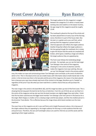
1. Front Cover Analysis Ryan Baxter
The target audience for this magazine is ranged
between the categories C1-E which is mainly lower
working class and students on the lowest incomes,
the age range for this magazine would be roughly
15-40.
The masthead is placed at the top of the article and
has been placed there on every issue of the Kerrang
series; therefore it is part of the house style. Also
the text is in capitals and a sans serif font, which
portrays that the magazine is present with an
informal approach and reflects the target audience.
Another thing that reflects the target audience is
the lines going through the masthead, this is trying
to give the illusion that the words are smashed and
broken, which gives a rebellious image and reflects
the target audience they are appealing too.
This front cover follows the Guttenberg design
principle. For example, you can see the lead singer
Tom Delonge in the centre of the magazine,
showing he is the centre of attention and this
makes the magazine more eye-catching. Also we
can see Tom Delonge’s hand in the primary optical
area, this makes our eyes sub-consciously go down Tom Delonge’s wrist and leads us the centre of attention
which is him. Then in the dead corners we see smaller boxes with information about smaller bands later in the
article. In the terminal area there is the barcode and the price of the magazine, the reason it has been placed
here is because your eyes have already read most of the content on the page, therefore you’re ‘hooked’ so
regardless of the price if you like what you have read there is a better chance that you will purchase the
magazine.
The main image in this article is the band Blink-182, and this image has taken up most of the front cover. This is
showing that Kerrang want the band to be the focus of attention. From the use of thirds we can see they’re in
the centre of the magazine and we also see that the band members are slightly bigger than each other. I think
that this has been used because the bigger band member Tom Delonge is the main person in the band as he is
the singer; Mark Hoppus is smaller as he is a backup singer and the bass player, and then the smallest person is
the drummer Travis Barker. This is effective because the image shows which band members are the most
important.
The cover lines on this magazine are all in sans serif fonts and in bright fluorescent colours, this is because of
the target audience they are appealing to, the target audience for Kerrang is a niche audience that like rock
and punk music. Therefore, the sans serif and bright colours are used for informal use and this works well for
appealing to their target audience.
2. The target audience for this magazine is
ranged between the categories B-E which is
mainly lower working class and students on
the lowest incomes, the age range for this
magazine would be roughly 15-50.
The masthead is placed at the top of the
article and has been placed there on every
issue of the Mixmag series; therefore it is part
of the house style. From the masthead we can
see that the text is in lower case and not in
capitals, this is showing that the magazine is
being used for informal use. We can also see
that the masthead is using the fluorescent
colour of pink, this is showing that the
audience of the magazine will be loud and
active people because fluorescent colours
represent the club and dance scene.
This magazine follows the Guttenberg design
principle. For example, we can see that the
women is mainly in the centre and right of the
image, this is effective because as a viewer
our eyes naturally move down the direction of
her body, so this is an effective way to make the magazine more eye-catching. From the use of thirds, we can
see that her body is in quite an awkward position; this represents the target audience that the magazine is
appealing to because when people dance they put themselves in awkward positions. Then in the dead corners
we see smaller boxes with information about smaller topics later in the article. In the terminal area there is the
barcode and the price of the magazine, the reason it has been placed here is because your eyes have already
read most of the content on the page, therefore you’re ‘hooked’ so regardless of the price if you like what you
have read there is a better chance that you will purchase the magazine.
The main image on this front cover is the woman holding the dog, this is showing that Mixmag want her to be
the focus of attention, from the image of the woman we can see, we can see that she is very accessorised with
headphones, handbag, bangles, make-up and the stereotypical celebrity girls dog, a Chihuahua.
The cover lines on this magazine are all in sans serif fonts and in bright fluorescent colours, this is because of
the target audience they are appealing to, the target audience for Mixmag is a mainstream audience that like
dance and pop music. Therefore, the sans serif and bright colours are used for informal use and this works well
for appealing to their target audience.
3. Comparison between the two magazines
From both of these magazines, we can see that in a way they are mostly similar rather than different
although they appeal to different target audiences.
The mastheads are the same because they both use serif fonts and use the text to appeal to their
target audiences. The mastheads are both at the same position which is the top of the page and also
the centre, the only difference between the two mastheads is that Kerrang uses capital letters and
Mixmag uses lowercase letters, this is because it helps them appeal to their target audiences.
Both magazines follow the Guttenberg design principle which is the use of thirds, both magazines
also place their barcodes and prices in the dead corners of the magazine, the reason it has been
placed there is because your eyes have already read most of the content on the pages, therefore
you’re ‘hooked’ so regardless of the price if you like what you have read there is a better chance that
you will purchase the magazines.
Both of the magazines also use main images for the same purpose, to be the centre of attention. The
magazines also use the cover lines for the same purpose as well, to appeal to their individual target
audiences by putting the text in sans serif fonts and in bright fluorescent colours.
The only real difference between the two magazines is that they appeal to different audiences, with
Kerrang being rock music and Mixmag being dance music. Kerrang magazine appeals to a niche
audience and Mixmag appeals to a more mainstream audience as dance and pop music is more
popular than punk rock.