VIP Call Girls Sonagachi - 8250192130 Escorts Service 50% Off with Cash ON De...
Fornt cover analysis 1
1. Adam Cunliffe
Cover Analysis
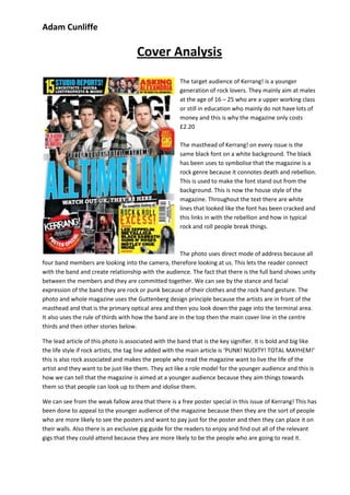
The target audience of Kerrang! is a younger
generation of rock lovers. They mainly aim at males
at the age of 16 – 25 who are a upper working class
or still in education who mainly do not have lots of
money and this is why the magazine only costs
£2.20
The masthead of Kerrang! on every issue is the
same black font on a white background. The black
has been uses to symbolise that the magazine is a
rock genre because it connotes death and rebellion.
This is used to make the font stand out from the
background. This is now the house style of the
magazine. Throughout the text there are white
lines that looked like the font has been cracked and
this links in with the rebellion and how in typical
rock and roll people break things.
The photo uses direct mode of address because all
four band members are looking into the camera, therefore looking at us. This lets the reader connect
with the band and create relationship with the audience. The fact that there is the full band shows unity
between the members and they are committed together. We can see by the stance and facial
expression of the band they are rock or punk because of their clothes and the rock hand gesture. The
photo and whole magazine uses the Guttenberg design principle because the artists are in front of the
masthead and that is the primary optical area and then you look down the page into the terminal area.
It also uses the rule of thirds with how the band are in the top then the main cover line in the centre
thirds and then other stories below.
The lead article of this photo is associated with the band that is the key signifier. It is bold and big like
the life style if rock artists, the tag line added with the main article is ‘PUNK! NUDITY! TOTAL MAYHEM!’
this is also rock associated and makes the people who read the magazine want to live the life of the
artist and they want to be just like them. They act like a role model for the younger audience and this is
how we can tell that the magazine is aimed at a younger audience because they aim things towards
them so that people can look up to them and idolise them.
We can see from the weak fallow area that there is a free poster special in this issue of Kerrang! This has
been done to appeal to the younger audience of the magazine because then they are the sort of people
who are more likely to see the posters and want to pay just for the poster and then they can place it on
their walls. Also there is an exclusive gig guide for the readers to enjoy and find out all of the relevant
gigs that they could attend because they are more likely to be the people who are going to read it.