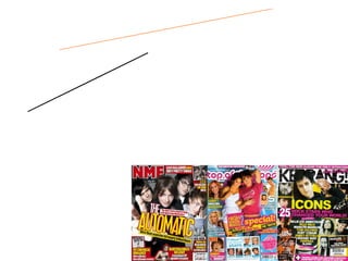
2. Rock Music “ Kerrang!” have decided to cram their magazine cover with pictures of famous rock musicians and idols. The use of dark colours against a light background with the glimpses of colour show a rocky, punky look as colours such as yellow and pink are used and this is what these colours relate to. The masthead of the magazine is black and appears to be smashed, which relates to rock stars as they are stereotyped to smash up their instruments after a concert.
3. Pop Music The use of bright, childlike colours such as yellow and pink attract a younger audience. Pictures of “Disney” actors and singers may also appeal to younger people. The font used in this magazine is round and bubbly, which is associated with “pop” music as it is playful and also childlike. The cover of this magazine is full of celebrities, and not all of them are associated with music. This may appeal to a wider audience. The magazine uses colours associated with girls to appeal to a feminine audience.
4. Indie Music NME uses dark and bright colours at the same time to aim at the target audience (teens onwards). Instead of cramming the magazine cover with pictures of lots of different famous celebrities, NME has gone for a subtler approach by having a picture of one feature band on the cover and just surrounding them with text. NME have also used small snapshot photos of other bands to give the reader a glimpse to as what it inside. The text has a wide girth and is very bold and has a dark outline to make the text seem more “grungy”. Also, the main text “The Automatic” is crooked to make the magazine look more “rough and ready”.
5. Classical Music Classical FM magazine uses a light, clean background to emphasise the picture of Myleene Klass and the quotes from her article. The magazine uses the colour scheme white, black and red which makes the magazine look more sophisticated. The words “Free Disk” are bolder and a deeper red than the rest of the magazine and so it draws in the audience and makes them want to buy it.