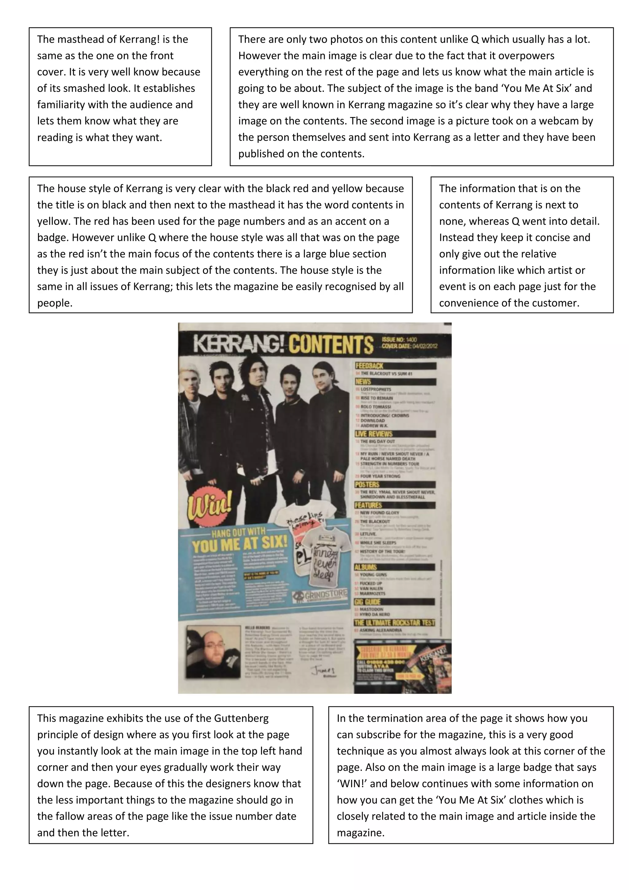
The masthead of Kerrang! is the             There are only two photos on this content unlike Q which usually has a lot.
same as the one on the front                However the main image is clear due to the fact that it overpowers
cover. It is very well know because         everything on the rest of the page and lets us know what the main article is
         V
of its smashed look. It establishes         going to be about. The subject of the image is the band ‘You Me At Six’ and
familiarity with the audience and           they are well known in Kerrang magazine so it’s clear why they have a large
lets them know what they are                image on the contents. The second image is a picture took on a webcam by
reading is what they want.                  the person themselves and sent into Kerrang as a letter and they have been
                                            published on the contents.

The house style of Kerrang is very clear with the black red and yellow because         The information that is on the
the title is on black and then next to the masthead it has the word contents in        contents of Kerrang is next to
yellow. The red has been used for the page numbers and as an accent on a               none, whereas Q went into detail.
badge. However unlike Q where the house style was all that was on the page             Instead they keep it concise and
as the red isn’t the main focus of the contents there is a large blue section          only give out the relative
they is just about the main subject of the contents. The house style is the            information like which artist or
same in all issues of Kerrang; this lets the magazine be easily recognised by all      event is on each page just for the
people.                                                                                convenience of the customer.


This magazine exhibits the use of the Guttenberg                  In the termination area of the page it shows how you
principle of design where as you first look at the page           can subscribe for the magazine, this is a very good
you instantly look at the main image in the top left hand         technique as you almost always look at this corner of the
corner and then your eyes gradually work their way                page. Also on the main image is a large badge that says
down the page. Because of this the designers know that            ‘WIN!’ and below continues with some information on
the less important things to the magazine should go in            how you can get the ‘You Me At Six’ clothes which is
the fallow areas of the page like the issue number date           closely related to the main image and article inside the
and then the letter.                                              magazine.

Contents analysis 2

  • 1.
    The masthead ofKerrang! is the There are only two photos on this content unlike Q which usually has a lot. same as the one on the front However the main image is clear due to the fact that it overpowers cover. It is very well know because everything on the rest of the page and lets us know what the main article is V of its smashed look. It establishes going to be about. The subject of the image is the band ‘You Me At Six’ and familiarity with the audience and they are well known in Kerrang magazine so it’s clear why they have a large lets them know what they are image on the contents. The second image is a picture took on a webcam by reading is what they want. the person themselves and sent into Kerrang as a letter and they have been published on the contents. The house style of Kerrang is very clear with the black red and yellow because The information that is on the the title is on black and then next to the masthead it has the word contents in contents of Kerrang is next to yellow. The red has been used for the page numbers and as an accent on a none, whereas Q went into detail. badge. However unlike Q where the house style was all that was on the page Instead they keep it concise and as the red isn’t the main focus of the contents there is a large blue section only give out the relative they is just about the main subject of the contents. The house style is the information like which artist or same in all issues of Kerrang; this lets the magazine be easily recognised by all event is on each page just for the people. convenience of the customer. This magazine exhibits the use of the Guttenberg In the termination area of the page it shows how you principle of design where as you first look at the page can subscribe for the magazine, this is a very good you instantly look at the main image in the top left hand technique as you almost always look at this corner of the corner and then your eyes gradually work their way page. Also on the main image is a large badge that says down the page. Because of this the designers know that ‘WIN!’ and below continues with some information on the less important things to the magazine should go in how you can get the ‘You Me At Six’ clothes which is the fallow areas of the page like the issue number date closely related to the main image and article inside the and then the letter. magazine.