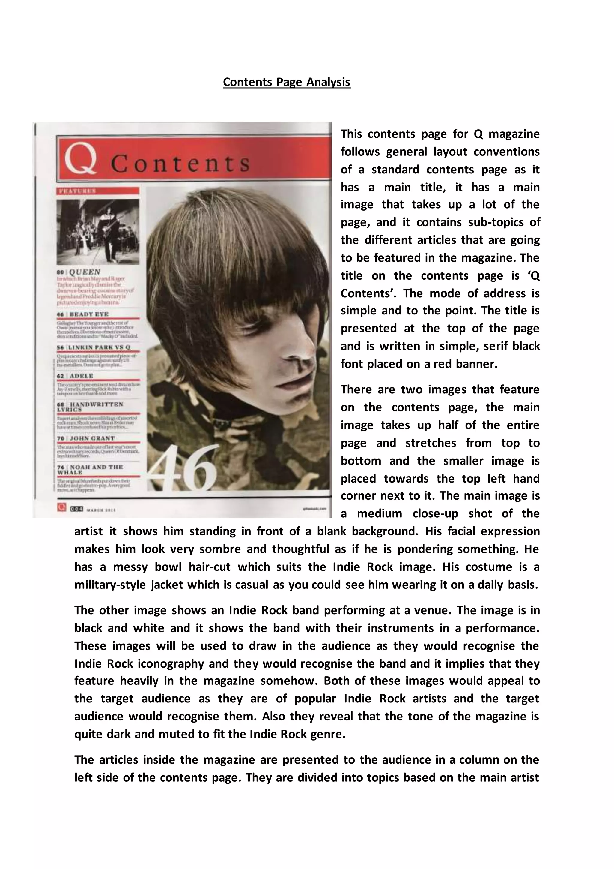
The document analyzes the contents page of Q magazine. It follows conventions with a main title in large font at the top, a large central image taking up half the page of a famous indie rock artist, and columns listing article topics and page numbers. The images are of popular indie rock artists meant to appeal to the target audience. The articles are divided by topic or featured artist. The layout, colors, fonts, and tone are consistent with the indie rock genre and help maintain the magazine's brand identity.