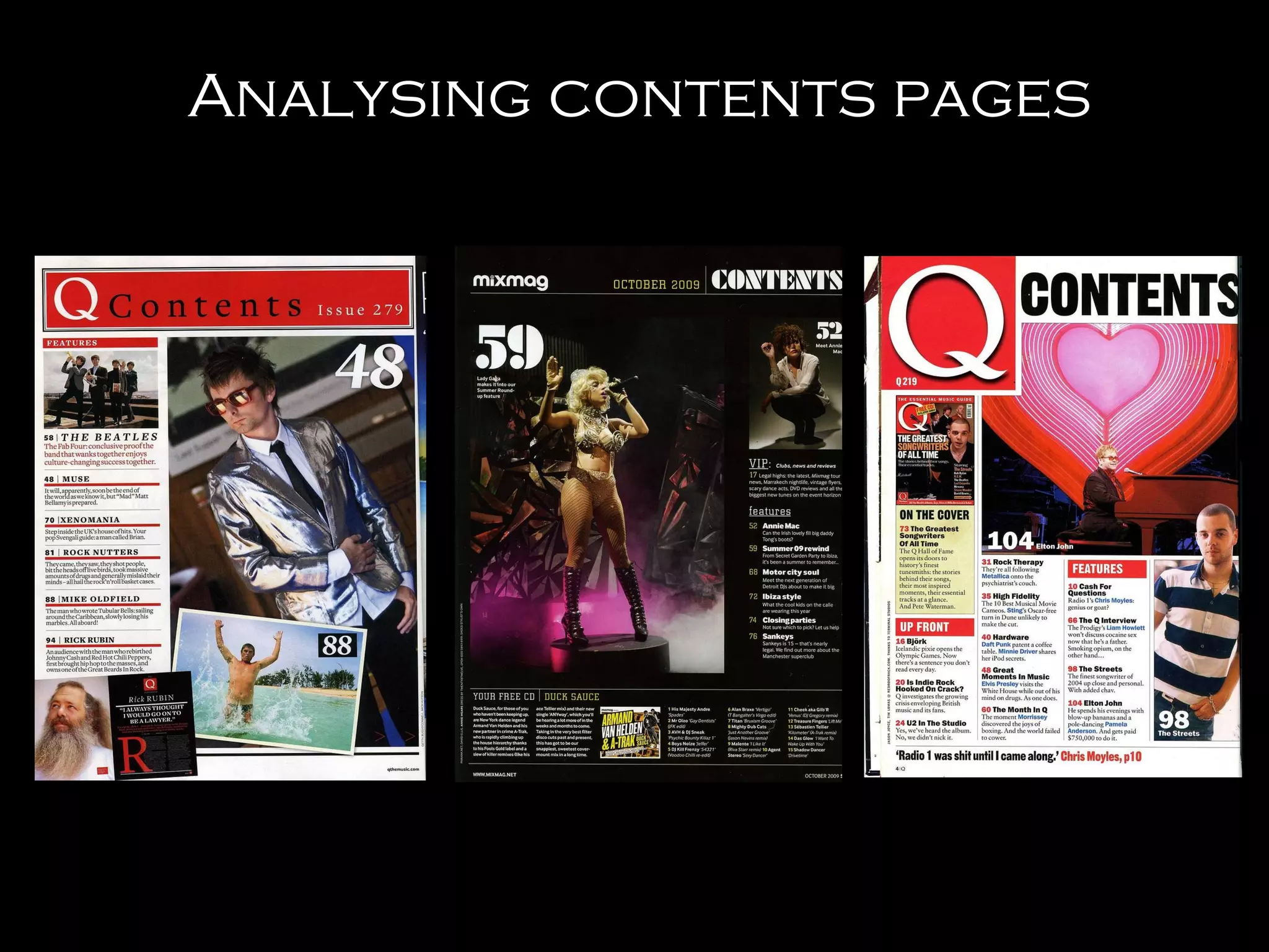
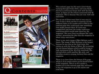
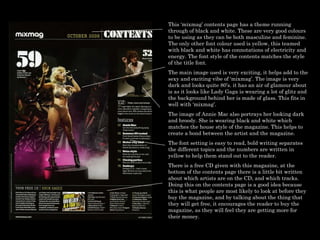
This document analyzes and compares the contents pages of music magazines 'Q', 'Mixmag', and 'The Streets'. Key points analyzed include color schemes, layout, images used, and how elements are designed to attract readers and encourage purchases. Common techniques included continuing cover themes and styles onto contents pages, using large prominent images of artists featured in the issue, and highlighting free promotional items included to increase value perception.