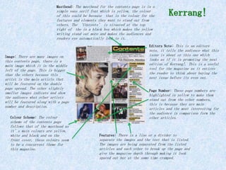
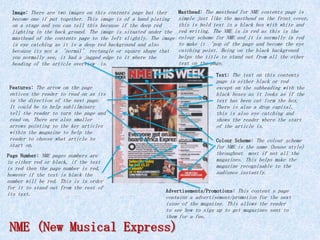
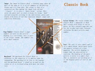
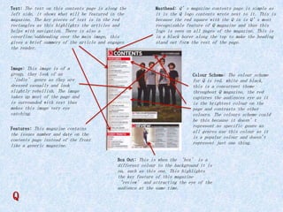
Masthead: The masthead for the contents page is in a

simple sans serif font which is yellow, the colour
of this could be because that is the colour for the
features and elements they want to stand out from
others. The ‘Contents’ is situated at the top
right of the in a black box which makes the yellow
writing stand out more and makes the audiences and
readers eye automatically look to it.

Kerrang!

Editors Note: This is an editors
Image: There are many images on

this contents page, there is a
main image which it in the middle
left of the page. This is bigger
than the others because this
artist is the main article that
will be featured on the double
page spread. The other slightly
smaller images indicate and show
the audience what other artists
will be featured along with a page
number and description.
Colour Scheme: The colour

scheme of the contents page
follows that of the masthead as
it’s main colours are yellow,
white and black and on the
front cover, these colours seem
to be a concurrent theme for
this magazine.

note, it tells the audience what this
issue is about or this one which
looks as if it is promoting the next
edition of Kerrang!. This is a useful
tool for the magazine as it entices
the reader to think about buying the
next issue before its even out.
Page Number: These page numbers are

highlighted in yellow to make them
stand out from the other numbers,
this is because they are main
articles and the most interesting for
the audience in comparison form the
other articles.

Features: There is a line or a divider to

separate the images and the text that is listed.
The images are being separated from the listed
articles and each other to break up the page and
give the magazine depth through making it look
spaced out but at the same time cramped.
Image: There are two images on this contents page but they

Masthead: The masthead for NME contents page is

become one if put together. This image is of a band plating
on a stage and you can tell this because if the deep red
lighting in the back ground. The image is situated under the
masthead of the contents page to the left slightly. The image
is eye catching as it is a deep red background and also
because its not a ‘normal’ rectangle or square shape that
you normally see, it had a jagged edge to it where the
heading of the article overview is.

simple just like the masthead on the front cover,
this is bold text in a black box with white and
red writing. The NME is in red as this is the
colour scheme for NME and it is normally in red
to make it ‘pop of the page and become the eye
catching point. Being on the black background
helps the title to stand out from all the other
text on the page.
Text: The text on this contents

page is either black or red
except on the subheading with the
black boxes as it looks as if the
text has been cut form the box.
There is also a drop capital,
this is also eye catching and
shows the reader where the start
of the article is.

Features: The arrow on the page

entices the reader to read on as its
in the direction of the next page.
It could be to help sublilminary
tell the reader to turn the page and
read on. There are also smaller
arrows pointing to the key articles
within the magazine to help the
reader to choose what article to
start on.

Colour Scheme: The colour scheme

for NME is the same (house style)
throughout most if not all the
magazines. This helps make the
magazine recognisable to the
audience instantly.

Page Number: NME pages numbers are

in either red or black, if the text
is red then the page number is red,
however if the text is black the
number will be red. This is in order
for it to stand out from the rest of
its text.

Advertisements/Promotions: This content s page

contains a advertisement/promotion for the next
issue of the magazine. This allows the reader
to see how to sign up to get magazines sent to
them for a fee.

NME (New Musical Express)
Image: The image on Classic Rock’s contents page takes up

most of the page as it is of all members of the Rolling
Stones and is a long shot. The colour is that of a
saturated one thus making the image look old and
‘classic’ it is also a ‘dusty brown’ colour. This
suits the genre well as rock is known for being ‘dark’
and non-colourful sticking to the dark browns, greys and
blacks with hints of red that represent danger, anger and
rebellious behaviour.

Classic Rock

Colour Scheme: The colour scheme for

Page Number: Classic Rock’s page

Classic Rock’s magazine is dark
dull colours with hints of red in
paces. As this contents page has red
for the sticker and other features
including the main articles page
number.

numbers are next to the article
heading in a red colour, this is part
of the colour scheme. The numbers are
quite small however.
Text: The text is very simple and is

Masthead: The masthead for Classic Rock is

different to the others as it is smaller than the
subheading. The masthead is in line to the boarder
and the masthead doesn’t stand out as much as the
others at it is in black along with most the other
text.

in a simple black, which again suits
the generic colours of a rock
magazine. The article heading is
bigger than the description to
overview. The heading of the main
article is wrote in a smart font
that is instantly eye catching as it
is the biggest piece of text on the
page.
Text: The text on this contents page is along the

Masthead: Q’s magazine contents page is simple as

left side, it shows what will be featured in the
magazine. The key pieces of text is in the red
rectangles as this highlights the articles and
helps with navigation. There is also a
coverline/subheading over the main image, this
gives a brief summery of the article and engages
the reader.

it is the Q logo contents wrote next to it. This is
because the red square with the Q in is Q’s most
recognisable feature of Q magazine and thus this
logo is seen on all pages of the magazine. This is
in a black borer along the top to make the heading
stand out form the rest of the page.

Image: This image is of a

group, they look of an
‘indie’ genre as they are
dressed casually and look
slightly rebellish. The image
takes up most of the page and
is surrounded with text thus
makes this image very eye
catching.
Features: This magazine contains

the issues number and date on the
contents page instead of the front
like a generic magazine.

Colour Scheme: The colour scheme

for Q is red, white and black,
this is a concurrent theme
throughout Q magazine, the red
captures the audiences eye as it
is the brightest colour on the
page and contrasts the other
colours. The colours scheme could
be this because it doesn’t
represent no specific genre as
all genres use this colour as it
is a popular colour and doesn't
represent just one thing.
Box Out: This is when the ‘box’ is a

Q

different colour to the background it is
on, such as this one. This highlights
the key feature of this magazine
‘review’ and attracting the eye of the
audience at the same time.

Contents analysis

  • 1.
    Masthead: The mastheadfor the contents page is in a simple sans serif font which is yellow, the colour of this could be because that is the colour for the features and elements they want to stand out from others. The ‘Contents’ is situated at the top right of the in a black box which makes the yellow writing stand out more and makes the audiences and readers eye automatically look to it. Kerrang! Editors Note: This is an editors Image: There are many images on this contents page, there is a main image which it in the middle left of the page. This is bigger than the others because this artist is the main article that will be featured on the double page spread. The other slightly smaller images indicate and show the audience what other artists will be featured along with a page number and description. Colour Scheme: The colour scheme of the contents page follows that of the masthead as it’s main colours are yellow, white and black and on the front cover, these colours seem to be a concurrent theme for this magazine. note, it tells the audience what this issue is about or this one which looks as if it is promoting the next edition of Kerrang!. This is a useful tool for the magazine as it entices the reader to think about buying the next issue before its even out. Page Number: These page numbers are highlighted in yellow to make them stand out from the other numbers, this is because they are main articles and the most interesting for the audience in comparison form the other articles. Features: There is a line or a divider to separate the images and the text that is listed. The images are being separated from the listed articles and each other to break up the page and give the magazine depth through making it look spaced out but at the same time cramped.
  • 2.
    Image: There aretwo images on this contents page but they Masthead: The masthead for NME contents page is become one if put together. This image is of a band plating on a stage and you can tell this because if the deep red lighting in the back ground. The image is situated under the masthead of the contents page to the left slightly. The image is eye catching as it is a deep red background and also because its not a ‘normal’ rectangle or square shape that you normally see, it had a jagged edge to it where the heading of the article overview is. simple just like the masthead on the front cover, this is bold text in a black box with white and red writing. The NME is in red as this is the colour scheme for NME and it is normally in red to make it ‘pop of the page and become the eye catching point. Being on the black background helps the title to stand out from all the other text on the page. Text: The text on this contents page is either black or red except on the subheading with the black boxes as it looks as if the text has been cut form the box. There is also a drop capital, this is also eye catching and shows the reader where the start of the article is. Features: The arrow on the page entices the reader to read on as its in the direction of the next page. It could be to help sublilminary tell the reader to turn the page and read on. There are also smaller arrows pointing to the key articles within the magazine to help the reader to choose what article to start on. Colour Scheme: The colour scheme for NME is the same (house style) throughout most if not all the magazines. This helps make the magazine recognisable to the audience instantly. Page Number: NME pages numbers are in either red or black, if the text is red then the page number is red, however if the text is black the number will be red. This is in order for it to stand out from the rest of its text. Advertisements/Promotions: This content s page contains a advertisement/promotion for the next issue of the magazine. This allows the reader to see how to sign up to get magazines sent to them for a fee. NME (New Musical Express)
  • 3.
    Image: The imageon Classic Rock’s contents page takes up most of the page as it is of all members of the Rolling Stones and is a long shot. The colour is that of a saturated one thus making the image look old and ‘classic’ it is also a ‘dusty brown’ colour. This suits the genre well as rock is known for being ‘dark’ and non-colourful sticking to the dark browns, greys and blacks with hints of red that represent danger, anger and rebellious behaviour. Classic Rock Colour Scheme: The colour scheme for Page Number: Classic Rock’s page Classic Rock’s magazine is dark dull colours with hints of red in paces. As this contents page has red for the sticker and other features including the main articles page number. numbers are next to the article heading in a red colour, this is part of the colour scheme. The numbers are quite small however. Text: The text is very simple and is Masthead: The masthead for Classic Rock is different to the others as it is smaller than the subheading. The masthead is in line to the boarder and the masthead doesn’t stand out as much as the others at it is in black along with most the other text. in a simple black, which again suits the generic colours of a rock magazine. The article heading is bigger than the description to overview. The heading of the main article is wrote in a smart font that is instantly eye catching as it is the biggest piece of text on the page.
  • 4.
    Text: The texton this contents page is along the Masthead: Q’s magazine contents page is simple as left side, it shows what will be featured in the magazine. The key pieces of text is in the red rectangles as this highlights the articles and helps with navigation. There is also a coverline/subheading over the main image, this gives a brief summery of the article and engages the reader. it is the Q logo contents wrote next to it. This is because the red square with the Q in is Q’s most recognisable feature of Q magazine and thus this logo is seen on all pages of the magazine. This is in a black borer along the top to make the heading stand out form the rest of the page. Image: This image is of a group, they look of an ‘indie’ genre as they are dressed casually and look slightly rebellish. The image takes up most of the page and is surrounded with text thus makes this image very eye catching. Features: This magazine contains the issues number and date on the contents page instead of the front like a generic magazine. Colour Scheme: The colour scheme for Q is red, white and black, this is a concurrent theme throughout Q magazine, the red captures the audiences eye as it is the brightest colour on the page and contrasts the other colours. The colours scheme could be this because it doesn’t represent no specific genre as all genres use this colour as it is a popular colour and doesn't represent just one thing. Box Out: This is when the ‘box’ is a Q different colour to the background it is on, such as this one. This highlights the key feature of this magazine ‘review’ and attracting the eye of the audience at the same time.