The document discusses a mood board for an indie magazine. It includes images representing the indie genre through typical clothing styles and colors like blues, pinks and purples. Many indie genre pictures also feature instruments like acoustic guitars.
The proposed magazine will focus on modern indie music, trends, gigs and events. It will have a large audience due to the popularity of indie music. The magazine will be composed of experienced writers to provide detailed yet accessible content.
The magazine's aesthetic will use red, white and black colors with specialized fonts and images related to the genre. The target audience will be social classes A, B and C1, so the magazine will be priced at £3.99. The primary
We would like to introduce ourselves as a dynamic and professional company offering Corporate Housekeeping / 5-S Concept in manufacturing Industry, Horticulture, Pantry Management, Guest House Management, Pest Control & day to day Maintenance Services to the corporate sector. We have conceived a new concept, which could take care of all above-mentioned requirements under one single agency.
Globalization thinking has emerged, as security threats keep increasing. Cybercrime has taken a different dimension in Cameroon, forensics remain questionable.This is because of the nature of the society,marked with corruption and staff dishonesty. This is a clue on how and what need to be done to combat cybercrime in Cameroon.
This presentation elaborates on how terrorism has gain currency in Cameroon. A brief idea on the regional and institutional approach on the issue and the answers to the question, if Cameroon can defeat Boko-Haram?
Leadership is not longevity in service, but your contribution to your community or country. Pan-Africanism has been questioned by our ancestors. Can you stand for Pan-Africanism?
African union transition and its ability to respond to conflicts in africaSARON MESSEMBE OBIA
From the Organization of African Unity (OAU) to African Union (AU) The African Union initiated by Pan Africanists to improve the lives of Africans through sustainable development and to resolve conflicts in the continent. But the competence of the African Union has been put to question. The inability of the AU to resolve the conflict in central African Republic, the continuous terrorist attacks in Nigeria by Boko-Haram, in Kenya and Somalia by Al-Shabba, has led the international community to focus on insecurity in the African continent. Though this change from OAU to AU the AU still faces some challenges. Nonetheless it has registered some success.
Questo Webinar mostra l'opportunità, per chi distribuisce il proprio gestionale o quello di terzi, offerta dalla fatturazione elettronica tra privati integrando i servizi di Digithera
Welcome to TechSoup New Member Orientation and Q&A (May 2024).pdfTechSoup
In this webinar you will learn how your organization can access TechSoup's wide variety of product discount and donation programs. From hardware to software, we'll give you a tour of the tools available to help your nonprofit with productivity, collaboration, financial management, donor tracking, security, and more.
Operation “Blue Star” is the only event in the history of Independent India where the state went into war with its own people. Even after about 40 years it is not clear if it was culmination of states anger over people of the region, a political game of power or start of dictatorial chapter in the democratic setup.
The people of Punjab felt alienated from main stream due to denial of their just demands during a long democratic struggle since independence. As it happen all over the word, it led to militant struggle with great loss of lives of military, police and civilian personnel. Killing of Indira Gandhi and massacre of innocent Sikhs in Delhi and other India cities was also associated with this movement.
Unit 8 - Information and Communication Technology (Paper I).pdfThiyagu K
This slides describes the basic concepts of ICT, basics of Email, Emerging Technology and Digital Initiatives in Education. This presentations aligns with the UGC Paper I syllabus.
Students, digital devices and success - Andreas Schleicher - 27 May 2024..pptxEduSkills OECD
Andreas Schleicher presents at the OECD webinar ‘Digital devices in schools: detrimental distraction or secret to success?’ on 27 May 2024. The presentation was based on findings from PISA 2022 results and the webinar helped launch the PISA in Focus ‘Managing screen time: How to protect and equip students against distraction’ https://www.oecd-ilibrary.org/education/managing-screen-time_7c225af4-en and the OECD Education Policy Perspective ‘Students, digital devices and success’ can be found here - https://oe.cd/il/5yV
This is a presentation by Dada Robert in a Your Skill Boost masterclass organised by the Excellence Foundation for South Sudan (EFSS) on Saturday, the 25th and Sunday, the 26th of May 2024.
He discussed the concept of quality improvement, emphasizing its applicability to various aspects of life, including personal, project, and program improvements. He defined quality as doing the right thing at the right time in the right way to achieve the best possible results and discussed the concept of the "gap" between what we know and what we do, and how this gap represents the areas we need to improve. He explained the scientific approach to quality improvement, which involves systematic performance analysis, testing and learning, and implementing change ideas. He also highlighted the importance of client focus and a team approach to quality improvement.
Synthetic Fiber Construction in lab .pptxPavel ( NSTU)
Synthetic fiber production is a fascinating and complex field that blends chemistry, engineering, and environmental science. By understanding these aspects, students can gain a comprehensive view of synthetic fiber production, its impact on society and the environment, and the potential for future innovations. Synthetic fibers play a crucial role in modern society, impacting various aspects of daily life, industry, and the environment. ynthetic fibers are integral to modern life, offering a range of benefits from cost-effectiveness and versatility to innovative applications and performance characteristics. While they pose environmental challenges, ongoing research and development aim to create more sustainable and eco-friendly alternatives. Understanding the importance of synthetic fibers helps in appreciating their role in the economy, industry, and daily life, while also emphasizing the need for sustainable practices and innovation.
The Roman Empire A Historical Colossus.pdfkaushalkr1407
The Roman Empire, a vast and enduring power, stands as one of history's most remarkable civilizations, leaving an indelible imprint on the world. It emerged from the Roman Republic, transitioning into an imperial powerhouse under the leadership of Augustus Caesar in 27 BCE. This transformation marked the beginning of an era defined by unprecedented territorial expansion, architectural marvels, and profound cultural influence.
The empire's roots lie in the city of Rome, founded, according to legend, by Romulus in 753 BCE. Over centuries, Rome evolved from a small settlement to a formidable republic, characterized by a complex political system with elected officials and checks on power. However, internal strife, class conflicts, and military ambitions paved the way for the end of the Republic. Julius Caesar’s dictatorship and subsequent assassination in 44 BCE created a power vacuum, leading to a civil war. Octavian, later Augustus, emerged victorious, heralding the Roman Empire’s birth.
Under Augustus, the empire experienced the Pax Romana, a 200-year period of relative peace and stability. Augustus reformed the military, established efficient administrative systems, and initiated grand construction projects. The empire's borders expanded, encompassing territories from Britain to Egypt and from Spain to the Euphrates. Roman legions, renowned for their discipline and engineering prowess, secured and maintained these vast territories, building roads, fortifications, and cities that facilitated control and integration.
The Roman Empire’s society was hierarchical, with a rigid class system. At the top were the patricians, wealthy elites who held significant political power. Below them were the plebeians, free citizens with limited political influence, and the vast numbers of slaves who formed the backbone of the economy. The family unit was central, governed by the paterfamilias, the male head who held absolute authority.
Culturally, the Romans were eclectic, absorbing and adapting elements from the civilizations they encountered, particularly the Greeks. Roman art, literature, and philosophy reflected this synthesis, creating a rich cultural tapestry. Latin, the Roman language, became the lingua franca of the Western world, influencing numerous modern languages.
Roman architecture and engineering achievements were monumental. They perfected the arch, vault, and dome, constructing enduring structures like the Colosseum, Pantheon, and aqueducts. These engineering marvels not only showcased Roman ingenuity but also served practical purposes, from public entertainment to water supply.
How to Make a Field invisible in Odoo 17Celine George
It is possible to hide or invisible some fields in odoo. Commonly using “invisible” attribute in the field definition to invisible the fields. This slide will show how to make a field invisible in odoo 17.
We all have good and bad thoughts from time to time and situation to situation. We are bombarded daily with spiraling thoughts(both negative and positive) creating all-consuming feel , making us difficult to manage with associated suffering. Good thoughts are like our Mob Signal (Positive thought) amidst noise(negative thought) in the atmosphere. Negative thoughts like noise outweigh positive thoughts. These thoughts often create unwanted confusion, trouble, stress and frustration in our mind as well as chaos in our physical world. Negative thoughts are also known as “distorted thinking”.
The French Revolution, which began in 1789, was a period of radical social and political upheaval in France. It marked the decline of absolute monarchies, the rise of secular and democratic republics, and the eventual rise of Napoleon Bonaparte. This revolutionary period is crucial in understanding the transition from feudalism to modernity in Europe.
For more information, visit-www.vavaclasses.com
Model Attribute Check Company Auto PropertyCeline George
In Odoo, the multi-company feature allows you to manage multiple companies within a single Odoo database instance. Each company can have its own configurations while still sharing common resources such as products, customers, and suppliers.
Ethnobotany and Ethnopharmacology:
Ethnobotany in herbal drug evaluation,
Impact of Ethnobotany in traditional medicine,
New development in herbals,
Bio-prospecting tools for drug discovery,
Role of Ethnopharmacology in drug evaluation,
Reverse Pharmacology.
Read| The latest issue of The Challenger is here! We are thrilled to announce that our school paper has qualified for the NATIONAL SCHOOLS PRESS CONFERENCE (NSPC) 2024. Thank you for your unwavering support and trust. Dive into the stories that made us stand out!
Digital Tools and AI for Teaching Learning and Research
Magazine coursework 2/11
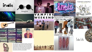
1. My mood board is constituted of images composed in
the indie genre. Many of the pictures include people
wearing typical clothing that is part of the indie ideal.
Colours that are usually associated with the genre are
light pastel colours such as blues, pinks and purples. A
lot of music composed in the indie genre feature
instruments such as the acoustic guitar.
2. Proposal and audience
The chosen genre of my magazine is indie. The reason for the choice is due to the large following of indie music,
setting the magazine up as a successful profitable magazine with a large audience. My magazine will parade and
feature modern music and current trends including gigs and events that feature the designated music. We are
composed of the best writers in the profession which ensures our content is detailed yet not so convoluted.
The aesthetics of the magazine will be composed of the colours scheme red, white and black. This is because the
physical appearance and primary colours contrast a simple yet professional piece of media. With specialised fonts
and images that pertinent with the genre in order to form an apt magazine.
The chosen audience I will be of the social classes A, B and C1. For this reason, the magazine will be priced at £3.99.
The chosen demographic include students who are my primary target audience. The type of person to buy the
magazine would fit into the mainstreamer category. This is because indie music is a popular sub culture within
society. However the popularity of indie, it is not entirely recognised as the most influential genre and thus appeals
to individualists.
3. The main image is a close up
photograph of Beyonce. The picture
is composed of her hair done up in a
fashion that surrounds her face in a
mane-like hairstyle. Her facial
expression is promiscuous and
attractive and is playfully biting on a
necklace in a sensual matter. The
colours of both hair and skin are
virtually the same- the hue is a
golden brown that looks elegant.
Overall the image is enticing and eye
catching.
The masthead is placed at the top of the
magazine in its recognisable font in the colour
white. The white stands out and is easily
identifiable against the colours of hair and skin.
In the letters with holes in, colours have
replaced with the colours red, yellow, blue and
lime.
The masthead stands out bold against the
background in its large font.
The main sell line is simply presented
three-quarters down the page in a
formal font. The font is the second
largest on the page, seconded only to
the masthead. Like the masthead and
other sell lines featuring on the cover,
the type is in white which stands out
against the hues of the background.
The font, as mentioned above is formal
– which connotates elegance and
finesse.
Space On the magazine front cover,
there is no white space seen. The
whole of the background is
composed of the photograph
allowing now space, but a photo
canvas in the top right corner.
4. Main image: The main image on the contents page is Liam
Gallagher who is the feature of this issue. The image is large,
taking up almost the space on the left side of the spread. In the
corner is the number of the page the related article is situated
within the magazine.
Banner: At the top of the double
page there is a red banner which
is the signature colour of Q
which features the name of the
magazine and also the heading
‘contents’. The banner on the
right hand side states the
number of the issue
accompanied with a smaller
image of the front cover askew.
The banner is bordered in white
and red and is prominent on the
white page.
Images: Various images are featured on the contents page with the
incentive to accompany the brief descriptions of the articles in the
magazine. The photographs include relevant pictures of the bands and
singers which the article revolve around and like the main image, a page
number is also in the image too.
Headings/description of
articles: The article
descriptions are written in a
format with the heading of
the article with the page
number. The heading and
page number are underlined
in red (Q’s colour scheme)
and underneath is the
synopsis. The descriptions
and headings are arranged in
a pillar-esque form around
the sides of both pages of
the spread.
Features: Under the
banner is a heading in its
own (red) banner that
reads ‘features’ and is
assisted by a relevant
image of the band QUEEN.
Underneath is a brief
description like that
around the page is in red
text to further constitute a
colour scheme.
‘The Q review’: Featured
on the contents page is a
brief synopsis of a
segment featured in the
magazine.
Colour scheme: The colour
scheme of the whole
magazine consists of red,
black and white. This helps
establish the genre of the
magazine which is
alternative. The chosen
colours connotates
difference rather than a
collaboration of multiple
colours.
Page numbers: Appearing
at the bottom of the page
on the far right and left
bottom corners are the
page numbers. The
numbers are represented
in triple digits and in a
black highlight
accompanied with the logo
‘Q’.
Date/issue number: There is no date on the contents page, only
a issue number.
Space: There is very little blank space on the contents page and
thus the spread is filled with relevant information, text and
pictures.
5. Main image: The main image on
the contents page is Miles Kane
in the middle of the street. It is
the largest picture on the
contents page and is in the centre
with the largest quote.
Heading: The heading of the
page is right in the centre of the
page and is in a formal font. The
size of the text is large and is
black against the stark
contrasting colour of white.
Images: Various images are
featured on the contents page
with the incentive to accompany
the brief descriptions of the
articles in the magazine. The
photographs include relevant
pictures of the bands and singers
which the article revolve around
and like the main image, a page
number is also in the image too.
Headings/description of articles: The
article descriptions are written in a
format with the heading of the article
with the page number. The heading is in
a blocked font and underneath is the
synopsis in a different style albeit the
same colour. The descriptions and
headings are arranged in around the
main image in the centre.
At the bottom of the page is a small
panel featured ‘plus’. This presents the
names of featured articles within the
magazine usually of inferior importance
to the articles matched with a
photograph, quote and synopsis.
Colour scheme: The colour
scheme of the whole magazine
consists of teal, black and white.
This helps establish the genre of
the magazine which is
alternative. The chosen colours
connotates formality and
smartness which is aimed at the
chosen demographic of c1.
Subscription panel: The panel in
the bottom right of the corner is
an advertisement for a
subscription deal for the
magazine. With a teal
background and white font, the
text is easily visible. Underneath
the text is an array of back-issues
in the number the subscription
deal includes.
Page numbers: Unlike other magazines,
on the bottom of the page, no page
numbers are present. Overall there is
no text on the bottom of the page at all.
Space: There is not a large amount of
white space albeit there is still some
easily visible. The setting out of the
page allows white space to be available,
however the page doesn’t subtract from
aesthetic purpose.
6. Heading: The heading of the
page is split into 3 lines albeit it is
one word. The word ‘contents’ is
the largest piece of text on the
page and is stark white against a
background of multiple red hues.
The position of the header is to
the right of the page and is not
centred.
Main image: The main image on
the contents page is a close up
shot of a male rapper who is
holding up his chains. The picture
takes up most of the page and
the position of the man is a form
of showing off his wealth and
accessories. The chains around
his neck are being held up in a
shape that resembles the V for
‘Vibe’. The necklace and chains
consist of gold and silver and the
main jewel is a medallion of a
head wearing a balaclava with the
words ‘GOON’ embossed on the
forehead. The rapper is also
without a T-Shirt to show off his
tattoos which further help
constitute a persona related to
gangs, crime and wealth.
Bracelets made notably of
precious metals are also being
worn on both arms and the
baring of teeth to reveal golden
teeth shows again wealth and
prosperity.
Headings/description of articles: The
article descriptions are written in a
format with the heading of the article
with the page number. The heading is in
a blocked font and underneath is the
synopsis in a different style albeit the
same colour. The descriptions and
headings are arranged at the side of the
main image on the left and is separated
by man’s arm.
Colour scheme: The colour scheme of
the whole magazine consists of
different hues of red, black and white.
This helps establish the genre of the
magazine which is rap. The red
connotates danger but also wealth
(from velvet). The demographic is also
reflected in the colour scheme of c1.
Page numbers: At the very bottom in a
very small font is the page number. The
font is white (standing out against the
red background). The page number is
accompanied by the month and year of
the issue’s publication.
Date/issue number: Next to the contents
page is where the title of the magazine is
accompanied with the publication month
and year. The date is situated underneath
the title of the magazine which is in a
different font and size.
Space: There is a large blank space of
the background behind the main image
and article descriptions. The
background is a deep red with a large
‘V’ for ‘Vibe’ in a deeper hue of red.