Download to read offline


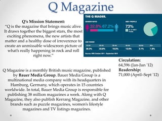


Q Magazine is a British music magazine published monthly. It has a consistent color scheme of red, white, and black to build its identity. Images are high quality and enhanced to stand out. The target audience is young to middle aged adults interested in pop, rock, and indie music. Q aims to provide factual information but also make the magazine fun and interesting to read.


