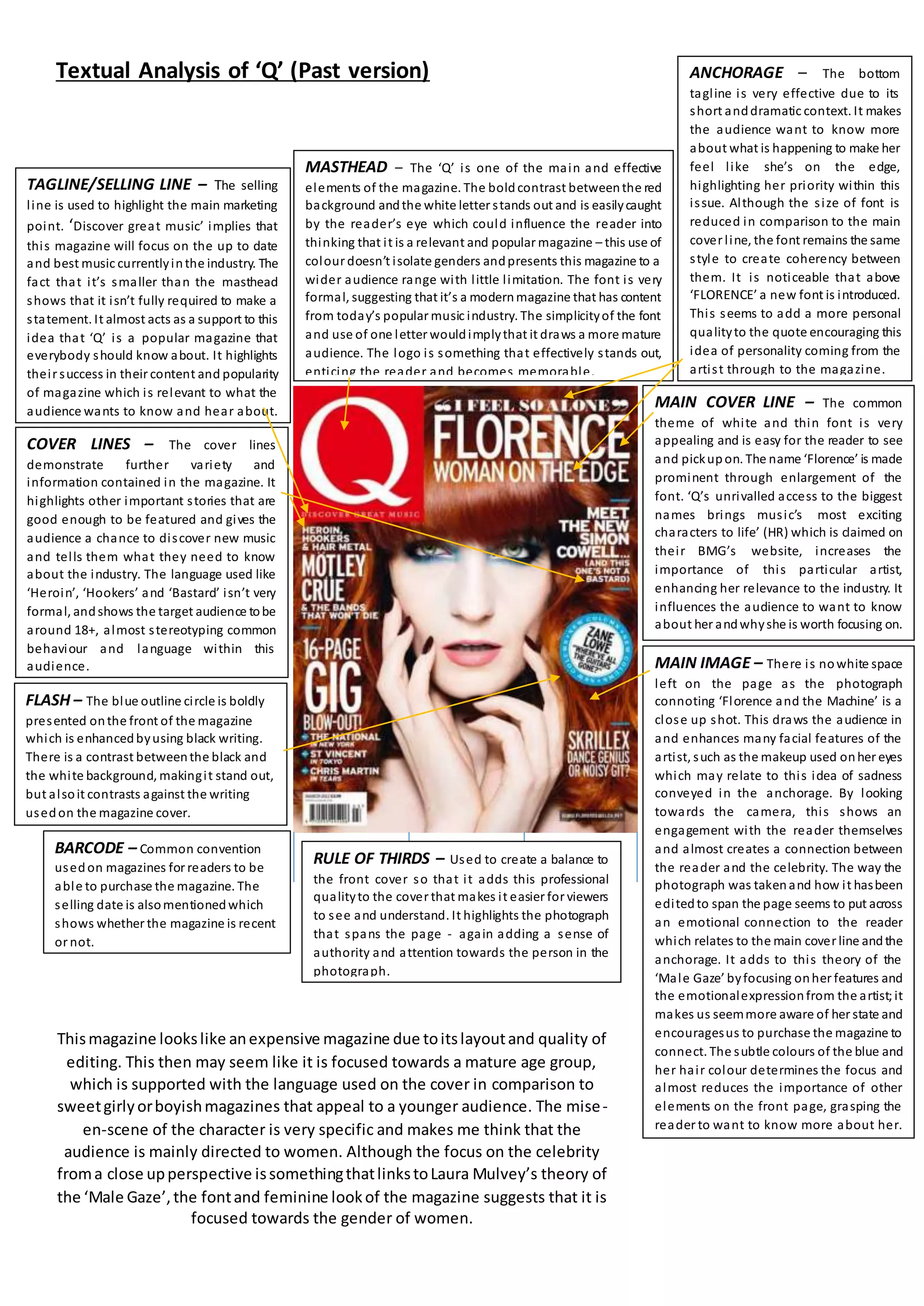
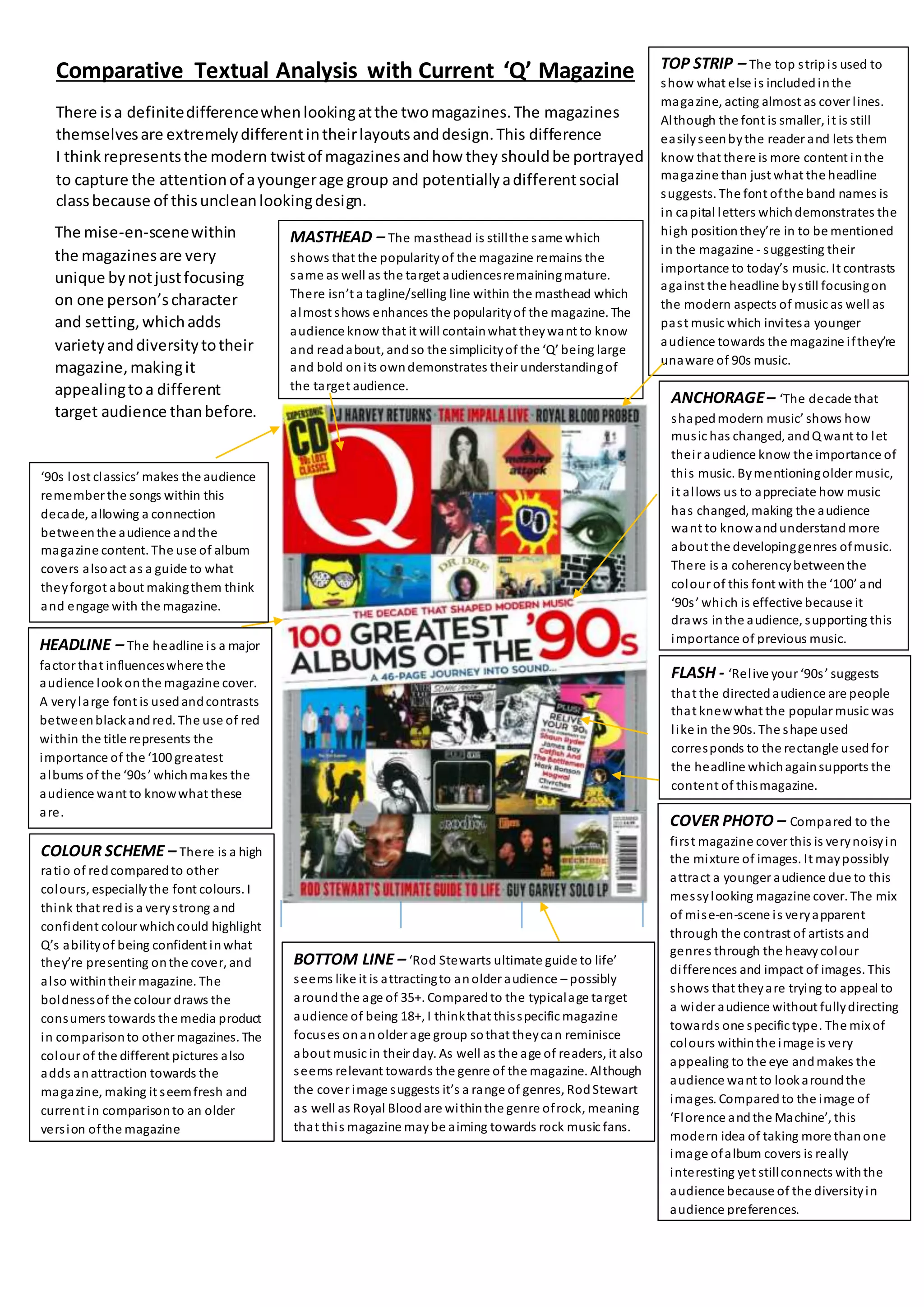
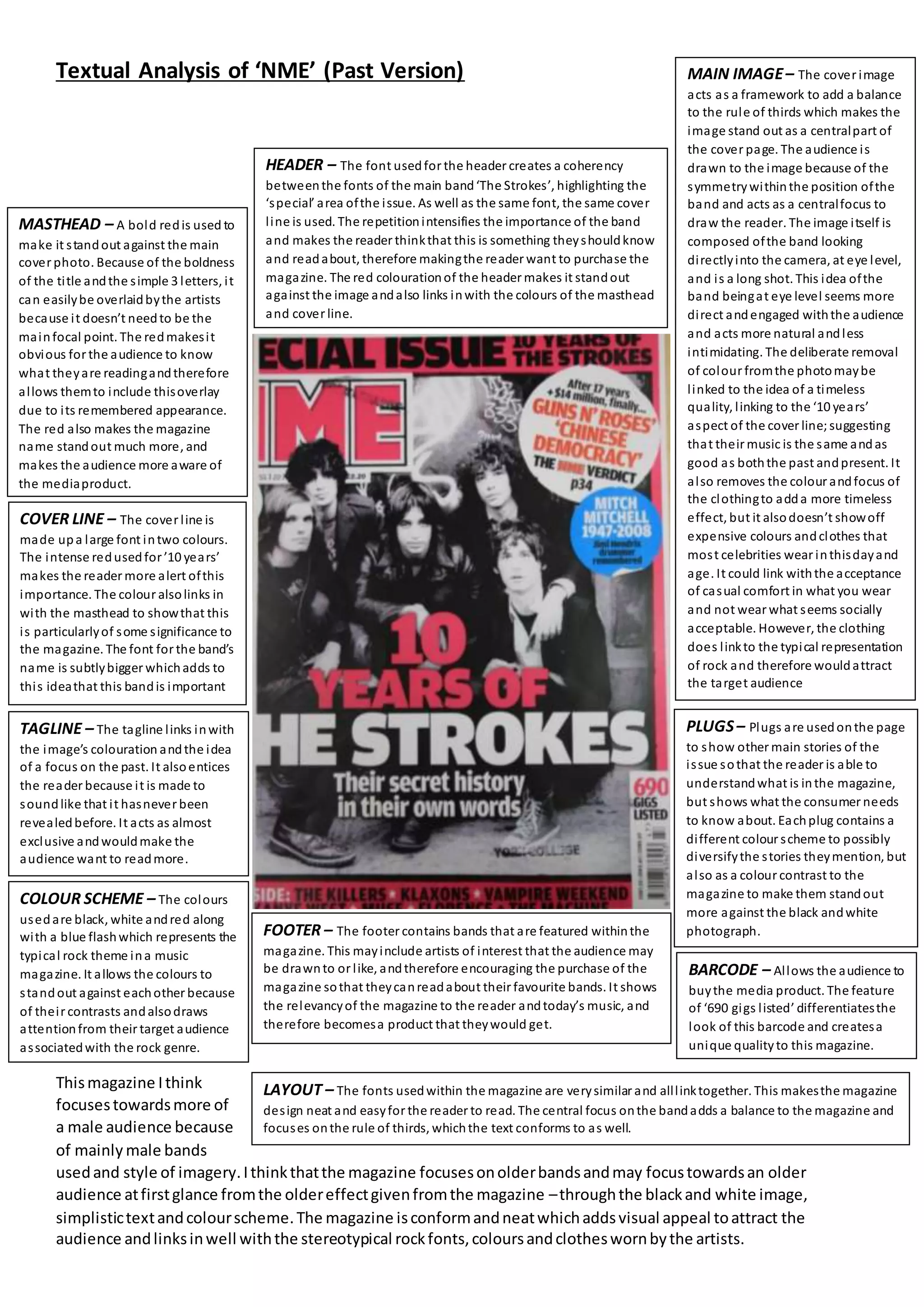
The document provides an in-depth textual analysis of the front covers of two different issues of the magazine "Q".
The first issue from the past focuses mainly on Florence and the Machine, using techniques like rule of thirds, close-up shots, and font styles to draw attention to the artist and create an emotional connection.
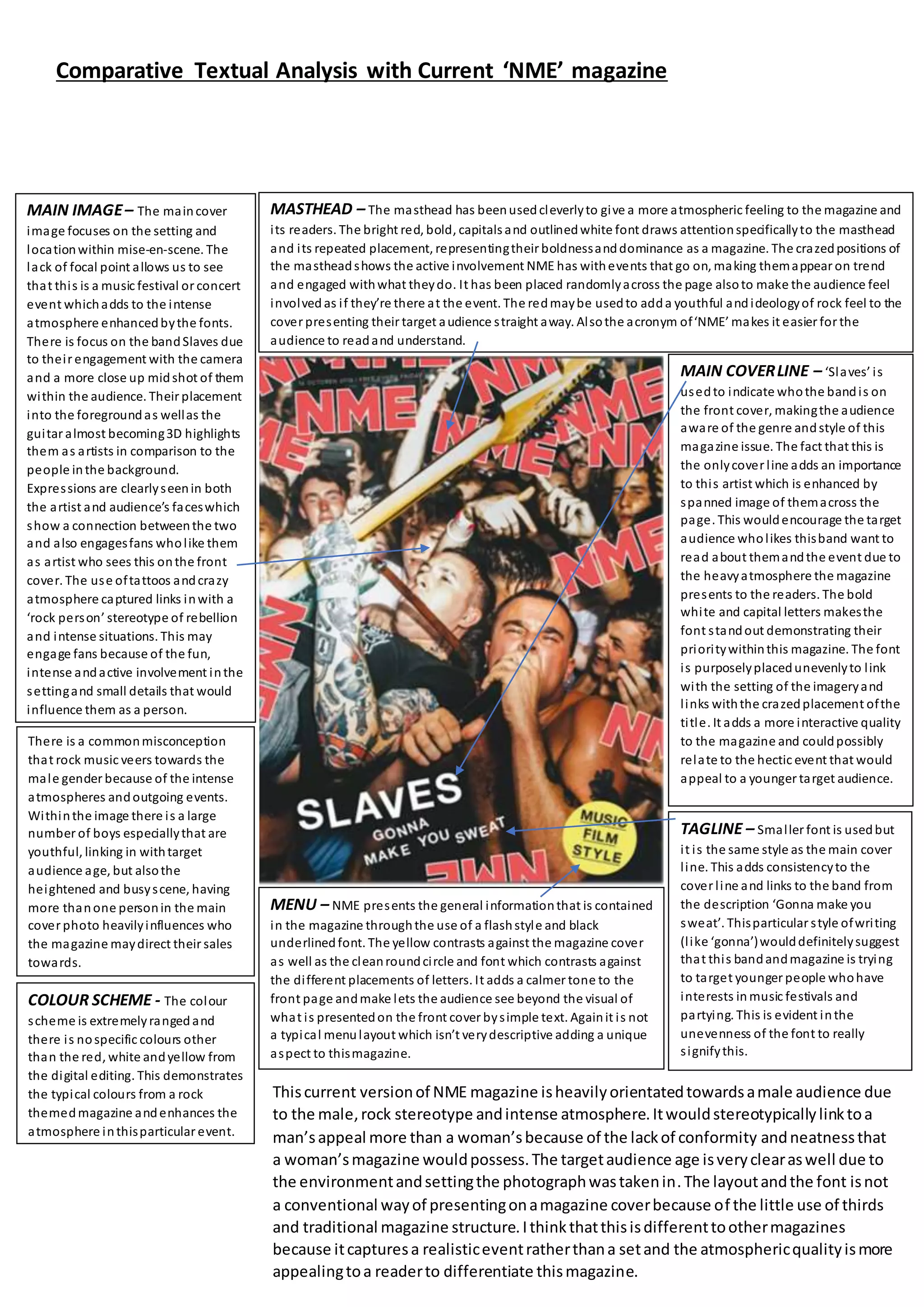
The current issue analyzed has a much busier, colorful layout with multiple album covers. It aims to appeal to younger audiences through a messy, diverse design while still honoring past music. Both covers effectively use techniques like color, images, and font to target their intended audiences and promote the relevant musical content inside.


![Magazine research really official [recovered]](https://cdn.slidesharecdn.com/ss_thumbnails/magazine-research-really-official-recovered-160211094822-thumbnail.jpg?width=640&height=640&fit=bounds)


