Download to read offline


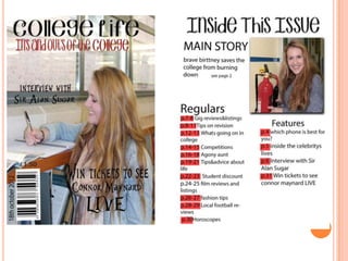
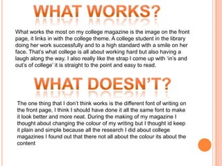
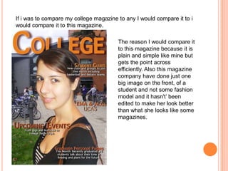

The document summarizes the creation of a college magazine. It discusses the successful aspects like using an image of a happy student on the front page that captures college life. The most difficult parts were using Photoshop software and learning photography skills. Overall, the creator learned new skills in designing a magazine and enjoyed the hands-on project compared to writing essays.


![Looking back at your preliminary task, what [autosaved]](https://cdn.slidesharecdn.com/ss_thumbnails/lookingbackatyourpreliminarytaskwhatautosaved-120503190551-phpapp02-thumbnail.jpg?width=640&height=640&fit=bounds)


