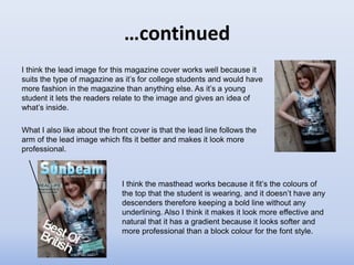
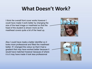
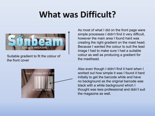
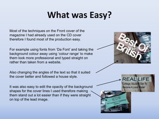
Download to read offline

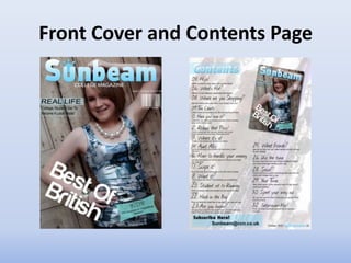
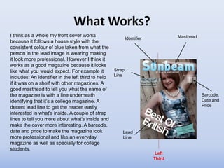
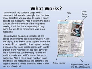
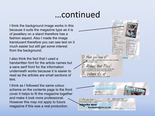
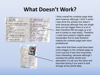
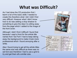
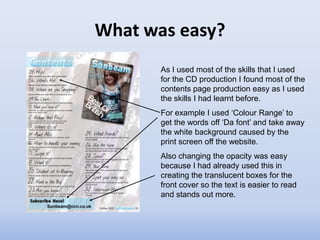
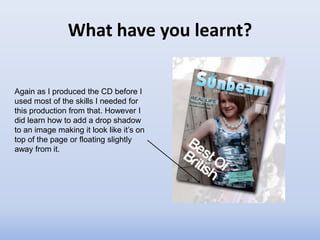

The document evaluates the front cover and contents page of a student magazine. For the front cover, it summarizes that the identifier, masthead, lead image, and inclusion of barcode/date/price make it look professional. However, the lead image or masthead could be resized to better frame the student's head. The contents page works due to following the front cover style, but the article font is difficult to read with many titles. Creating gradients and drop shadows were techniques learned.


![Looking back at your preliminary task, what [autosaved]](https://cdn.slidesharecdn.com/ss_thumbnails/lookingbackatyourpreliminarytaskwhatautosaved-120503190551-phpapp02-thumbnail.jpg?width=640&height=640&fit=bounds)


