Download to read offline

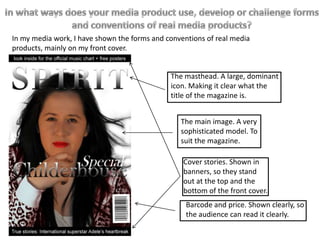
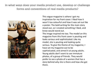
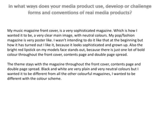
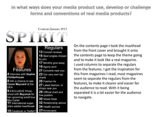
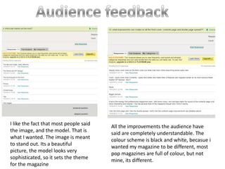

The document discusses the inspiration and design choices for a music magazine front cover created by the author. The author was inspired by the layout and style of Vogue magazine, particularly the prominent masthead, main image of a sophisticated model, and use of banners to highlight cover stories. The author's music magazine front cover uses a neutral color scheme of black and white to seem sophisticated. The model is pouting and looks serious to set the mature tone. The bold cover story text stands out as intended.


