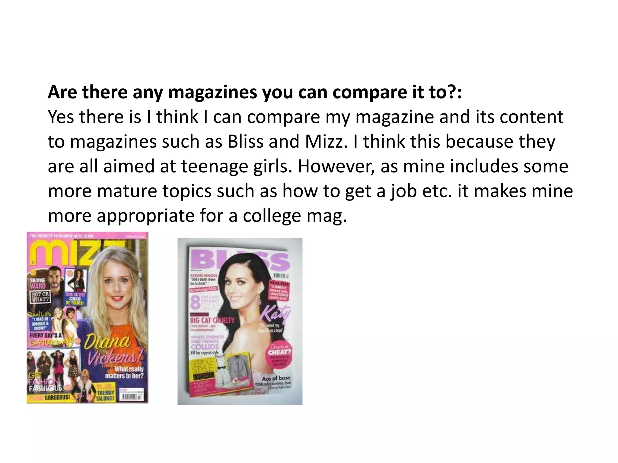
Download to read offline
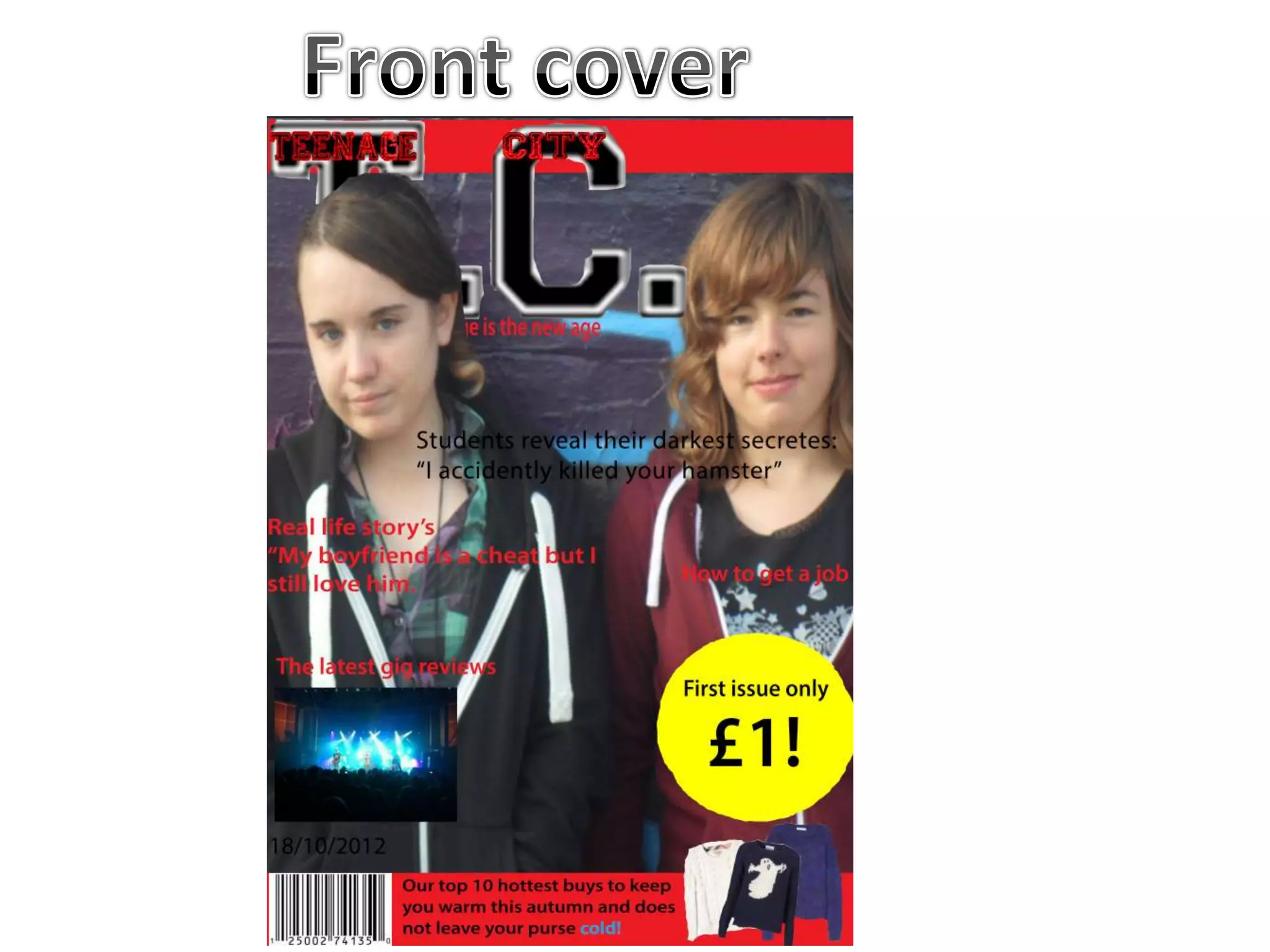
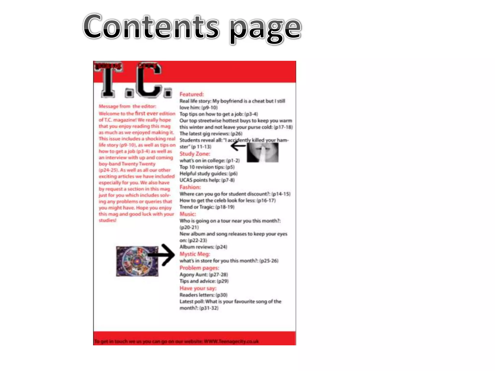
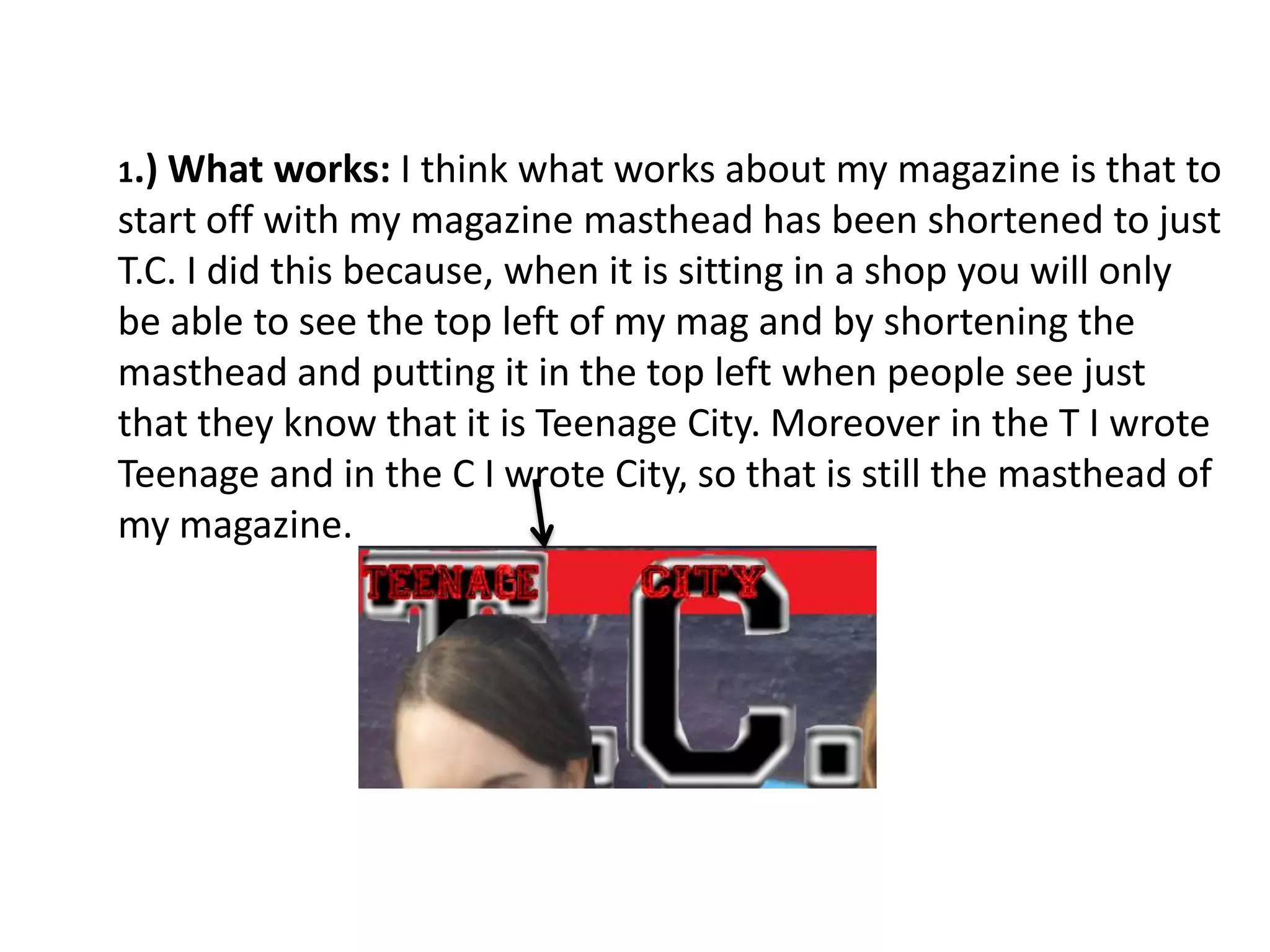

The document summarizes the author's magazine project. Some key points that worked well included shortening the masthead to initials to identify it quickly and keeping the same red color scheme throughout for consistency. Some challenges were fitting the masthead in a corner by overlaying a model's head, and lead text being hard to read against the red background. The author learned more about magazine layout and design with Photoshop. Changes suggested were simplifying the background and changing lead text colors or model outfits for improved readability and professional appearance.


