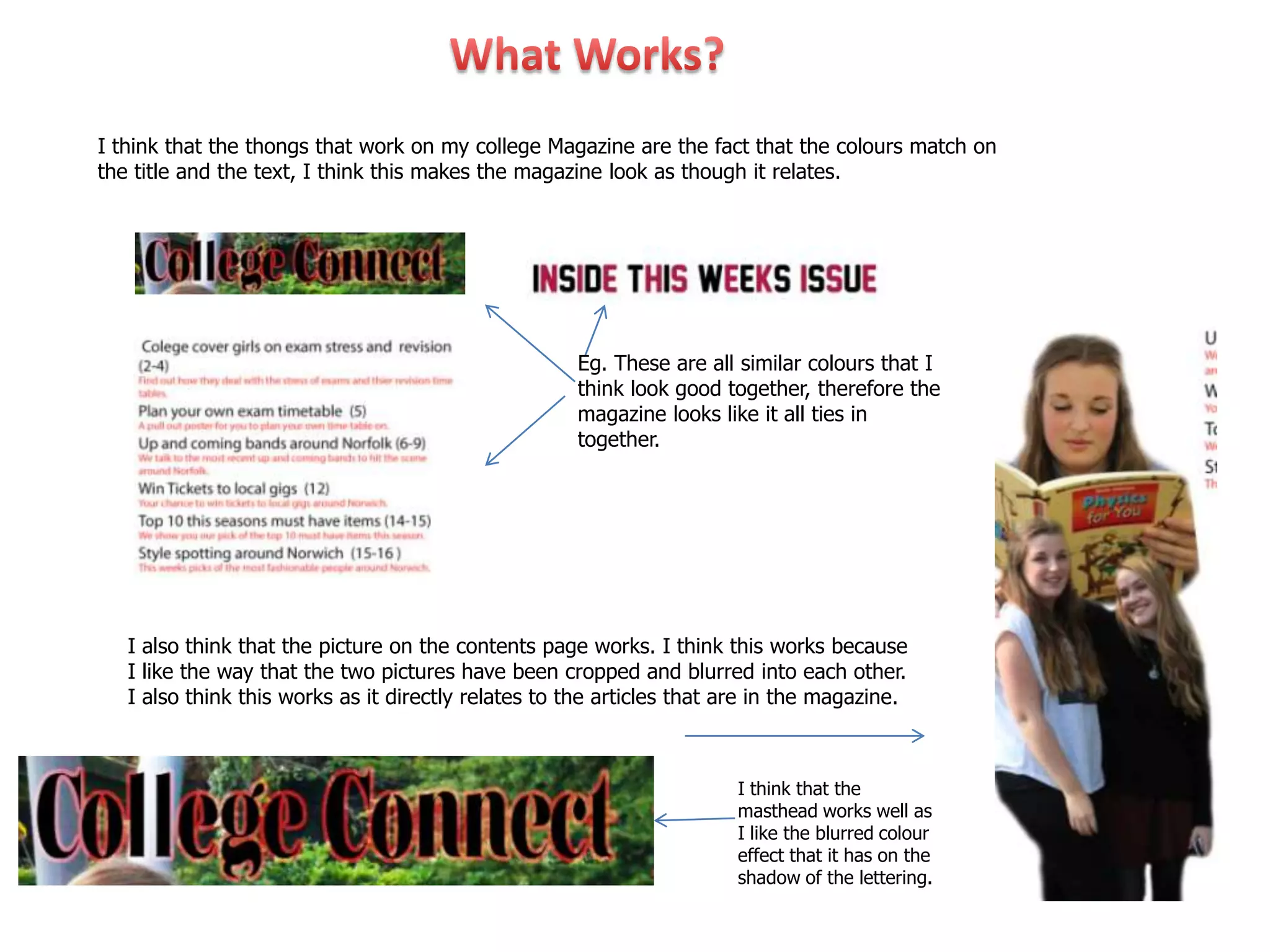
I think that the thongs that work on my college Magazine are the fact that the colours match on
the title and the text, I think this makes the magazine look as though it relates.


                                                     Eg. These are all similar colours that I
                                                     think look good together, therefore the
                                                     magazine looks like it all ties in
                                                     together.


   I also think that the picture on the contents page works. I think this works because
   I like the way that the two pictures have been cropped and blurred into each other.
   I also think this works as it directly relates to the articles that are in the magazine.


                                                                       I think that the
                                                                       masthead works well as
                                                                       I like the blurred colour
                                                                       effect that it has on the
                                                                       shadow of the lettering.
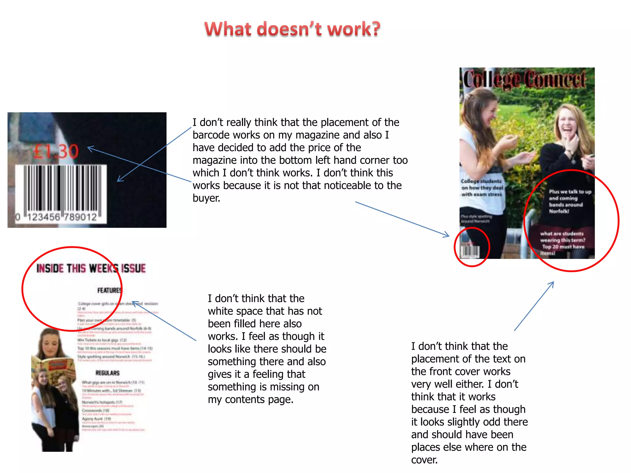
I don’t really think that the placement of the
barcode works on my magazine and also I
have decided to add the price of the
magazine into the bottom left hand corner too
which I don’t think works. I don’t think this
works because it is not that noticeable to the
buyer.


   I don’t think that the
   white space that has not
   been filled here also
   works. I feel as though it
   looks like there should be                    I don’t think that the
   something there and also                      placement of the text on
   gives it a feeling that                       the front cover works
   something is missing on                       very well either. I don’t
   my contents page.                             think that it works
                                                 because I feel as though
                                                 it looks slightly odd there
                                                 and should have been
                                                 places else where on the
                                                 cover.
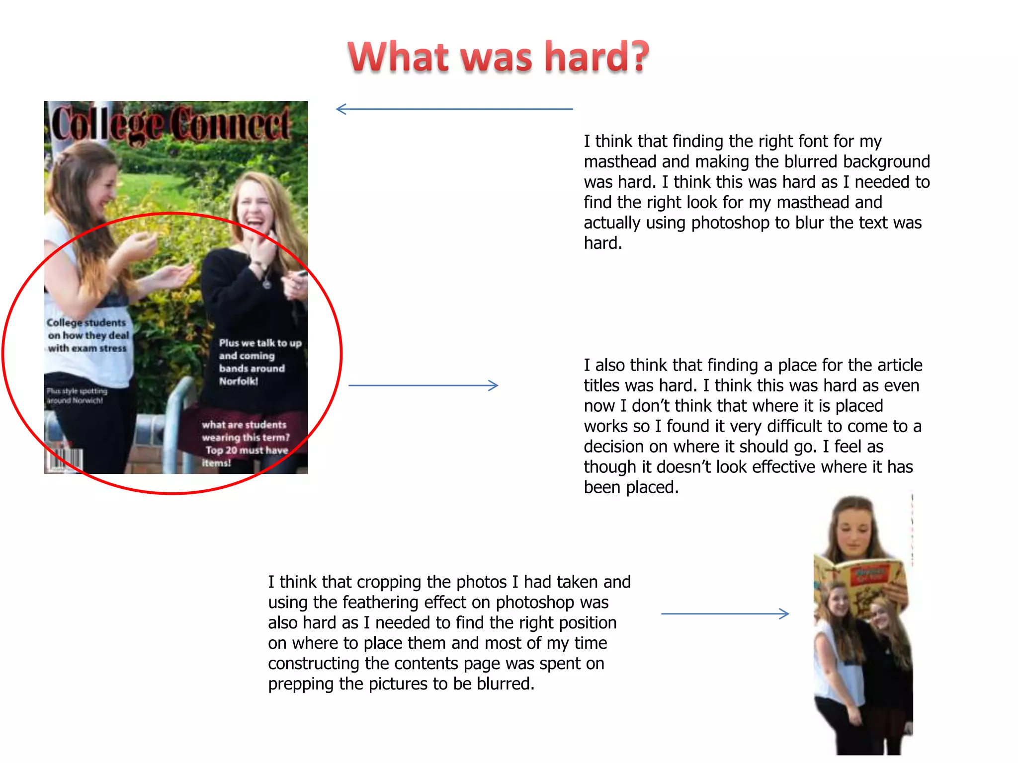
I think that finding the right font for my
                                         masthead and making the blurred background
                                         was hard. I think this was hard as I needed to
                                         find the right look for my masthead and
                                         actually using photoshop to blur the text was
                                         hard.


                                         I also think that finding a place for the article
                                         titles was hard. I think this was hard as even
                                         now I don’t think that where it is placed
                                         works so I found it very difficult to come to a
                                         decision on where it should go. I feel as
                                         though it doesn’t look effective where it has
                                         been placed.


I think that cropping the photos I had taken and
using the feathering effect on photoshop was
also hard as I needed to find the right position
on where to place them and most of my time
constructing the contents page was spent on
prepping the pictures to be blurred.
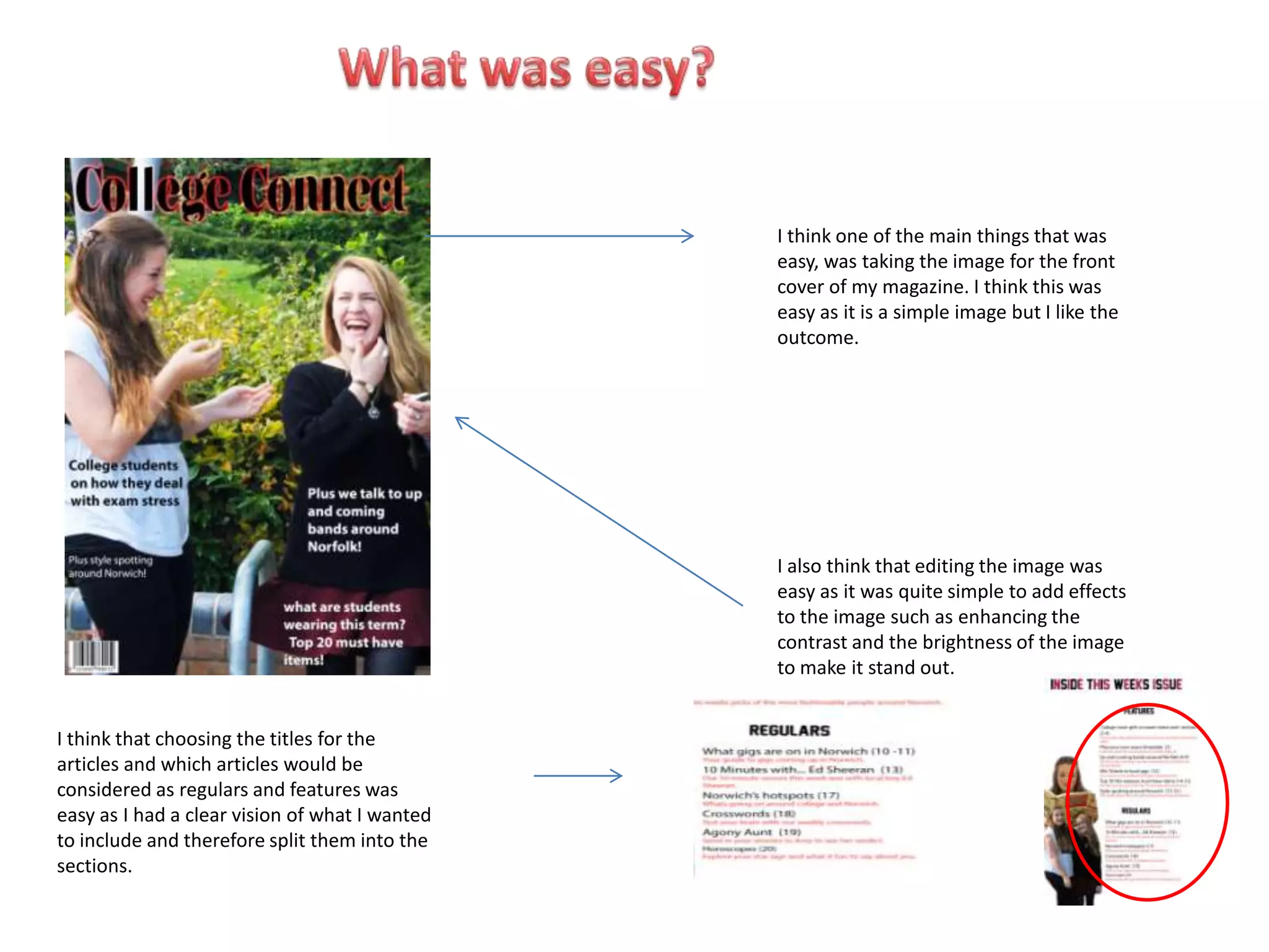
I think one of the main things that was
                                                easy, was taking the image for the front
                                                cover of my magazine. I think this was
                                                easy as it is a simple image but I like the
                                                outcome.


                                                I also think that editing the image was
                                                easy as it was quite simple to add effects
                                                to the image such as enhancing the
                                                contrast and the brightness of the image
                                                to make it stand out.


I think that choosing the titles for the
articles and which articles would be
considered as regulars and features was
easy as I had a clear vision of what I wanted
to include and therefore split them into the
sections.
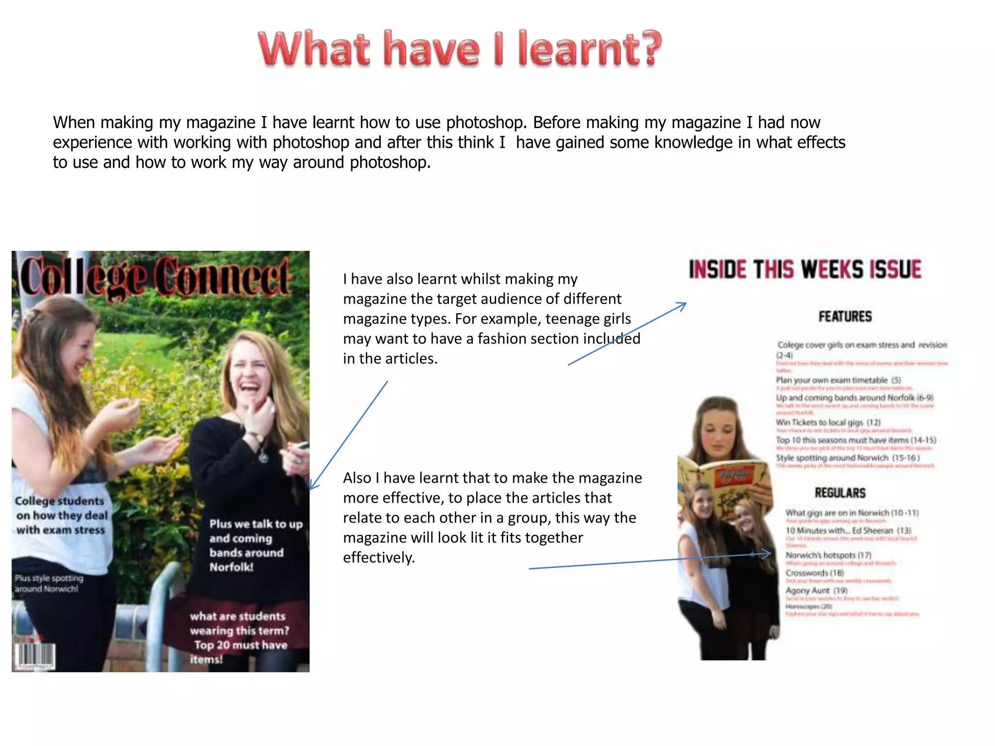
When making my magazine I have learnt how to use photoshop. Before making my magazine I had now
experience with working with photoshop and after this think I have gained some knowledge in what effects
to use and how to work my way around photoshop.


                                      I have also learnt whilst making my
                                      magazine the target audience of different
                                      magazine types. For example, teenage girls
                                      may want to have a fashion section included
                                      in the articles.


                                      Also I have learnt that to make the magazine
                                      more effective, to place the articles that
                                      relate to each other in a group, this way the
                                      magazine will look lit it fits together
                                      effectively.
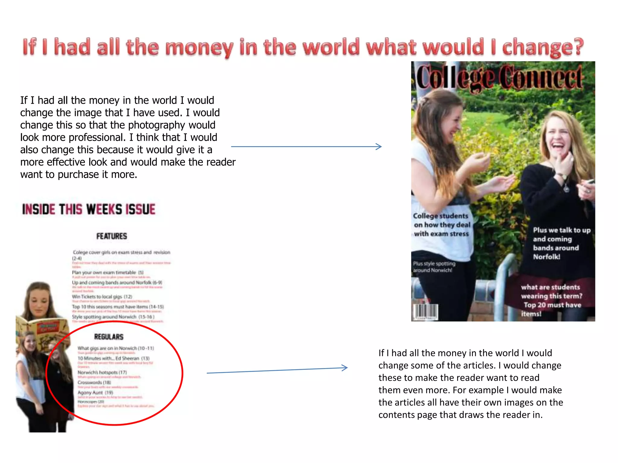
If I had all the money in the world I would
change the image that I have used. I would
change this so that the photography would
look more professional. I think that I would
also change this because it would give it a
more effective look and would make the reader
want to purchase it more.


                                                If I had all the money in the world I would
                                                change some of the articles. I would change
                                                these to make the reader want to read
                                                them even more. For example I would make
                                                the articles all have their own images on the
                                                contents page that draws the reader in.
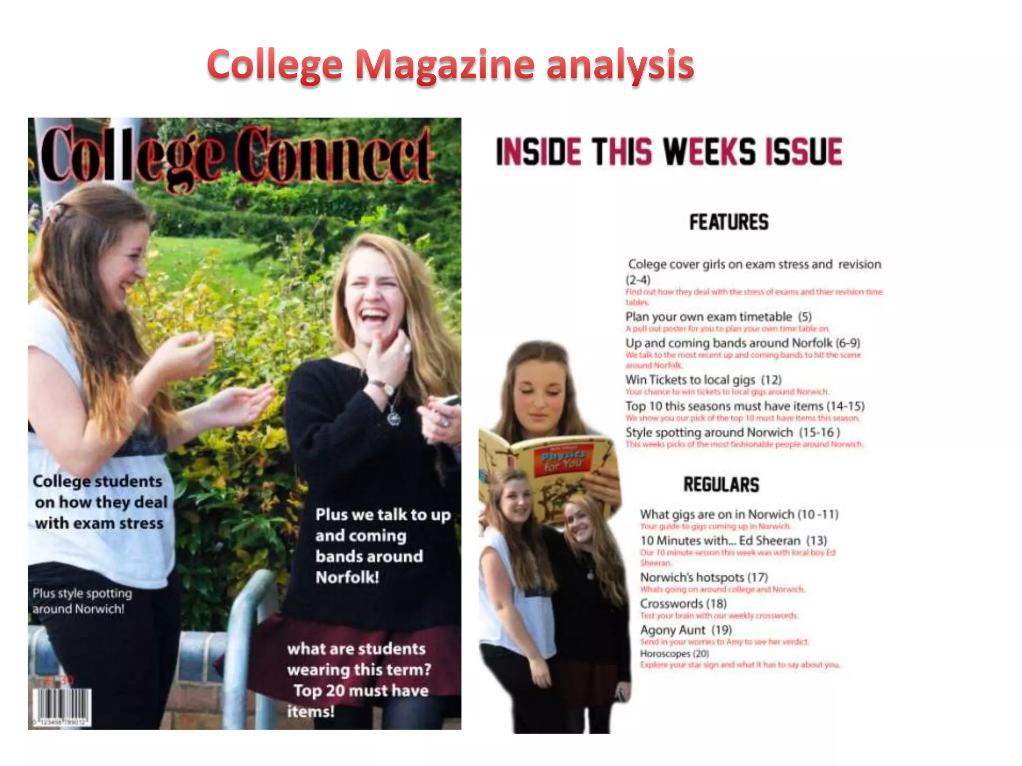
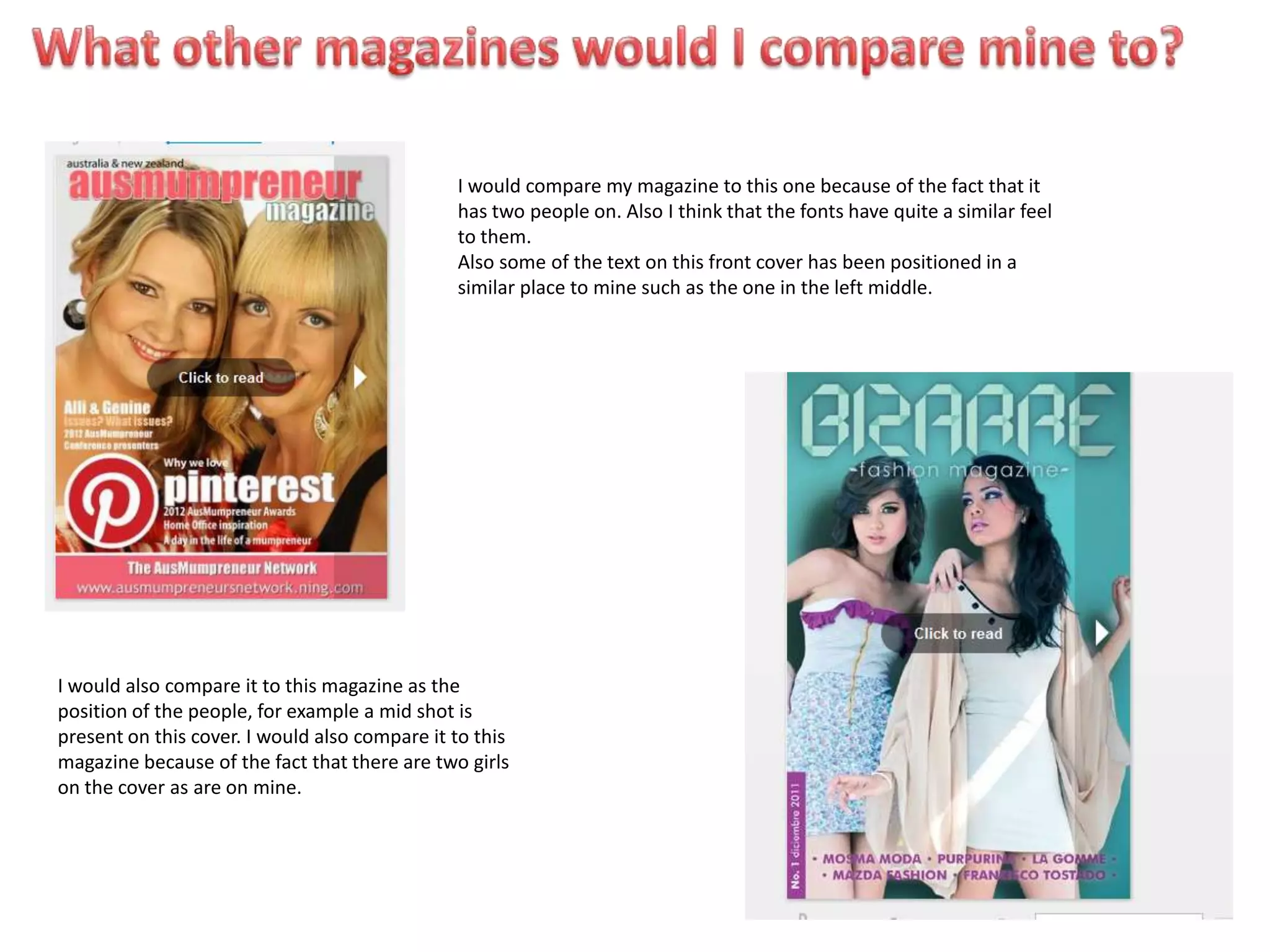
I would compare my magazine to this one because of the fact that it
                                               has two people on. Also I think that the fonts have quite a similar feel
                                               to them.
                                               Also some of the text on this front cover has been positioned in a
                                               similar place to mine such as the one in the left middle.


I would also compare it to this magazine as the
position of the people, for example a mid shot is
present on this cover. I would also compare it to this
magazine because of the fact that there are two girls
on the cover as are on mine.

Magazine analysis

  • 2.
    I think thatthe thongs that work on my college Magazine are the fact that the colours match on the title and the text, I think this makes the magazine look as though it relates. Eg. These are all similar colours that I think look good together, therefore the magazine looks like it all ties in together. I also think that the picture on the contents page works. I think this works because I like the way that the two pictures have been cropped and blurred into each other. I also think this works as it directly relates to the articles that are in the magazine. I think that the masthead works well as I like the blurred colour effect that it has on the shadow of the lettering.
  • 3.
    I don’t reallythink that the placement of the barcode works on my magazine and also I have decided to add the price of the magazine into the bottom left hand corner too which I don’t think works. I don’t think this works because it is not that noticeable to the buyer. I don’t think that the white space that has not been filled here also works. I feel as though it looks like there should be I don’t think that the something there and also placement of the text on gives it a feeling that the front cover works something is missing on very well either. I don’t my contents page. think that it works because I feel as though it looks slightly odd there and should have been places else where on the cover.
  • 4.
    I think thatfinding the right font for my masthead and making the blurred background was hard. I think this was hard as I needed to find the right look for my masthead and actually using photoshop to blur the text was hard. I also think that finding a place for the article titles was hard. I think this was hard as even now I don’t think that where it is placed works so I found it very difficult to come to a decision on where it should go. I feel as though it doesn’t look effective where it has been placed. I think that cropping the photos I had taken and using the feathering effect on photoshop was also hard as I needed to find the right position on where to place them and most of my time constructing the contents page was spent on prepping the pictures to be blurred.
  • 5.
    I think oneof the main things that was easy, was taking the image for the front cover of my magazine. I think this was easy as it is a simple image but I like the outcome. I also think that editing the image was easy as it was quite simple to add effects to the image such as enhancing the contrast and the brightness of the image to make it stand out. I think that choosing the titles for the articles and which articles would be considered as regulars and features was easy as I had a clear vision of what I wanted to include and therefore split them into the sections.
  • 6.
    When making mymagazine I have learnt how to use photoshop. Before making my magazine I had now experience with working with photoshop and after this think I have gained some knowledge in what effects to use and how to work my way around photoshop. I have also learnt whilst making my magazine the target audience of different magazine types. For example, teenage girls may want to have a fashion section included in the articles. Also I have learnt that to make the magazine more effective, to place the articles that relate to each other in a group, this way the magazine will look lit it fits together effectively.
  • 7.
    If I hadall the money in the world I would change the image that I have used. I would change this so that the photography would look more professional. I think that I would also change this because it would give it a more effective look and would make the reader want to purchase it more. If I had all the money in the world I would change some of the articles. I would change these to make the reader want to read them even more. For example I would make the articles all have their own images on the contents page that draws the reader in.
  • 8.
    I would comparemy magazine to this one because of the fact that it has two people on. Also I think that the fonts have quite a similar feel to them. Also some of the text on this front cover has been positioned in a similar place to mine such as the one in the left middle. I would also compare it to this magazine as the position of the people, for example a mid shot is present on this cover. I would also compare it to this magazine because of the fact that there are two girls on the cover as are on mine.