Download to read offline

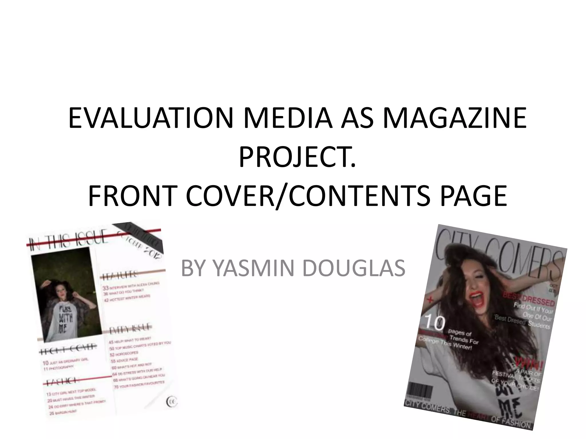
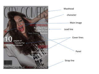
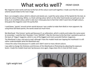
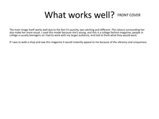
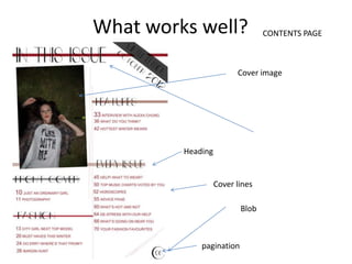
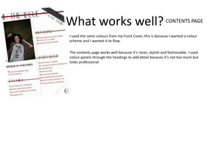
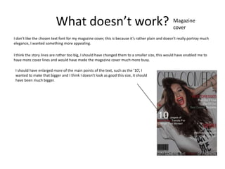
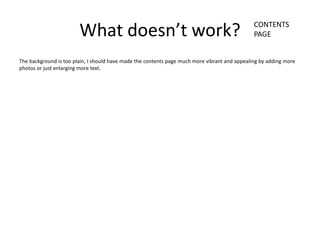
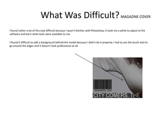
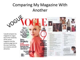

The document provides an evaluation of a magazine cover and contents page design project. It discusses what works well, such as the color scheme and layout elements. It also notes aspects that could be improved, such as making text fonts and cover lines sizes more appealing. Creating the magazine cover design in Photoshop was initially difficult due to unfamiliarity with the software tools. However, certain tasks like planning the design were easy once the goals were determined. Overall, the document reflects on lessons learned about magazine design and production.


