Download to read offline
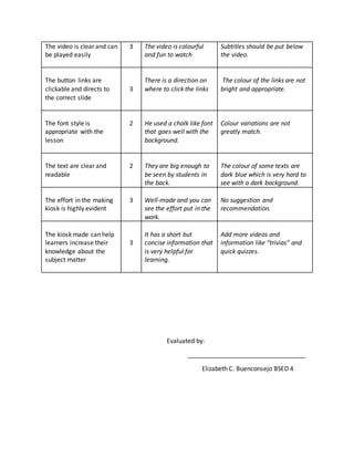
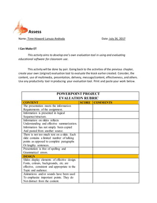
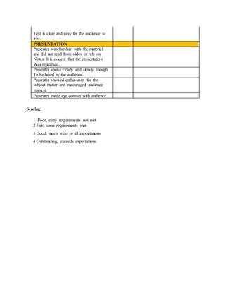

This activity aims to have students create their own evaluation tool to assess an educational kiosk presentation. Students work in pairs to design a rubric that evaluates the content, use of multimedia, presentation, delivery, message, and effectiveness of the kiosk. The rubric uses a scale of 1 to 4 to score different criteria such as information requirements, design elements, and presentation skills. Students are then asked to explain why it is important for teachers to evaluate educational technology for use in class and when checklists, rating scales, and rubrics should be used.


![Field Study 2 (FS 2) - Episode 2 [2018]](https://cdn.slidesharecdn.com/ss_thumbnails/fs2-episode2-180914121852-thumbnail.jpg?width=640&height=640&fit=bounds)


