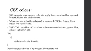
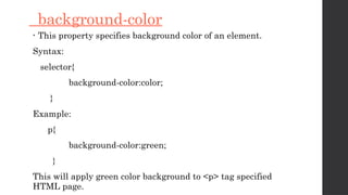
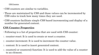
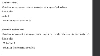
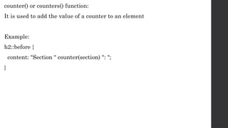
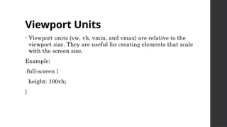
CSS Properties and
Values
CSS colors
• CSS supports huge amount colors to apply foreground and background
for text, blocks and divisions etc.
• Colors can be applied based on color name or RGB(Red Green Blue)
values or hex codes etc.
• CSS/HTML provides 140 standard color names such as red, green, blue,
tomato, lightgray, etc.
Ex:
p{
background-color:tomato;
}
Now background color of <p> tag will be tomato red.
• You can also specify colors by using hex codes
Ex:
#00FF00 -> for Green colors
#0000FF -> blue color
#FF6347 -> tomato red color
• CSS also supports the following functions to apply colors.
 rgb(red,green,blue) -> This function is used to apply rgb colors using values
ranging from 0 to 255.
Syntax:
rgb(255,0,0) -> apply red color.
 rgba(red,green,blue,alpha) -> This function is used to apply rgb colors along with
alpha value to specify transparency.
-> alpha value ranged from 0 to 1
Syntax:
rgba(255,0,0,0.3) -> apply red color with 30% transparent.
• hsl( hue, saturation, lightness): This function used to apply color
based on given hue, saturation and lightness values
Hue – is degree on the color wheel 0 to 360
0 to 120 is red, 120 to 270 is green, 270 to 360 is blue
saturation - % value to specify shaded or full color
lightness -> % value to specify darkness of the color
ex: hsl(0,100%,50%) -> gives tomato red.
• hsla(hue, saturation, lightness, alpha): This function also works as hsl( )
with transparency of color.
ex: hsla(0,100%,50%,0.5) -> gives tomato red with 50% transparent.
Background properties
• In CSS, background properties of used to apply background
effects to elements.
• The following background properties are used to apply
background effects.
 background-color
 background-image
 background-repeat
 background-attachment
 background-position
 background (shorthand property)
background-color
• This property specifies background color of an element.
Syntax:
selector{
background-color:color;
}
Example:
p{
background-color:green;
}
This will apply green color background to <p> tag specified
HTML page.
Pseudo – elements
• Pseudo-elements in CSS are used to style specific parts of
an element.
• They are not real HTML elements but rather are used to
generate content or apply styles to parts of an element's
content.
• Pseudo-elements are denoted by double colons (::) in CSS.
• Some common pseudo-elements
include ::before, ::after, ::first-line, and ::first-letter.
::before:
This pseudo-element is used to insert content before the content of the selected element.
It is often used for adding decorative elements or text before an element.
Example:
p::before {
content: "Before Text: ";
}
::after:
Similar to ::before, this pseudo-element is used to insert content after the content of the
selected element.
Example:
p::after {
content: " After Text";
}
::first-line:
This pseudo-element selects the first line of text within an element. It allows you to
apply styles to just the first line of text.
Example:
p::first-line {
font-weight: bold;
}
::first-letter:
::first-letter selects the first letter of a block-level element, allowing you to apply
styles to the initial letter.
Example:
p::first-letter {
font-size: 2em;
}
CSS Counters
• CSS counters are similar to variables.
• These are maintained by CSS and those values can be incremented by
CSS rules to track how many times they are used.
• CSS counters facilitate simple CSS based incrementing and display of a
number for generated content.
CSS Counter Properties
• Following is a list of properties that are used with CSS counter:
1. counter-reset: It is used to create or reset a counter.
2. counter-increment: It is used to increment the counter value.
3. content: It is used to insert generated content.
4. counter() or counters() function: It is used to add the value of a counter
to an element.
counter-reset:
Used to initialize or reset a counter to a specified value.
Example:
body {
counter-reset: section 0;
}
counter-increment:
Used to increment a counter each time a particular element is encountered.
Example:
h2::before {
counter-increment: section;
}
counter-reset:
Used to initialize or reset a counter to a specified value.
Example:
body {
counter-reset: section 0;
}
counter-increment:
Used to increment a counter each time a particular element is encountered.
Example:
h2::before {
counter-increment: section;
}
counter() or counters() function:
It is used to add the value of a counter to an element
Example:
h2::before {
content: "Section " counter(section) ": ";
}
CSS Responsive
• Responsive web design makes your web page look good on all devices.
• Responsive web design uses only HTML and CSS.
• Responsive web design is not a program or a JavaScript.
• Here are some key CSS properties and techniques for creating responsive
designs:
1. Media Queries
2. Fluid Layouts
3. Flexible Typography
4. Flexible Images
5. Viewport Units
Media Queries
• Media query is a CSS technique introduced in CSS3.
• It uses the @media rule to include a block of CSS properties only if a
certain condition is true.
Example:
@media only screen and (max-width: 600px) {
body {
background-color: lightblue;
}
}
Fluid Layouts
• Create fluid layouts by using relative units like percentages for
width and max-width properties instead of fixed pixel values.
• This allows your content to adapt to different screen sizes.
Example:
.container {
width: 100%;
max-width: 960px;
}
Flexible Typography
• Use relative units like em, rem, or vw for font sizes and line heights
to ensure text is legible on different devices.
Example:
body {
font-size: 16px;
}
h1 {
font-size: 2em;
}
Flexible Images
• To make images scale appropriately, you can use the max-width:
100% property to ensure they don't exceed the container width.
Example:
img {
max-width: 100%;
height: auto;
}
Viewport Units
• Viewport units (vw, vh, vmin, and vmax) are relative to the
viewport size. They are useful for creating elements that scale
with the screen size.
Example:
.full-screen {
height: 100vh;
}

CSS Properties and Values with responsive design

  • 1.
  • 2.
    CSS colors • CSSsupports huge amount colors to apply foreground and background for text, blocks and divisions etc. • Colors can be applied based on color name or RGB(Red Green Blue) values or hex codes etc. • CSS/HTML provides 140 standard color names such as red, green, blue, tomato, lightgray, etc. Ex: p{ background-color:tomato; } Now background color of <p> tag will be tomato red.
  • 3.
    • You canalso specify colors by using hex codes Ex: #00FF00 -> for Green colors #0000FF -> blue color #FF6347 -> tomato red color • CSS also supports the following functions to apply colors.  rgb(red,green,blue) -> This function is used to apply rgb colors using values ranging from 0 to 255. Syntax: rgb(255,0,0) -> apply red color.  rgba(red,green,blue,alpha) -> This function is used to apply rgb colors along with alpha value to specify transparency. -> alpha value ranged from 0 to 1 Syntax: rgba(255,0,0,0.3) -> apply red color with 30% transparent.
  • 4.
    • hsl( hue,saturation, lightness): This function used to apply color based on given hue, saturation and lightness values Hue – is degree on the color wheel 0 to 360 0 to 120 is red, 120 to 270 is green, 270 to 360 is blue saturation - % value to specify shaded or full color lightness -> % value to specify darkness of the color ex: hsl(0,100%,50%) -> gives tomato red. • hsla(hue, saturation, lightness, alpha): This function also works as hsl( ) with transparency of color. ex: hsla(0,100%,50%,0.5) -> gives tomato red with 50% transparent.
  • 5.
    Background properties • InCSS, background properties of used to apply background effects to elements. • The following background properties are used to apply background effects.  background-color  background-image  background-repeat  background-attachment  background-position  background (shorthand property)
  • 6.
    background-color • This propertyspecifies background color of an element. Syntax: selector{ background-color:color; } Example: p{ background-color:green; } This will apply green color background to <p> tag specified HTML page.
  • 7.
    Pseudo – elements •Pseudo-elements in CSS are used to style specific parts of an element. • They are not real HTML elements but rather are used to generate content or apply styles to parts of an element's content. • Pseudo-elements are denoted by double colons (::) in CSS. • Some common pseudo-elements include ::before, ::after, ::first-line, and ::first-letter.
  • 8.
    ::before: This pseudo-element isused to insert content before the content of the selected element. It is often used for adding decorative elements or text before an element. Example: p::before { content: "Before Text: "; } ::after: Similar to ::before, this pseudo-element is used to insert content after the content of the selected element. Example: p::after { content: " After Text"; }
  • 9.
    ::first-line: This pseudo-element selectsthe first line of text within an element. It allows you to apply styles to just the first line of text. Example: p::first-line { font-weight: bold; } ::first-letter: ::first-letter selects the first letter of a block-level element, allowing you to apply styles to the initial letter. Example: p::first-letter { font-size: 2em; }
  • 10.
    CSS Counters • CSScounters are similar to variables. • These are maintained by CSS and those values can be incremented by CSS rules to track how many times they are used. • CSS counters facilitate simple CSS based incrementing and display of a number for generated content. CSS Counter Properties • Following is a list of properties that are used with CSS counter: 1. counter-reset: It is used to create or reset a counter. 2. counter-increment: It is used to increment the counter value. 3. content: It is used to insert generated content. 4. counter() or counters() function: It is used to add the value of a counter to an element.
  • 11.
    counter-reset: Used to initializeor reset a counter to a specified value. Example: body { counter-reset: section 0; } counter-increment: Used to increment a counter each time a particular element is encountered. Example: h2::before { counter-increment: section; }
  • 12.
    counter-reset: Used to initializeor reset a counter to a specified value. Example: body { counter-reset: section 0; } counter-increment: Used to increment a counter each time a particular element is encountered. Example: h2::before { counter-increment: section; }
  • 13.
    counter() or counters()function: It is used to add the value of a counter to an element Example: h2::before { content: "Section " counter(section) ": "; }
  • 14.
    CSS Responsive • Responsiveweb design makes your web page look good on all devices. • Responsive web design uses only HTML and CSS. • Responsive web design is not a program or a JavaScript. • Here are some key CSS properties and techniques for creating responsive designs: 1. Media Queries 2. Fluid Layouts 3. Flexible Typography 4. Flexible Images 5. Viewport Units
  • 15.
    Media Queries • Mediaquery is a CSS technique introduced in CSS3. • It uses the @media rule to include a block of CSS properties only if a certain condition is true. Example: @media only screen and (max-width: 600px) { body { background-color: lightblue; } }
  • 16.
    Fluid Layouts • Createfluid layouts by using relative units like percentages for width and max-width properties instead of fixed pixel values. • This allows your content to adapt to different screen sizes. Example: .container { width: 100%; max-width: 960px; }
  • 17.
    Flexible Typography • Userelative units like em, rem, or vw for font sizes and line heights to ensure text is legible on different devices. Example: body { font-size: 16px; } h1 { font-size: 2em; }
  • 18.
    Flexible Images • Tomake images scale appropriately, you can use the max-width: 100% property to ensure they don't exceed the container width. Example: img { max-width: 100%; height: auto; }
  • 19.
    Viewport Units • Viewportunits (vw, vh, vmin, and vmax) are relative to the viewport size. They are useful for creating elements that scale with the screen size. Example: .full-screen { height: 100vh; }