The document discusses CSS properties for styling text, including:
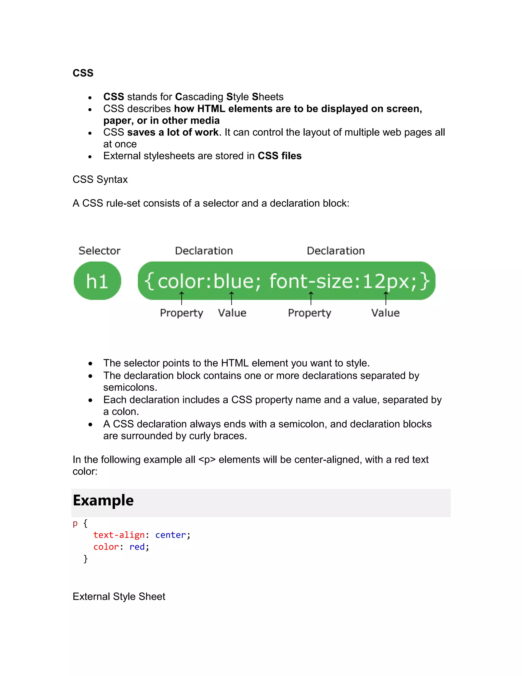
- CSS (Cascading Style Sheets) is used to describe how HTML elements are displayed on different media. CSS can control layout and styles across multiple web pages.
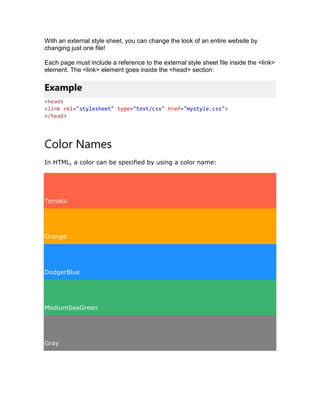
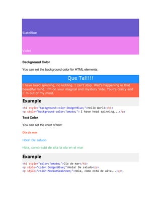
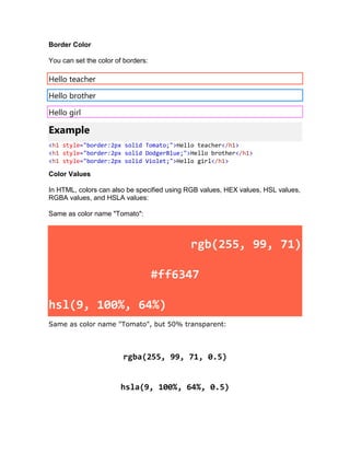
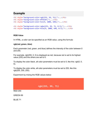
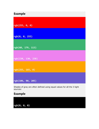
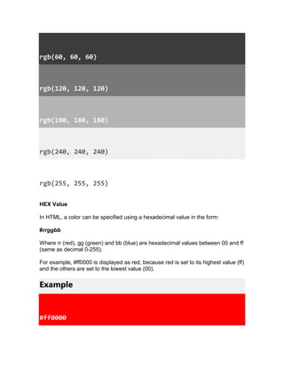
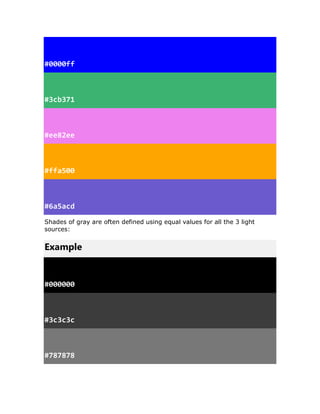
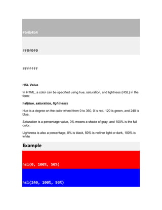
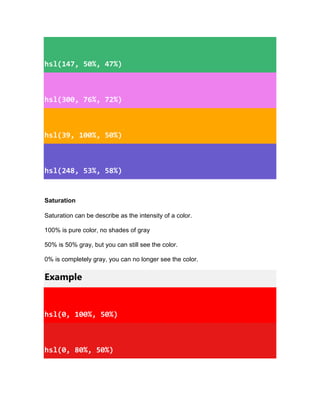
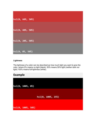
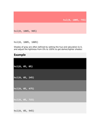
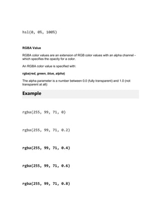
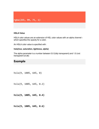
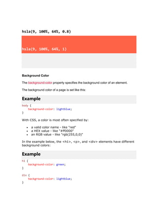
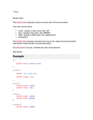
- Color properties like background-color, color, border-color are used to specify colors for elements using color names, HEX, RGB, HSL values.
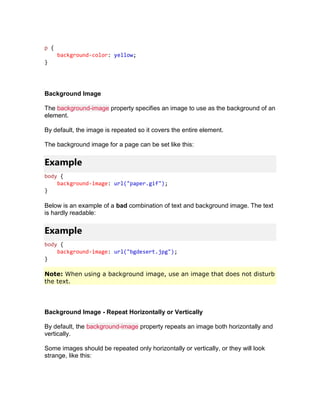
- Other properties like background-image, background-repeat, background-position are used to add and position background images. Border properties allow customizing element borders.